Allowed some time to collect my thoughts, upon seeing the new Le Mans 24 Hours logo, before sharing. I always try to be—well not always, but try to try—constructive when I’m sharing my thoughts about a logo design created by another logo designer.
After all, there is no joy whatsoever in hearing negative remarks about ones own work.
To be perfectly fair, and brutally honest, being any kind of artist immediately draws the spot-light upon you, be it for good or for worse, and well, we just ideally need to take the knock-downs with the re-ups.
Saying all that, I do feel the need to state my disappointment in the new Le Mans 24 Hours logo design, and not really sharing the opinions over at BrandNew either, which is pretty much a first.

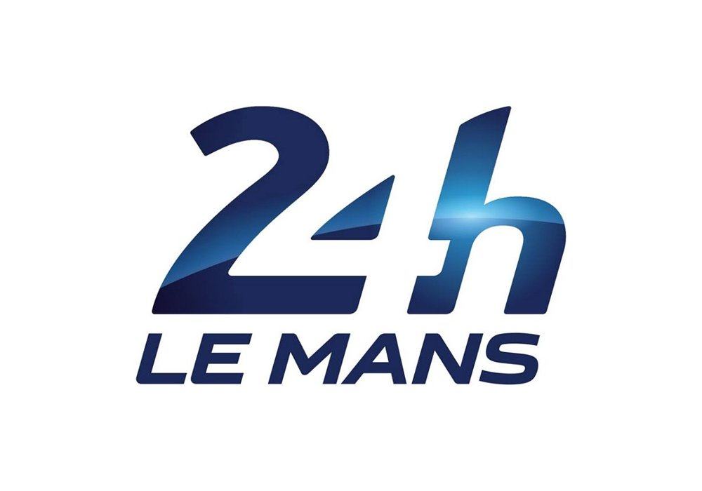
Le Mans: “Henceforth, the Le Mans 24 Hours has a new visual identity thanks to the new logo designed by the Leroy Tremblot agency. An event like the Le Mans 24 Hours is based around a central dimension — its legend. And this legend has been carefully forged since 1923 thanks to four
sacrosanct values: innovation, popularity, performance and variety. These four values can be found in the new logo, which also transforms the identity of the event to a brand concept.
This new sign replaces a logo that dates from 1978 and it coincides with the introduction this year of new technical regulations for the Le Mans blue riband category, the LM P1s (download hereafter).”
Mutton Dressed as Lamb
Take away the gloss, the shiny metallic paint job, the ‘blue riband category’ (see press release above) and what you see is—and what I immediately saw through the thick paint and lacquer job—the unbalanced nature of the logo.
First thing that hit me was, “what the hell is happening to the top of the# 2?”
I get streamlined car bonnets, curves, fading roads into the distance, but this simply looks like a catastrophic attempt at using some tool in Illustrator for the first time. A little more thickness at the top, maybe even a little more depth, a little thinning out around it’s waist would have made such a difference, in my personal opinion of course.
Given the #2 leads us in, it’s such a shame it looks so oddly shaped with it’s sturdy waistline, it’s dainty base, and the thinning on top. Almost feels like a good attempt at a first draft.
The baseline width of the #2, and thusly, the width of the #4, also seem a little too wide to me, in my personal opinion of course. I know there are often trade-offs with this method of creating something from nothing (negative/positive space), but even so, this could have been done a lot lot better, I really believe that.

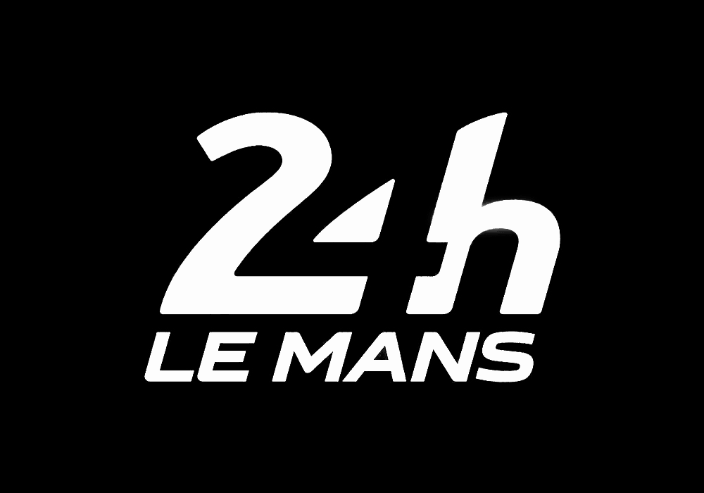
Reverse the logo (which is how it is primarily presented on the Le Mans website), and you see even more clearly the discrepancies between each letters shape and form, and how the #4 almost feels like it’s been shoehorned in, not so with the F1 logo.
The ‘h’ is really the only solid letter going on here. Oh, and the Le Mans wording is also solid, guess that’s a good thing because it literally is having to carry the rest of the logo.
Formula 1 vs Le Mans 24 Hours
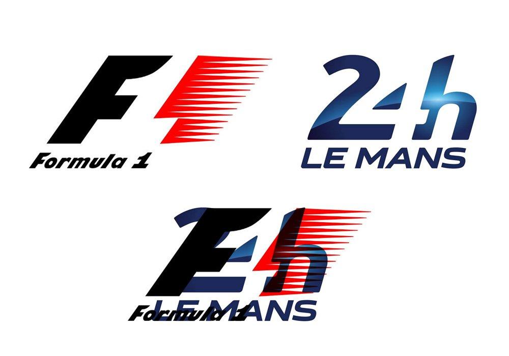
For us Formula 1 fans the similarity between both logos beckons some weary questions. I’m not ‘in the know’ enough to question if there is actually some kind of business connection between F1 and Le Mans, in which case excellent, bring some consistency. However, I feel this is probably not the case, and the similarity is simply more than a similarity shared with another motor racing organisation. If one is going to use inspiration from another design, then please do try a little harder to do it justice.
For such a prestigious event, I feel this opportunity to redesign the Le Mans 24 hour logo was simply not grasped. It’s really quite disappointing. Oh, and thinking about it, I wasn’t that impressed with Caterham’s 2012 F1 Team logo either…
Formula 1 vs 24 Hours Le Mans

Quick comparison below shows they also share, pretty much, the same boundaries, give or take.

