
Evernote Logo & Icon Design – Brand Identity Process
Ever since laying eyes on the famous Evernote Logo and Icon, I have always been a huge admirer of the design.
The particular shape of the elephant with the folded back ear reminiscent of a document icon, or a folded page in a book, oozed brandability.
It’s actually right up there as one of my favourite logos of all time. That might surprise a few of you, but I always felt that this was a perfect mix of style, colour, detail and meaning as well as being totally flexible in it’s universal application.
The Evernote logo is a perfect example of everything done right to cater for many possible variations of physical and digital requirements.
There is not one application I have seen where the logo fails to fit perfectly all the way from the 16px favicon, the browser extension icons in both colour and mono, the iOS icons, Macintosh dock icon and so on and so on.
The Evernote logo is also a perfect example of a mainstream online brand identity to study.
Since starting LogoStack I have been curious to find out the origins of the Evernote logo, and for a while kept drawing a blank on who/whom was responsible.
Then today the answer was given to me by a few people due to a relatively recent Evernote Trunk Conference Youtube video, uploaded September 2011.
So thanks to ElephantChannel for the tweet that put me in exactly the right spot to get all the information I needed.
Icon to Interface – Evernote Trunk Conference
In this post I have added a few images which I grabbed from the following YouTube video which I would strongly urge you to watch in it’s entirety.
It’s close to 45 minutes long and covers the initial scope of logo ideas, in-depth reasoning, logical and practical considerations of implementing the Evernote logo/icon across the entire brand identity.
For any one interested or actually works on logo and icon projects targeted towards web applications and mobile devices then this is a must see. If you also want to get a behind-the-scenes run down of the creative process of such an iconic brand then this is it.
In the video we find out who lead the creative team responsible for the logos creations which is Gabe Campodonico, Creative Director at Evernote. In this instance Evernote’s brand identity was totally created in-house.
I watched it this afternoon and will be returning back to watch it again as some of the pointers are simple, common sense thoughts yet that can be often forgotten.
Watching this video is a nice kick up the ass to not forgot the simple stuff that can make or break a project.
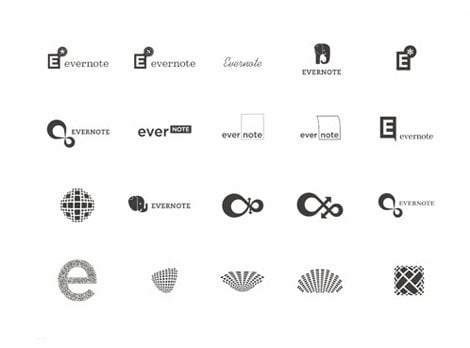
You get to see some of the initial logo ideas and explorations.
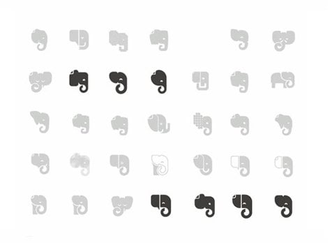
Then once Evernote settled on the core idea of an Elephant you get to see the variations they considered before settling on the final choice.
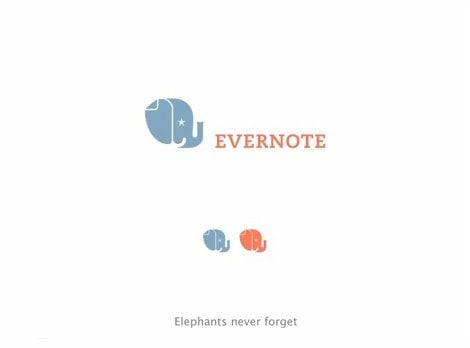
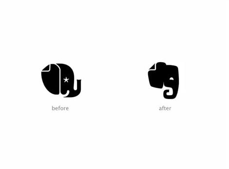
As well as a run through on the importance of owning a colour and style so that it shines above the many other applications and icons.
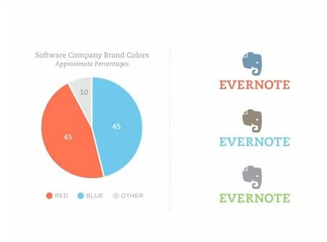
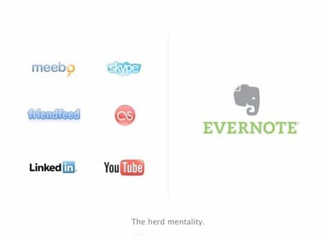
An interesting snip of information is that the creative team took just 6 weeks form start to finished logo design which is really quite incredible.
I am so genuinely pleased to have finally discovered the origins of the Evernote logo, and after watching the video have walked away with more than a few pointers and reminders about the creation and origination of solid logo and icon designs.
If you like all things brand identity then I have quite a meaty collection of guidelines and resources you might like: Bulging Sack of Brand Identity Guideline Resources
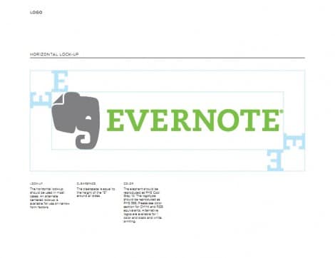
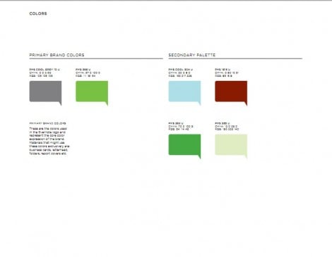
Evernote Brand Guidelines
To finish this post up Evernote has a nice section on their website, Evernote Trademark Use, which details all the technical and legal information regarding the use and referencing of core aspects of Evernote’s visual brand identity.
Download the Evernote Brand Guidelines
