1968 Mexico Olympics Logo & Brand Identity by Lance Wyman
This is a pretty complete run-through of the 1968 Mexico Olympics logo and brand identity design guidelines, designed by Lance Wyman.
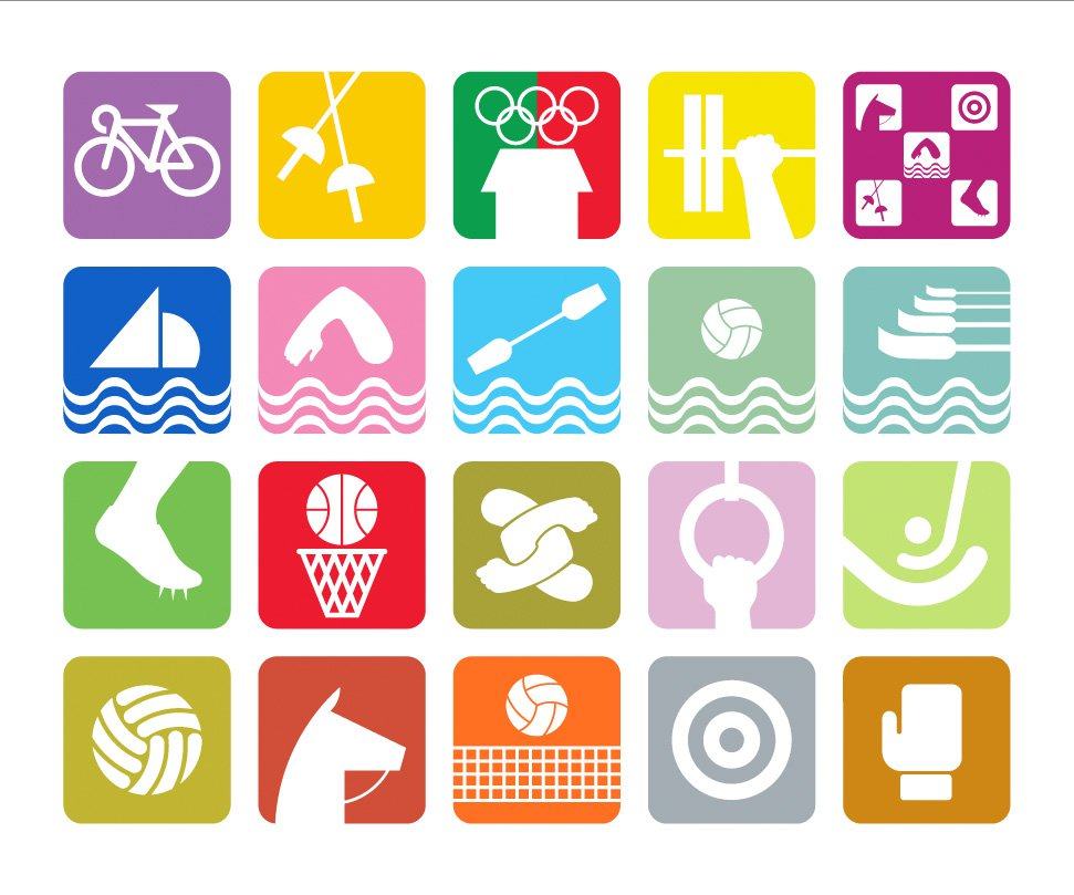
Found a huge article over on Graphic Ambient that contains image-after-image of the Olympic logo and graphic system in real-world scenarios, as well as more deconstructed style logo images.
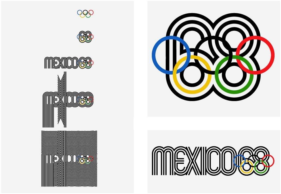
Lance Wyman was the main creative genius behind the 1968 Mexico Olympics Logotype as well as setting the tone for the rest of the Olympic identity:
![]()
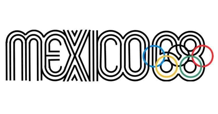
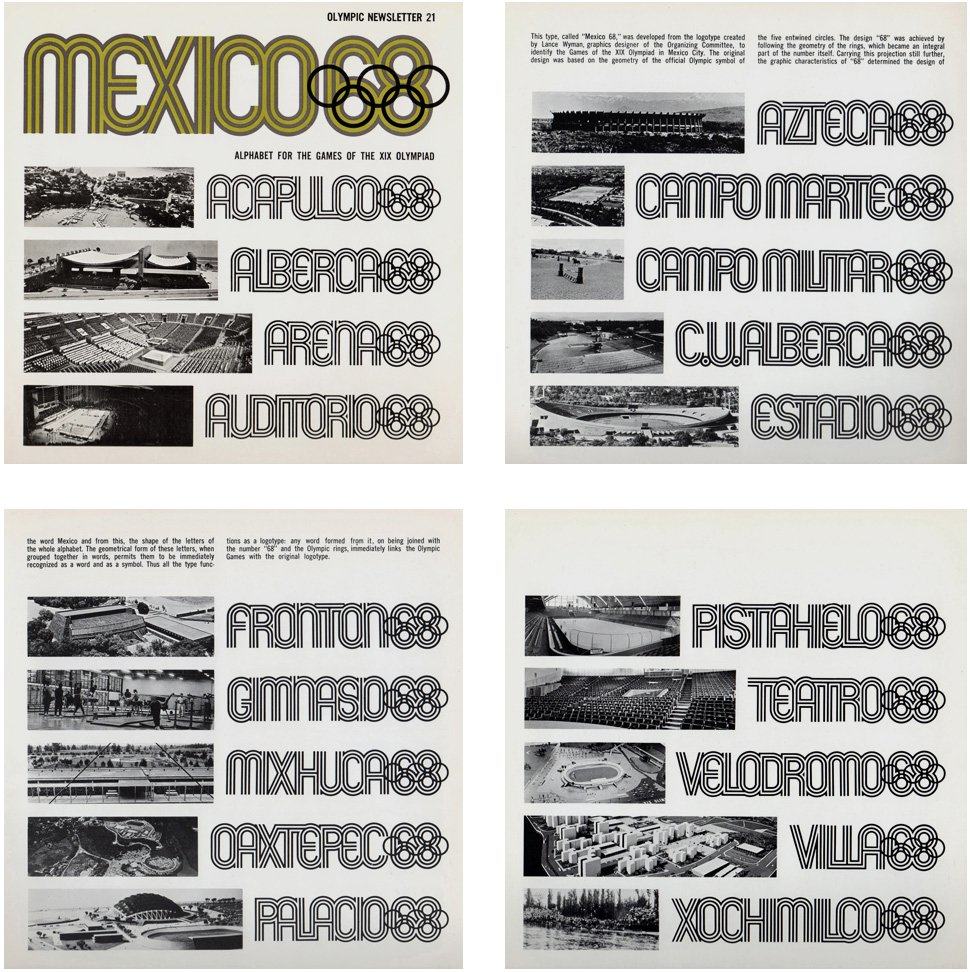
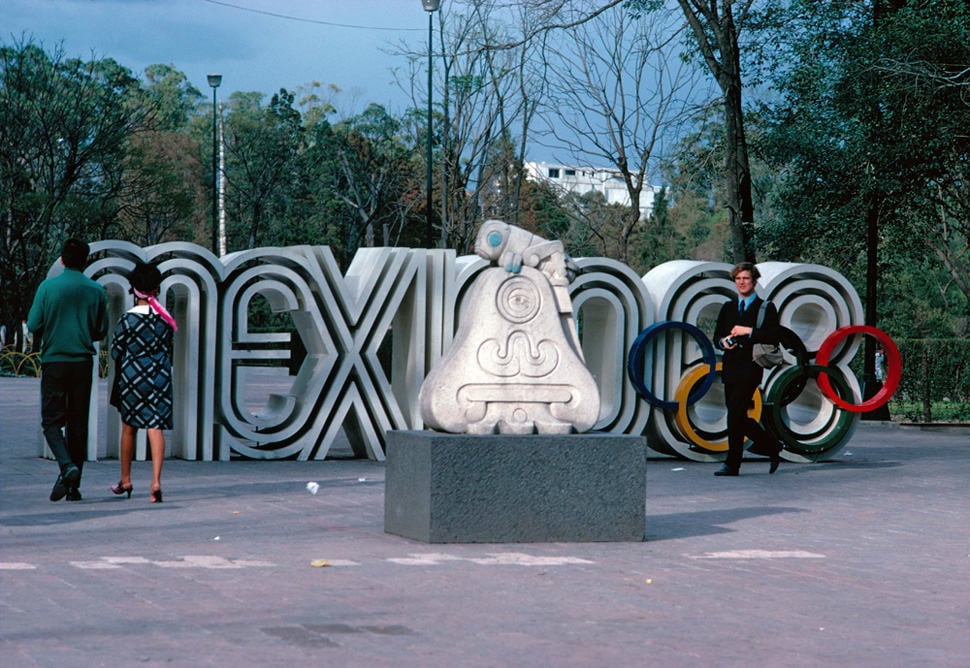
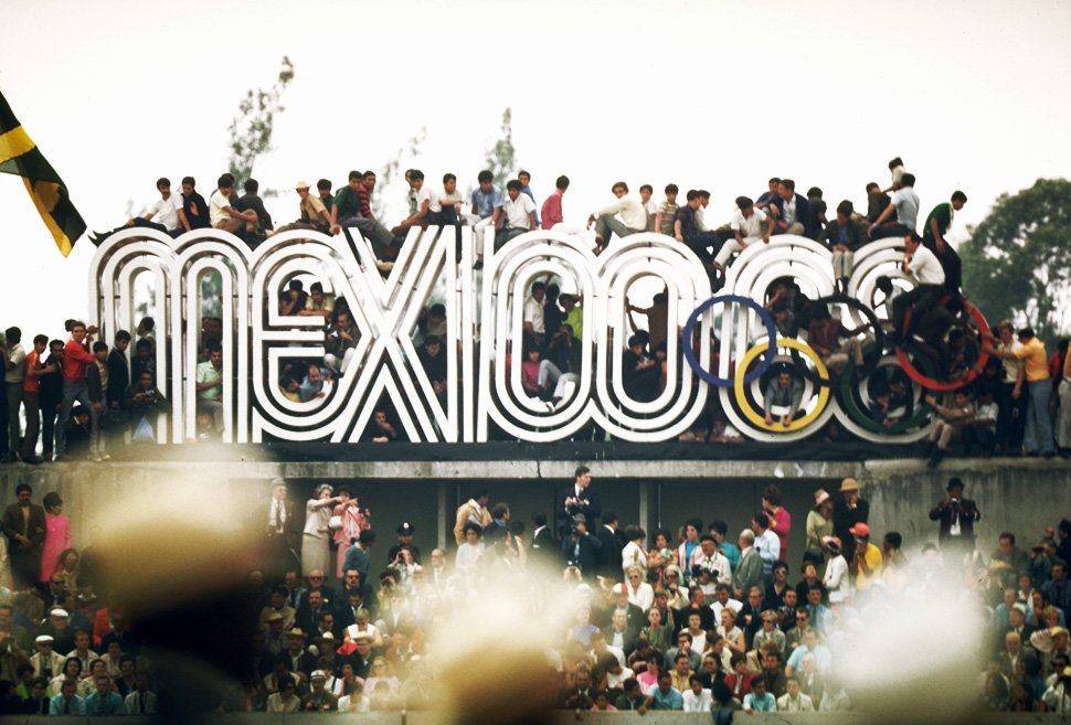
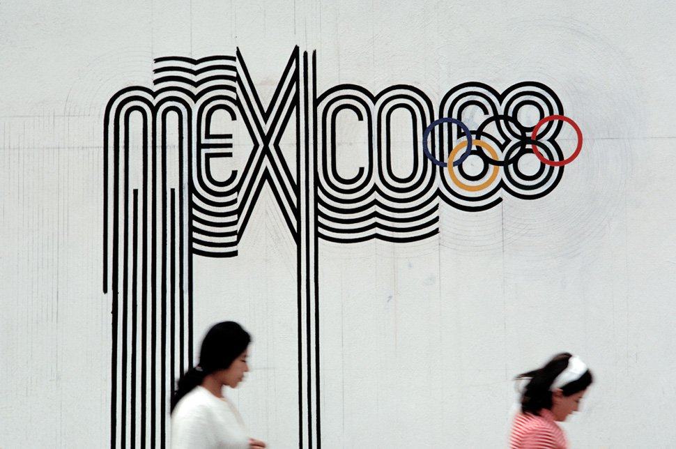
The Mexico 1968 logotype, based on traditional forms from Mexican culture (above) as well as being 60’s Op-art kinetic typography, set the tone for the entire graphics system.
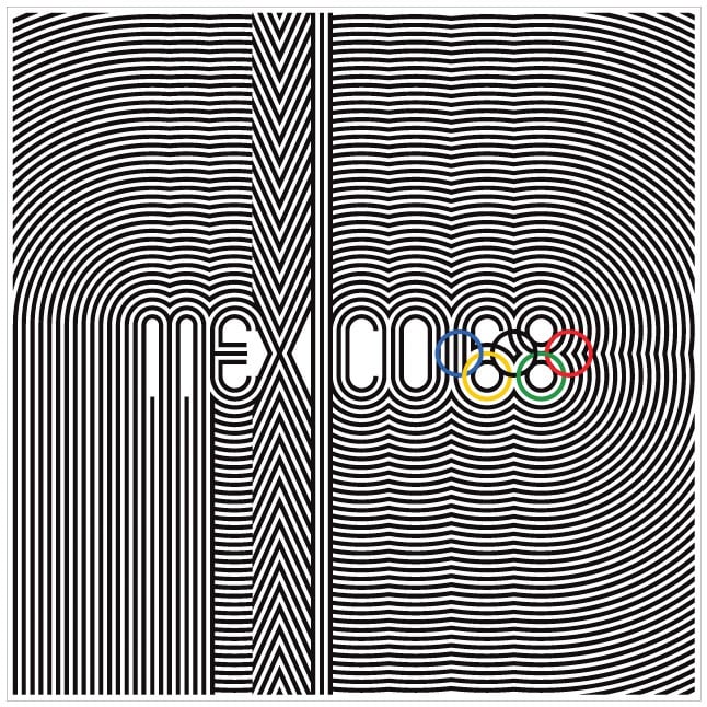
1968 Mexico Olympics, Mexico by Mexico 68 Design Team
From Graphic Ambient:
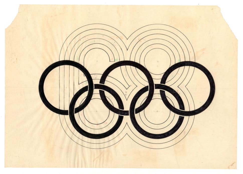
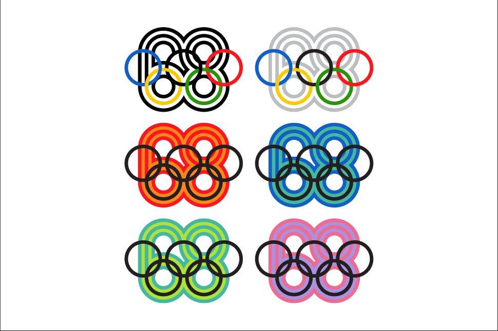
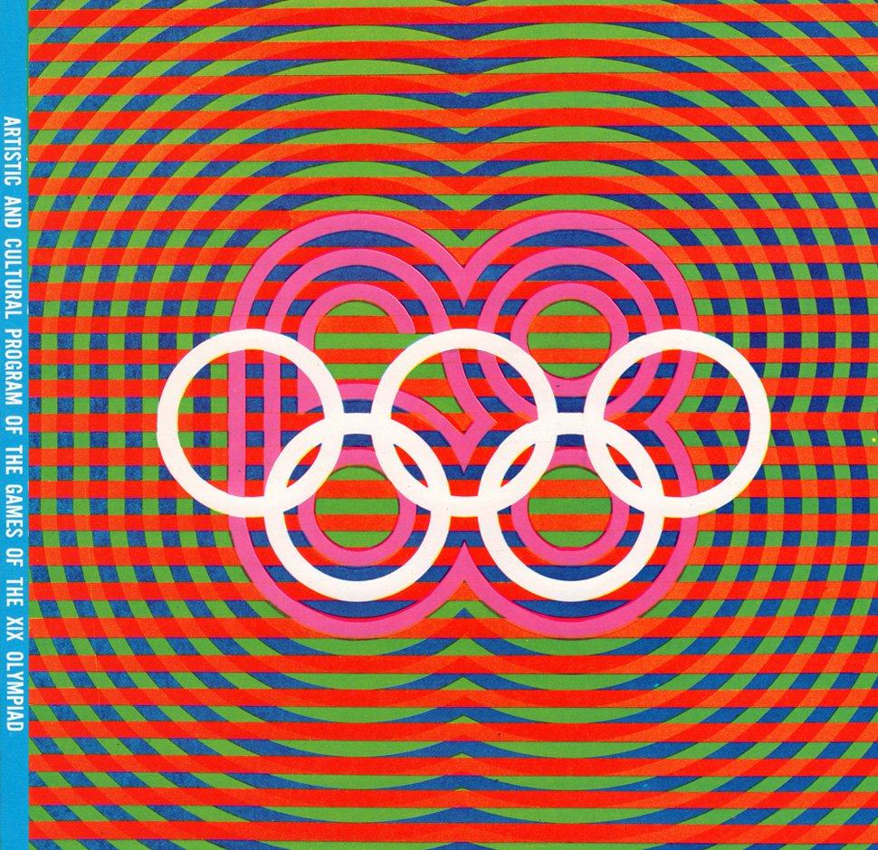
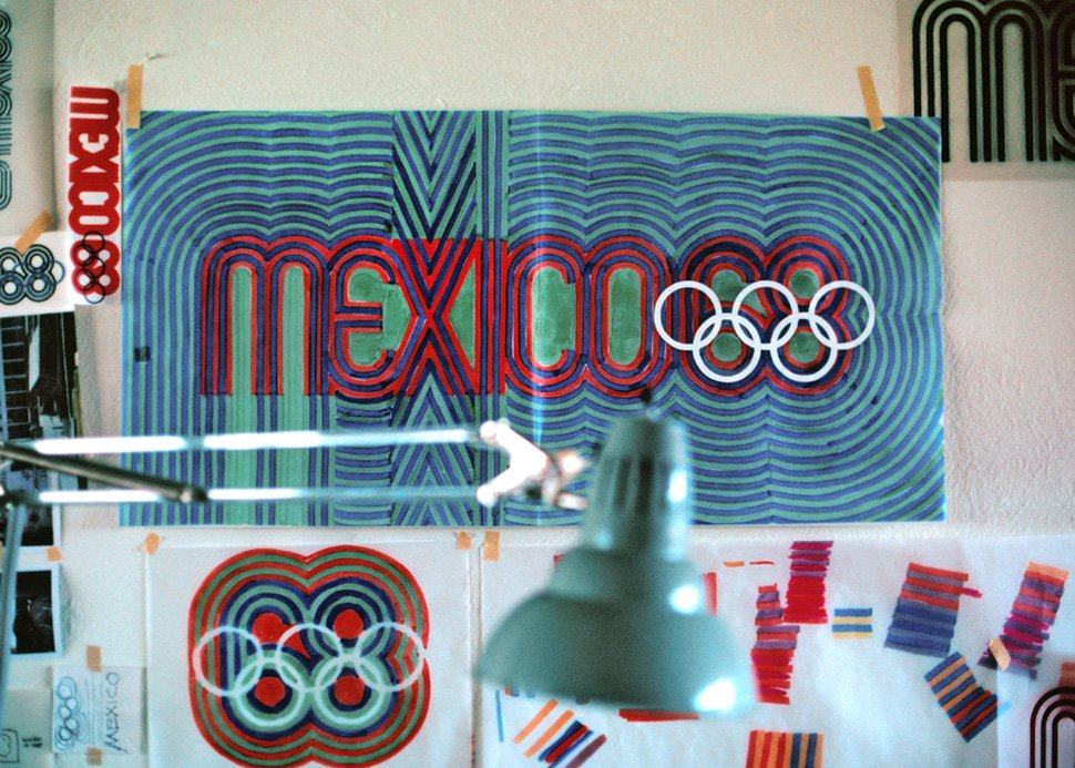
The starting point was the mandatory five-ring logo that identifies the modern Olympic Games. It was the realisation that the geometry of the five rings could be expanded to generate the number ’68′, the year of the games and with the addition of the word ‘Mexico’ the logotype was created.
Mexico 68 clearly identifies the country, the year and the event. The distinct geometric forms suggest early Mexican cultures and Mexican folk-art, and the final design references 1960′s Op Art.
Program Director
Pedro Ramirez Vázquez
(Chairman of the Organizing Committee)
Design Team Directors
Urban Design: Eduardo Terrazas
Olympic Publications: Beatrice Trueblood
Student Design Team: Manuel Villazon
Special Projects: Peter Murdoch
Graphic Design: Lance Wyman
Graphic Design Team
Lance Wyman, Beatrice Colle, Jose Luis Ortiz, Jan Stornfeld

Lance Wyman: “In 1966 I went to Mexico City with Peter Murdoch to participate in a competition to design the graphics for the 1968 Mexico Olympic Games. It was the beginning of an adventure that has continued to influence my work and my life.
The Mexico68 logotype that I designed was instrumental in winning the competition.
The resulting design program, a multidimensional integration of logos, typography and color, developed to communicate to a multilingual audience, was cited by Philip Meggs in the book: “A History of Graphic Design“, as, “…one of the most successful in the evolution of visual identification…”
The lessons from this program have been a constant guide to my work.”
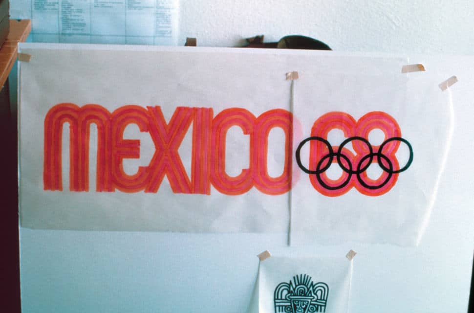
1968 Mexico Olympics Logo Resources
- See loads more images over at Graphic Ambient
- Personal Bio on Lance Wyman
- Lance Wyman’s website & portfolio
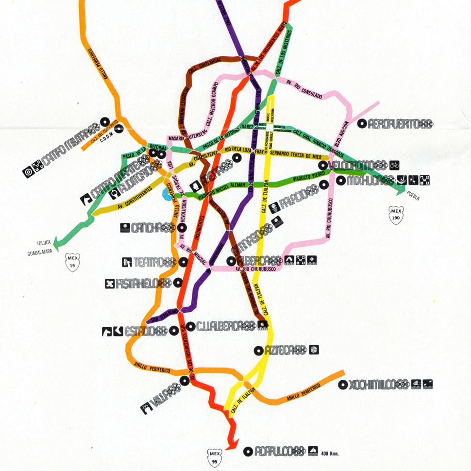




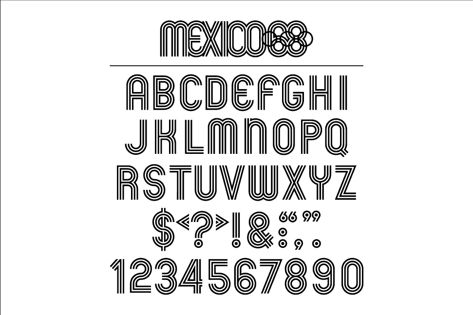
The Mexico Olympic Font
