
Mini Logo Design Tip: How Big Should My Logo Be?
Thought this little logo design tip could come in useful, especially when explaining to a client how big or small their logo design should be. It’s only a rough rule-of-thumb, but it’s not far off for most situations.
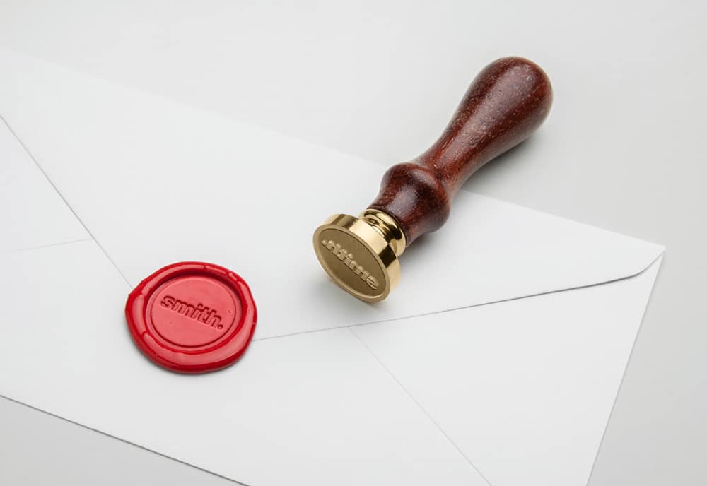
So think of a traditional wax seal, or rubber stamp, and how much space they usually take up on a letterhead, or complement slip?
For the most part, especially the wax seals, they are not that big.
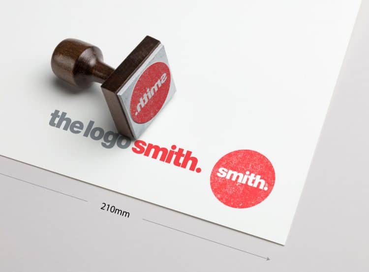
A typical rubber stamp size is a good guide for a round style logo mark, and I wouldn’t want to take a logo mark any bigger than this.
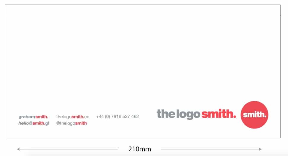
I’ve just done a crude mock-up of my circular logo for the ink stamp example (above), then placed my contact info on the compliment slip (below) for context.
It’s not an exact science, but I think keeping in mind a wax seal, or a round rubber stamp, is a good visual reference when explaining things to clients.
>> Rubber Stamp Mock-up courtesy of Mock-up World


