Smithographic has over 30 years experience.

Smithographic—aka Smith—is a supremely talented Independent Logo & Brand Identity Designer, and amongst his many successes has made Smith sound somewhat cool…
Smithographic, in his 30 years of working, has accumulated experience and knowledge in: Logo & Brand Identity Design; Logo & Brand Redesigns & Updates; Print & Digital Design; Typography; Photography; Reprographics, Lithographic & Digital Printing; Advertising & Marketing.
Smithographic develops and designs the highest quality logo marks & brand identities, that are all: beautiful & unique; clean & bold; flexible & adaptable; simple yet meaningful; designed with timeless grace in mind, and all created with meticulous & compulsive attention to detail.
Or, we could go with, the official unofficial USP pitch:
Smithographic – Forging the highest calibre: Logographics. Logo Marks, Combination Marks, Brand Marks, Type Marks, Word Marks, House Marks, Signature Marks, Emblems, Symbols, Icon & App Icon Designs, waaaay back since the 1986’s.
This is why you should really Hire Smithographic – Committed to developing & designing the finest logo and brand identities, that are well worth your investment.
The following text is a detailed look back at the start of my career in commercial print, and lithographics.
This starts with what I started doing straight after school, and then detailing the path that finally resulted in working for myself, under the guise of Smithographic; recently shortened to just Smith.
After all that is a little bit of copy about me: Graham Smith.
The Detailed Biography
My chosen path in Graphic Design & Print started way back in 1989, when I left school at 16 to start a 3 Year Apprenticeship at commercial printing company in Eastbourne, Manor Park Press Ltd.
It was during this 3 year apprenticeship that I learnt the real tradecraft of: letterpress, manual paste-up (strips of bromide text, run through a waxer and placed carefully on card grids to to create various magazine pages etc), film planning, platemaking and lithographic & letterpress printing.
Redundancy at 20
I was made redundant the day after I completed my apprenticeship at Manor Park Press, and not long after my 20th birthday.
With the help of the Print Union I managed to secure a reasonable redundancy payment, which I used to buy myself a Apple Macintosh Classic.
I knew then that everything I had thus far been taught in the traditional ways of page-layout, was being replaced by these Apple Macintosh computers, so in order to keep current, I had to relearn all over again.
I was unemployed for 6 months, but during this time I taught myself everything I could about the: Apple Macintosh, QuarkXpress, Photoshop, Freehand, and anything else remotely related to this new thing called D.T.P.
I did finally land my first full-time job, ironically within an advertising agency who only used PC’s, Corel Draw and Pagemaker…
This started a sobering journey that saw me work for various other companies over a 6 year period; painstakingly working myself back up the ladder, including:
• Marketing & Advertising Agency – Denton Advertising.
• Litho & Digital Printers – Tansley’s Printers & MGN Graphics
• Design & Reprographic Studios – RE Litho, Denton Advertising.
My last full-time job
I finally ended up at a huge commercial printers in Shoreham-by-Sea, Gemini Press Limited, where I worked for a further 10 years, which was to be my last full-time employed job.
It was at Gemini Press that I eventually become the Senior Studio Graphic Designer, as well as the Studio Technical Manager, of 20 designers and pre-press reprographic technicians.
In addition to designing, I also looked after the company’s entire PC and Apple Macintosh network, including: email, servers, website and about anything else IT related.
About Smithographic
After 10 years of loyal service I left Gemini, and set-up my own Logo & Brand Identity Studio: Smithographic, and this is where I find myself today.
All this experience, across numerous interconnecting sectors: print, reprographics, design, typography, advertising, branding, etc, perfectly prepared me to finally leave the relative security of full-time job.
It was a life-changing event, one that I’m forever happy with.
30 Years Experience
Since leaving full-time education, I have accumulated over 30 Years Commercial Experience in: Freelance Logo & Brand Identity Design, Graphic Design, Typography, Wordpress & Website Design, Reprographics, Photography, Advertising & Marketing, WordPress, SEO & Social Media.
I have had the opportunity to work on the: design, print, marketing, & advertising, for some very large and prominent companies, courtesy of their print and design work entrusted with the companies I worked for, mentioned above.
I now dedicate my time to working with local, and worldwide clients, on various styles of Logo & Brand Identity Projects.
Although I’d be hesitant to say I had a design style, if pushed I’d say I drift towards: clean, strong, minimal, geometric, cliché free with a strong typographic leaning.
Logo Design Longevity
Quite a few of my past logo design projects are still in use a number of years after their creation, and in a few cases up to 10 years old.
This of course is a massive point of pride for me, and something that gives me a huge sense of accomplishment.
With the logo designs over 5 years old, displayed in my Logo Design Portfolio, I’ve noted the date-of-design so you can see which ones have stood the test of time.
One of these long lasting logo designs, especially within the fast paced technology sector, is for Pure Storage, which you can see below:
Pure Storage hired Smithographic to design and develop their new logo & brand identity during it’s stealth mode period in 2010-11, and it’s still in use 2022.
Smithographic’s Website
In recent years I’ve simplified my website in terms of content, page layout, and other aspects that help my website become more mobile friendly.
For this reason, the layout of my portfolios, and most other pages, are more of a: clean, simple & functional design, rather than: a busy, fancy showcase style.
As Google more and more focuses on websites becoming Mobile friendly (indeed, for over a year now Google indexes for Mobile use, rather than desktop use), it’s quite a challenge for creatives to balance the aesthetics of their website and portfolios, along with increase usability, accessibility and speed in order to rank well in Google.
I’ve opted for the minimal approach, which means my website is lean, clean and fast, but not overly fancy in terms of website ‘design’.

All about Graham Smith
I’m Graham Smith, the founder and owner of the naturally named indie self employed logo design studio, Smithographic.
I’ve seemingly made having one of the most common surnames sound quite cool…
I operate Smithographic aka smith.™ a successful Freelance Logo Design & Brand Identity Design Studio, all from my cosy home in Seaford, East Sussex.
There’s obviously a little more to me than just being a great logo and brand identity designer, so here’s just a few things that sum me up.
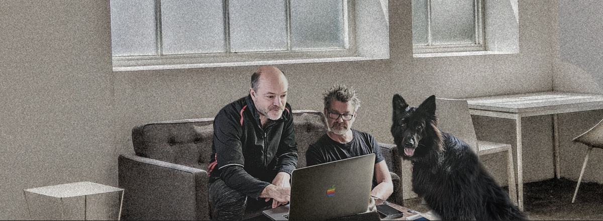
I absolutely live for Dogs
I’m hugely fond of dogs, and have always had one or two by my side, for as long as I can remember.
My current faithful companion is a stunning 3 year old black German Shepherd, called Miss Poppy.

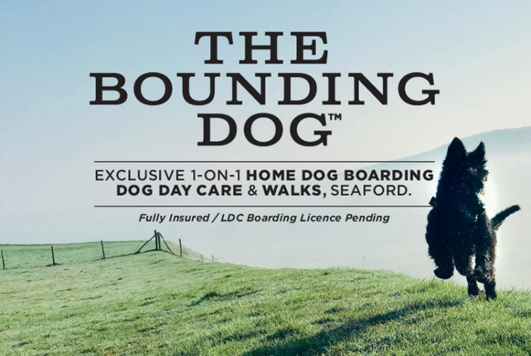
I also run a part-time Dog Boarding service called The Bounding Dog, which is only possible due to being able to work from home.
Here I offer an exclusive 1-on-1 Home Dog Boarding and Doggy Day Care Service, for the more discerning dog owners.
Miss Poppy is the perfect host, and so every dog that comes to stay with us here at The Bounding Dog, is ensured one hell of a good time!
Run Graham Run
I’m a keen runner, and have completed some pretty significant races in the last few years, notably running the London to Brighton Ultra Marathon, which is a total of 64 miles.
My running now is a little more modest, and so I keep to 5k, 10k, and the odd Half Marathon.
At my best, I can knock out a 5k ParkRun in about 21:30min, but that’s not really the normal, and would typically be looking around 22-24mins, depending on my mood, and other things.
I have a very healthy work/life balance, which allows me to look after my soul, the wonderful Miss Poppy, and the clients I work with.
Graham Smith.
Colophon
This website site is running on Wordpress, utilising a free base framework theme called Chaplin; developed & designed by Anders Norén, and which I have heavily modified for my own needs.
This website site only uses Wordpress Gutenberg Blocks for the layout; no other Page Building plug-in’s are used.
The site is hosted with with Siteground on a Cloud Server using: 4 CPU’s, 8GB Ram and 40GB SSD; caching provided by Siteground & WP-Rocket, with additional caching, performance and security provided by a Cloudflare Pro account.
→ Website Files: sitemap.xml / humans.txt / robots.txt