The Logo Smith Logo & Brand Identity Designed by The Logo Smith
My own logo and brand identity is based purely on solid and clean typography (customised Helvetica), as well as using a vivid red colour to highlight smith; my abbreviated name, such as you’ll find for my email etc: hello@smith.gl
I have various logo lock-up’s at my disposal which the full version includes all my contact details and the round sphere (which I’m starting to use less and less).
There are less detailed versions use just thelogosmith or even just the smith, which I’ve used as a bold statement on my envelopes, and a water mark on my letterheads, for example.
![]()
![]()
![]()
![]()
Along with the thelogosmith word mark that has the contact information underneath, there’s also variations with my descriptive tag-line, “logo & brand identity design studio”.
There’s also a secondary tag-line that I use on my letterheads, which was the first one I used some years ago, “forging unique & timeless logo & brand identity designs for over 27 years”, but this used sparingly as a reinforcer, or boast statement. I use it for example on the bottom of my business cards, and a variation of this within my Social Media Profile Bio’s.
There’s a nice little ‘animation’ of the smith logo which you’ve probably already come across on the home page (desktop not mobile).
![]()
![]() [/vc_column_text][/vc_column][/vc_row][vc_row padding_bottom=”pb-100″ margin_top=”mt-100″][vc_column][vc_column_text]
[/vc_column_text][/vc_column][/vc_row][vc_row padding_bottom=”pb-100″ margin_top=”mt-100″][vc_column][vc_column_text]
The Logo Design Lock-up’s
![]()
![]()
The Smith Sphere Alternative
In some places I even use my Social Media Profile Photograph (a photograph of me giggling my head off) as a replacement for the smith sphere; this has been quite a recent development, but I like using it for less serious needs, or something where a more personal touch might be helpful.
An example can be found running along the bottom on my new range of designed Client Testimonials:
![]()
![]() [/vc_column_text][/vc_column][/vc_row][vc_row padding_bottom=”pb-100″ margin_top=”mt-100″][vc_column][vc_column_text]
[/vc_column_text][/vc_column][/vc_row][vc_row padding_bottom=”pb-100″ margin_top=”mt-100″][vc_column][vc_column_text]
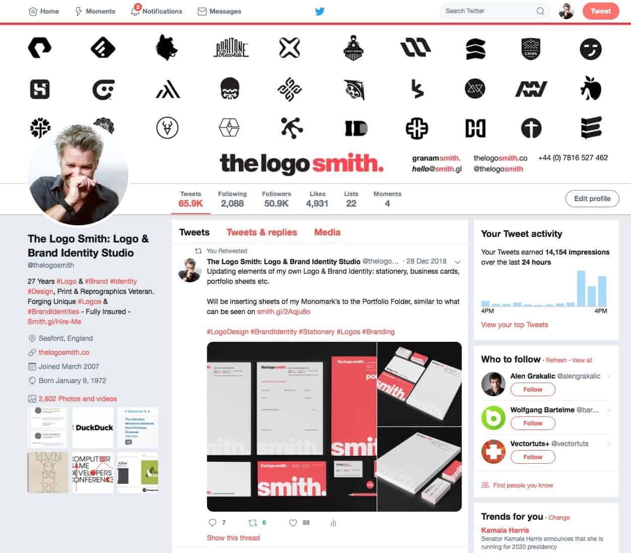
The Logo Smith on Social Media
I use the same banner image, which is a selective collection of my Monomark’s, on all Social Media platforms: Twitter, Facebook, LinkedIn, Behance etc, which I feel is a simple and bold way to show off some of my recent logo marks.
 [/vc_column_text][/vc_column][/vc_row]