
The Logo Smith was hired by UHC to redesign and update the brand logo for UHX Universal Healthcoin & Exchange back in 2018.
The old Universal Health Coin logo was in need of an update, due in part to a change in the companies direction as a result of various US political changes in the healthcare system.
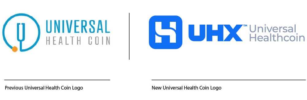
The New Universal Health Coin Logo Moves Forward
The new Universal Health Coin logo needed to be far more adaptable and flexible when it came to the online world, and specifically the iOS application which is in development.
Hence I focused on a monogram of sorts that sits within the typical confines of a square application icon, which can be used on it’s own and/or alongside the UHX wording and tag-line.
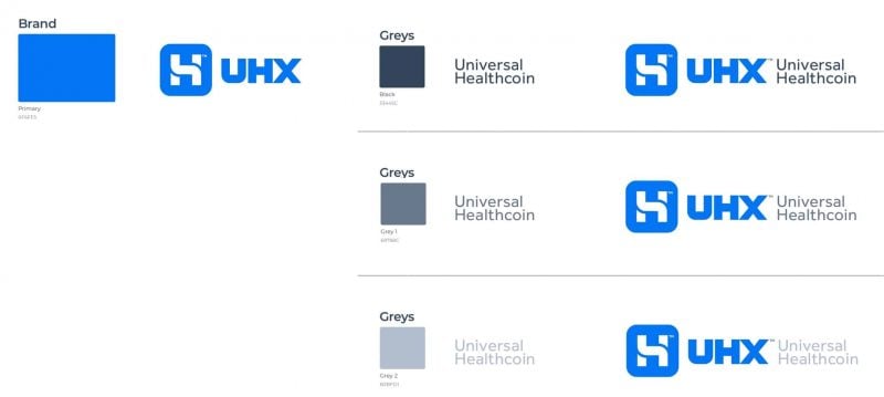
The new UHX logo mark was formed from all 3 initials: U, H, and X, to make a practical and flexible monogram.
The UHX wording was custom created to enhance the negative space ‘arrow’ between the H & X.
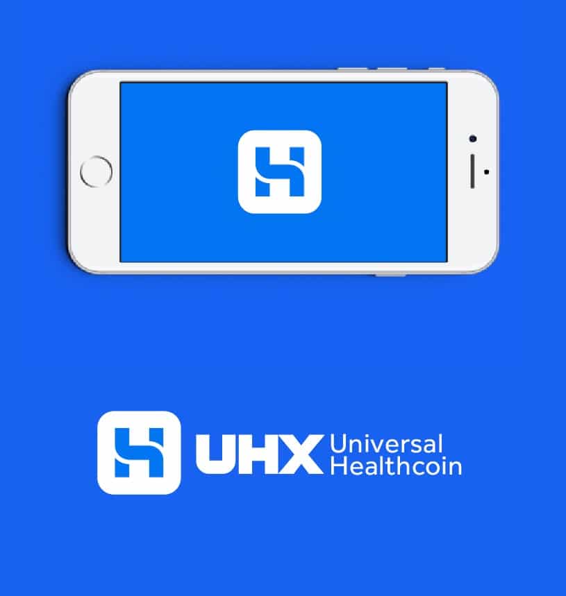
The end result is a clean, bold and unique logo mark that works really well at all sizes, and in particular at smaller sizes for application icons and social media profile image timelines etc.
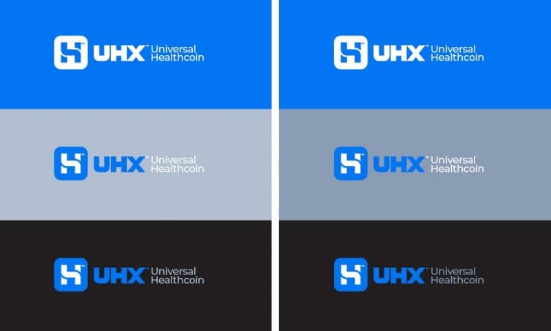
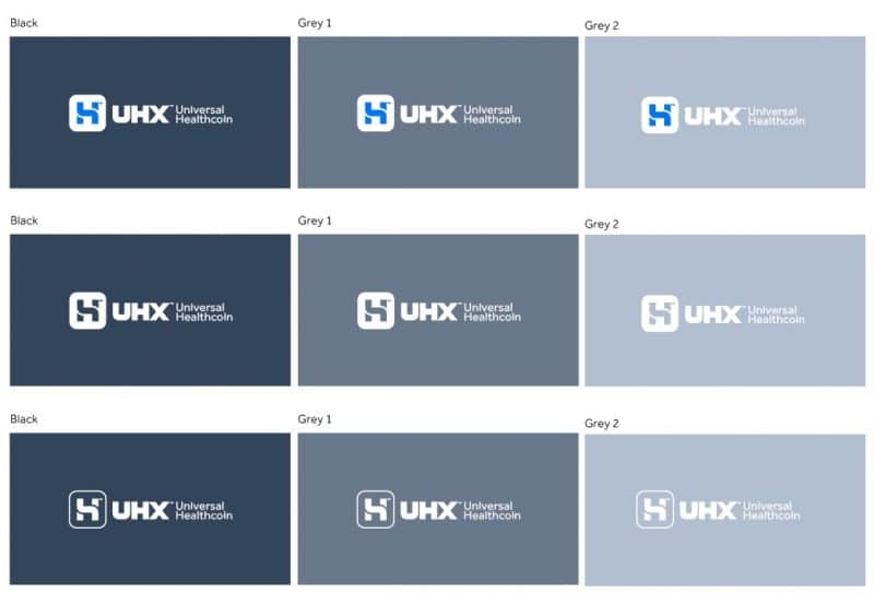
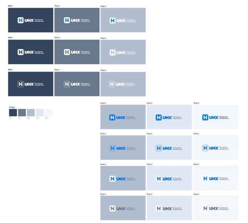
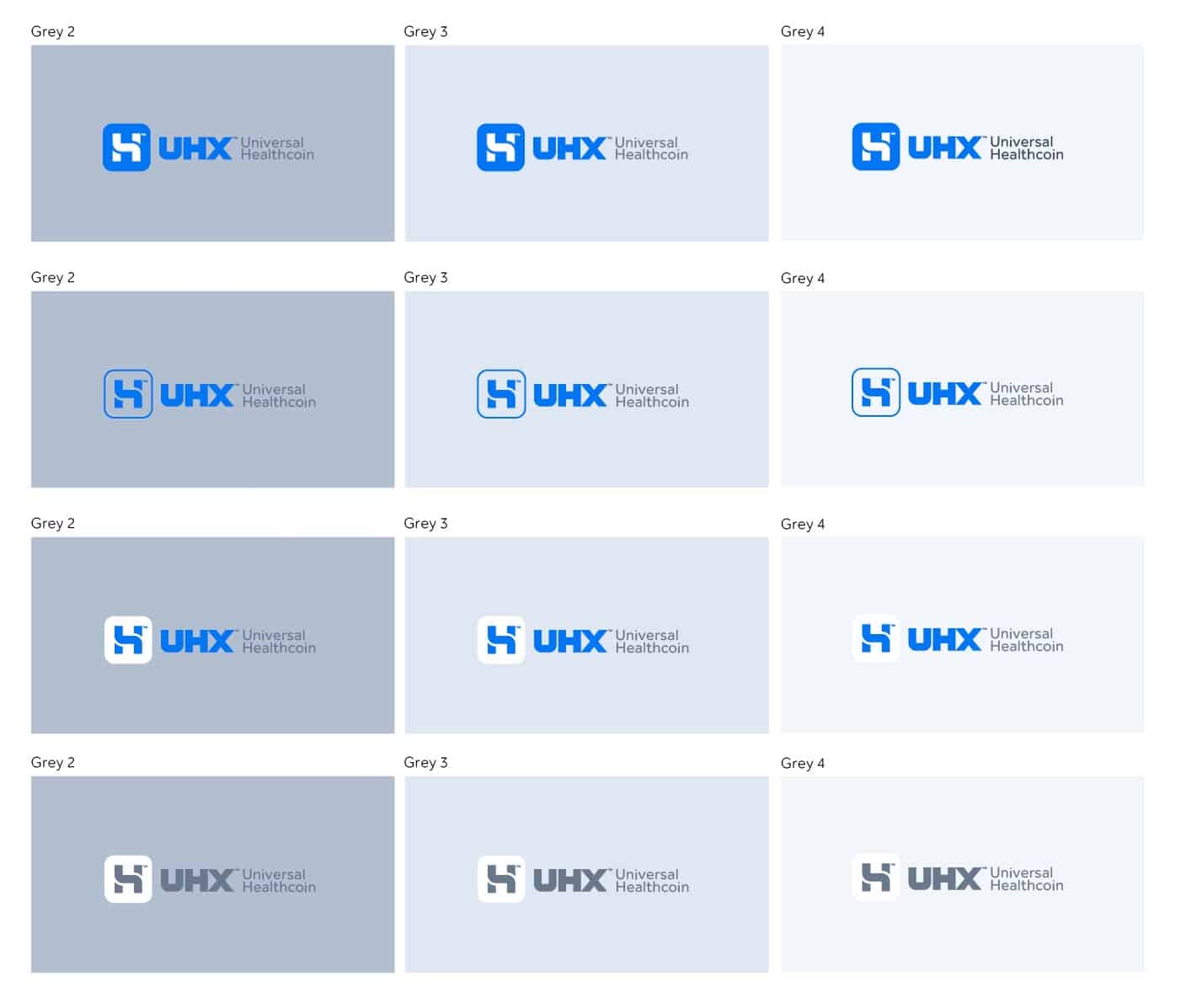
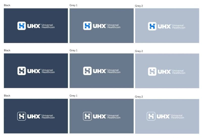
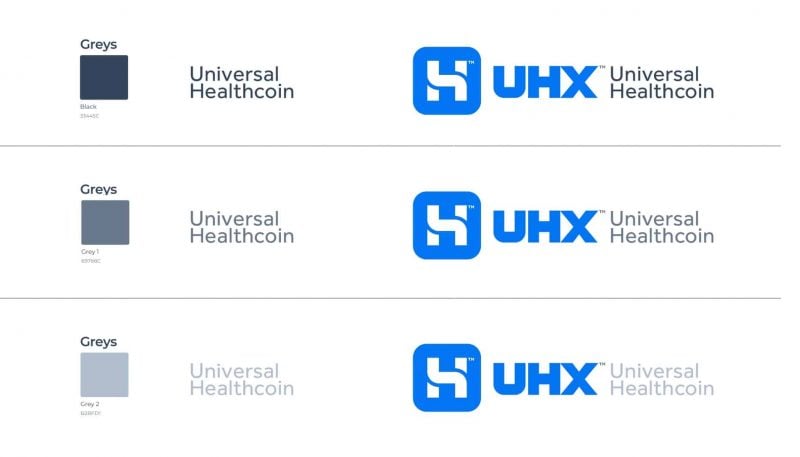
Various colour options are provided, using cool greys and blacks to create alternative backgrounds.
The UHX Blue
A lot of blues were looked at before we settled on this particular one:

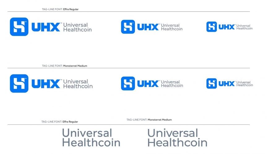
UHX Font Styles
Client Testimonial for UHX
Client Testimonial: “Graham was super professional, very easy to work with, and didn’t leave any creative stone unturned.
He put many hours into our project to help us find the perfect identity for our business.
I highly recommend him.”
Courtney Jones – CEO – UHX.io