
After having my BT Broadband upgrade to BT Infinity brilliantly ballsed up by a BT contractor, leaving me with no broadband at all, I ended up having to making a number of horrifyingly frustrating calls to BT’s abysmal call service hotlines.
The calls to BT started at 6pm Monday evening, and after 4 separate calls, and talking to 6 different people in various parts of the world, I gave up the will to live at 11pm being no better off in getting my broadband up and working.
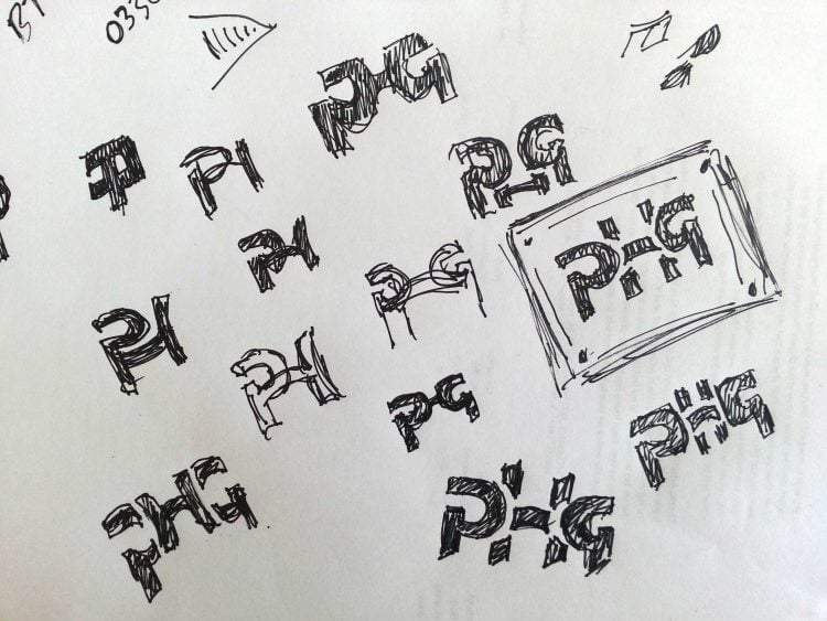
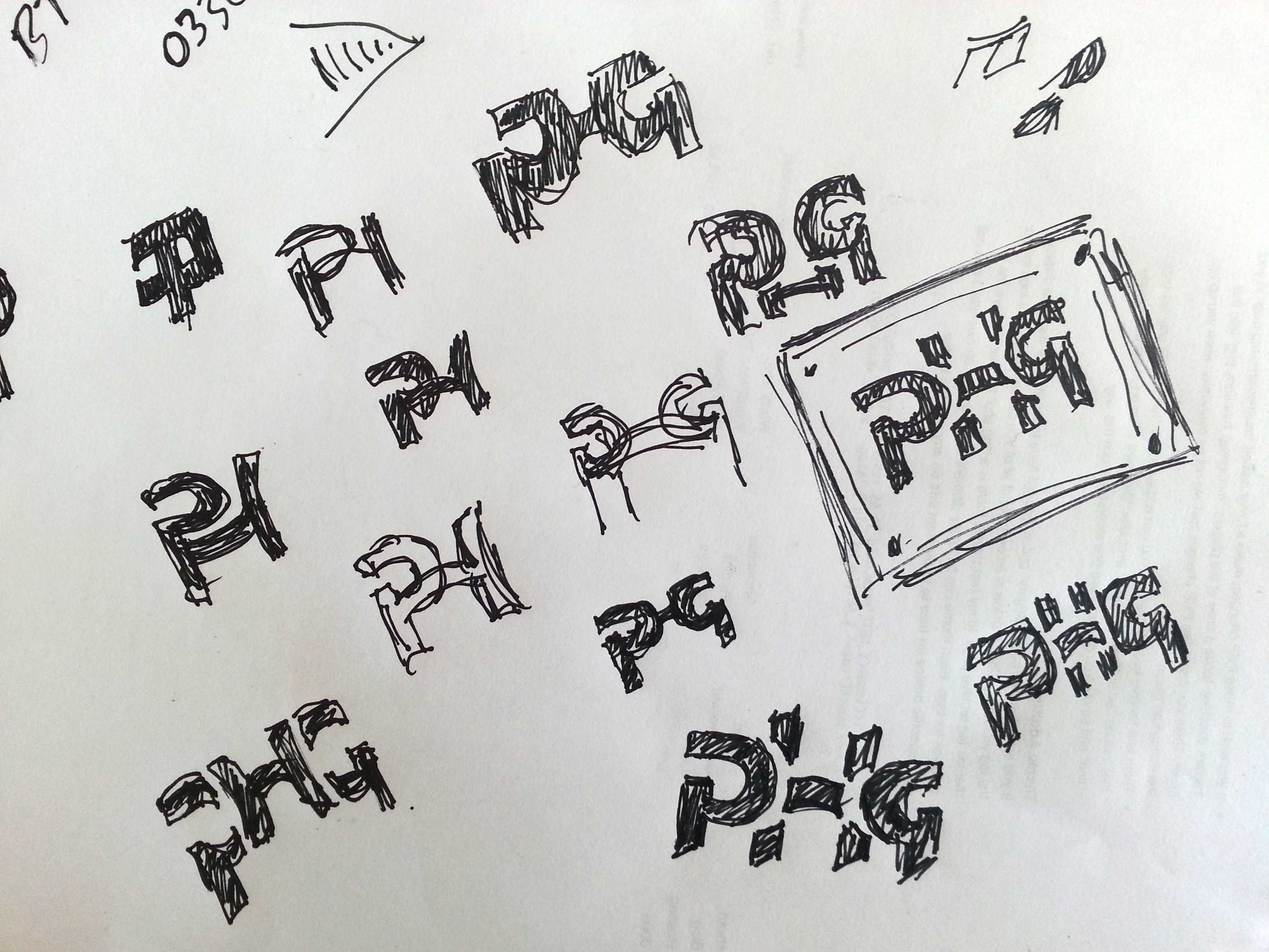
However, all this time on hold and listening to scripted questions, I ended up sketching some ideas for a logo project I’m currently working on. The one with the frame has a nice symmetry as the P and G are/would be the exact same form, just flipped vertically, with the H sitting behind, but gelling all 3 initials: PHG, together. It’s a little more interesting that just having 3 regular initials, and basically does become a logomark in it’s own way. It could be used independently of the full length typemark; Pleasant Hill Grain, for example, rather than being a regular logomark that typically always forms part of the whole logo.
I think twiddling my thumbs would have left me close to wanting to commit a terrible act upon myself to avoid the ongoing misery, but the doodling actually proved to be very soothing and actually actually lead to a decent idea to pursue further. Hadn’t previously seen that the P & G could be formed from the same shape thus creating a reasonable solid, and quite unique initialmark
Not sure what the moral is of this tale, but maybe always have a pen and some paper handy should you ever find yourself stuck in an infinite loop of BT helpline hell.
