BBC Television Logos and Idents – The BBC Logo Gallery Archives from 1953
During the course of researching for a logo design project, I somehow ended up at rather intriguing website called 625.co.com, housing a rather terrific collection of Television logos and idents, in particular it was the BBC Television logos and idents that really interested me.
This website: The BBC Logo Gallery, was created way back in 1997 and last revised 2006, so stagnated in terms of updates, but it still proves to be a fascinating insight into BBC television logo history.
I remember sitting at home as a young kid, in the 1970’s, watching the familiar golden glob spinning on a blue background. This collection has really sparked some marvelous memories.
Therefore, I have picked some of the images to display here, but I strongly recommend visting 625.co.com to fully take a trip down memory line.
Also, there is a complete library of the logo and idents on Wikipedia. This could be your one and only stop, bypassing 625.co.com, but as I first found this site prior to information on Wiki, it’s only polite to visit the latter.
625.co.com: In 1936 the BBC became the world’s first broadcaster of a regular “high-definition” television service. In the beginning, the gaps between the programmes would be filled with tuning signals (also known as test cards) or on-screen announcers.
The first attempt at proper branding was first seen on the evening of December 2nd, 1953 when the “bat’s wings” logo appeared.
Abram Games, famous at the time for designing the logo for The Festival of Britain of 1951, was commissioned to design the Television Symbol, which was actually a brass model whose centre circles could rotate. For BBC Scotland the spot in the middle was replaced by a lion. There were also other regional variations (static captions) as well as a matching clock.
This new logo replaced the BBC coat of arms on screen, and would be seen before programmes such as Quatermass II.
The way the BBC presented itself would soon become more important as in September 1955 it would have competition in the form of the commercial television service, ITV.
Visual History of BBC Television Logos & Idents from 1953
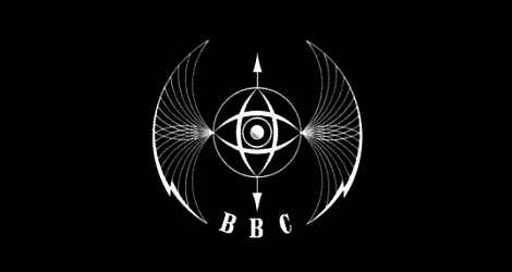
BBC Logo & Ident, 1953 – 1963
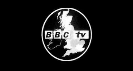
BBC Logo & Ident, 1962
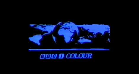
BBC Logo & Ident, 1969-1985
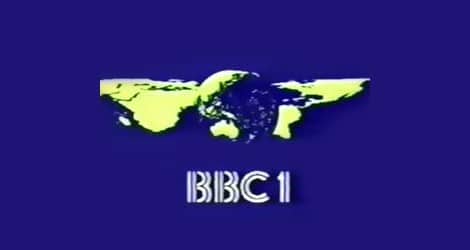
BBC Logo & Ident, 1969-1985
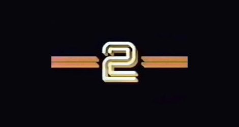
BBC Logo & Ident, 1979-1986
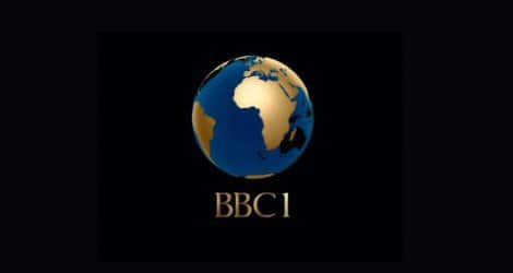
BBC Logo & Ident, 1985-1991
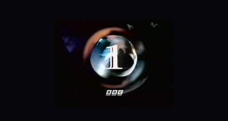
BBC Logo & Ident, 1991-1997
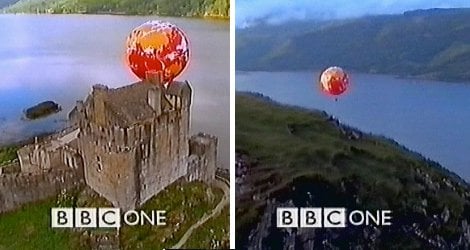
BBC Logo & Ident, 1997-2002
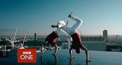
BBC Logo & Ident, 2002-2006
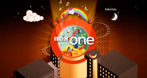
BBC Logo & Ident, 2010
Current BBC Logo
Bonus: CULT – TV, DVD & Lovely Stuff
The BBC website has a hidden gem of a page called ‘Cult’ and has the original animated clips of all the idents listed below, including the very first one from 1953: http://www.bbc.co.uk/cult/classic/testcards/video/index.shtml
BBC 1950’s Batwing Video Ident
Incidentally, I then found a website dedicated to television idents, called Idents.tv, certainly a more tasteful affair in website design.


