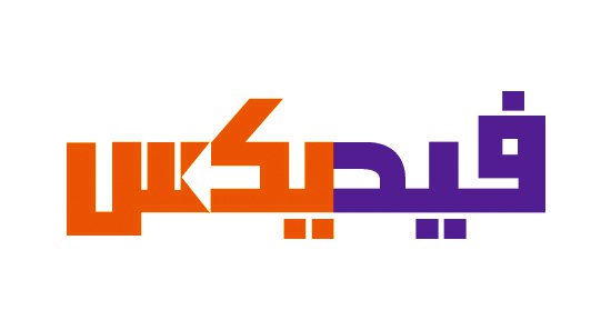
The Arabic FedEx Logo
The Arabic FedEx Logo was something I had to look at, before an opportunity to work on an identity project with a client in Dubai, Saudi Arabia, for ADXPRS
With this possibility I needed to brush up on certain skills: namely how typography, visual brand imagery and the actual finished logo design will need to translate to Arabic whilst keeping a clear brand link between the two.
This new client sent me some homework to absorb: examples of famous brands that have been translated to Arabic including the Arabic FedEx logo.
I was also passed some interesting information on the how-to of Arabic logo translation:
“The general trend is to create the exact phonetic spelling of the brand name, and not the meaning of the brand name of which there can be a huge difference.”
It is explained further, thus:
“Subway is the name of a famous sandwich shop, and it literally means ‘the subway’ or ‘underground’. The Arabic adaptation is purely graphic, and when read it just sounds exactly like ‘Subway’ and not the Arabic word for ‘underground’ which is usually ‘Metro’.”
Just to make it clear that the image of the Arabic FedEx below is NOT the official version. It is vector version I tried my best to recreate from the photographs to hand.

I know the Arabic version of the FedEx logo is not new, but I think this is one of the few times I have actually seen it and paid attention to it.
There are a few smatterings of the logo around the net, but finding a half decent image of the Arabic FedEx logo has been a fruitless task.
The only versions I have found are photographs of the logo on the side of vans, and even then they are of questionable quality.
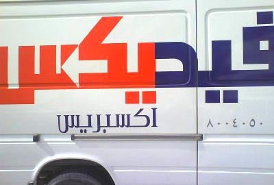
You can see the official Arabic FedEx logo on the website (below).

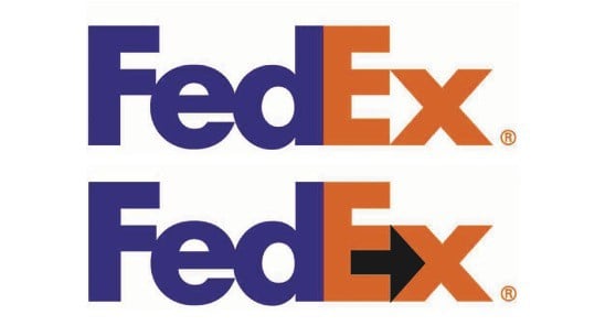
The few existing blogs that have referenced the Arabic FedEx logo have pointed out the implementation of the negative space arrow within the Arabic version.
Given Arabic is read right-to-left it then makes sense that the negative space arrow follows this same reading direction as well as the design logic of the original FedEx logo.
It’s a heck of a lot easier to spot the negative space arrow in the Arabic version due to the typography constraints, but it’s still a decent translation/conversion.
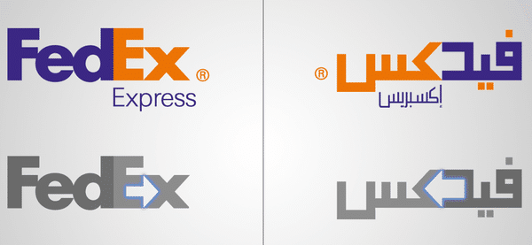
Surely not an envious task to have been responsible for the Arabic version of the FedEx logo? Let’s hope expectations were suitably realistic.
Interestingly there is a unofficial version of the Arabic FedEx logo on Behance and Deviant Art (above). As far as I can tell is a reimagined idea of how it should look like according to this particular designer.
The important distinction is that the original version has the infamous arrow located entirely in the red type, as it indeed should be?
The concept version has the arrow sandwiched between the Fedex Pantone Purple 2685 and Pantone Red 186 letters for some reason I can’t fully grasp.
I‘m certainly not in a position to make any kind of judgement on this version given my total inability to read Arabic, but I would be interested to know the rational behind the positioning of the negative space arrow.
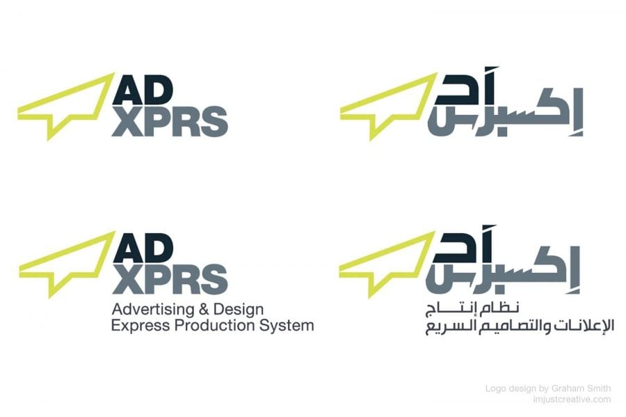
Going back to my logo design for ADXPRS, this is the Arabic version that was created based off the English version I designed:
