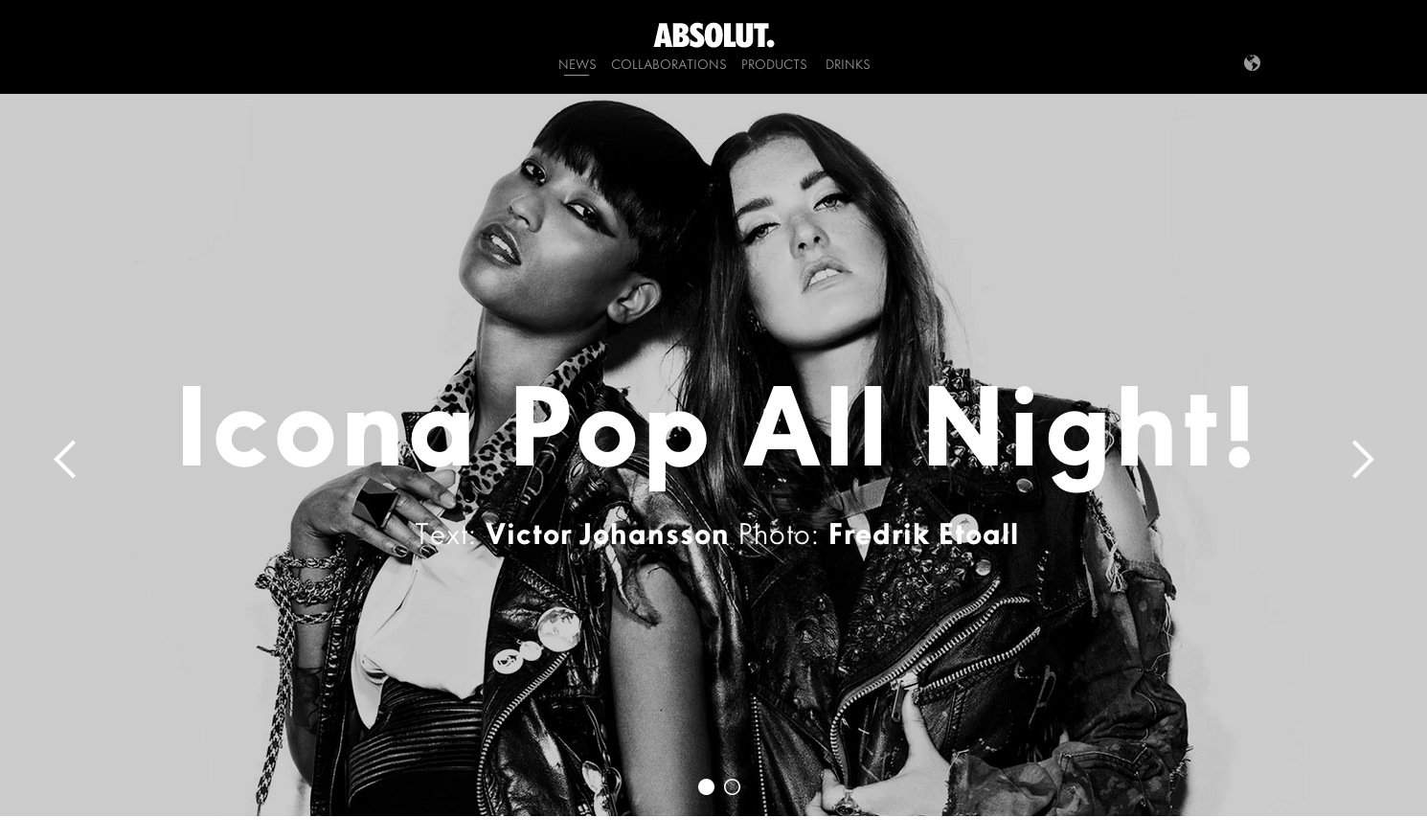
![]()
The Absolut Logo Comes of Age
Once in a while a rebrand (logo redesign ) comes along that simply looks like how it should have always been.
By that I mean the revised logo simply looks like a natural evolution, but at the same time immediately becomes the ‘right’ look, almost immediately more appropriate, than the logo before. Not sure I’m explaining myself very well here.
To me the new Absolute logo, minus the ‘Country of Sweden’ & ‘Vodka’, works better than the logo with the additional lines. Pretty sure that’s also widely agreed.
That’s not to say the previous version sucked balls, far far far from it. Sometimes, in order to minimise/defluff a logo, the brand must have become so well established, adored and imprinted in our minds that stripping the fluff away to reveal the core element, in this case down to just Absolut, looks like the completely logical, and right thing to do.
Then the magic of hindsight kicks in, “why wasn’t it done before now”.
When the new logo simply and transparently slots into place without so much as a ripple, then you know that a brand has become deeply imbued into our psyche.
The Spirits Business: Anna Kamjou, global director of Design Strategy at The Absolut Company, said: “The brand has become so iconic that we no longer needed the full three-line logo to convey ourselves.
The same holds completely true for Starbucks, Nike and Apple. When each one of those companies simplified their logos, it signalled the arrival of maturity, strength and dominance, in an all too crowded world.
When a company believes they can safely remove core elements from their logo, and that logo then, somehow, becomes stronger than more iconic than before, well, that’s just magic.
The Spirits Business: The Absolut Company, which is owned by Pernod Ricard, claims the changes won’t be noticeable by most consumers, but will “strengthen the brand’s iconic status as a contemporary, forward thinking brand”.
Anna Kamjou, global director of Design Strategy at The Absolut Company, said: “The brand has become so iconic that we no longer needed the full three-line logo to convey ourselves.
“By removing ‘Country of Sweden’, and ‘Vodka’, we’re putting the focus on the most important part of the brand – Absolut. The word itself not only means the perfect, the complete, and the ultimate, but it also means the open-ended, infinite and indefinite.