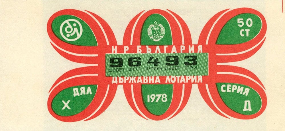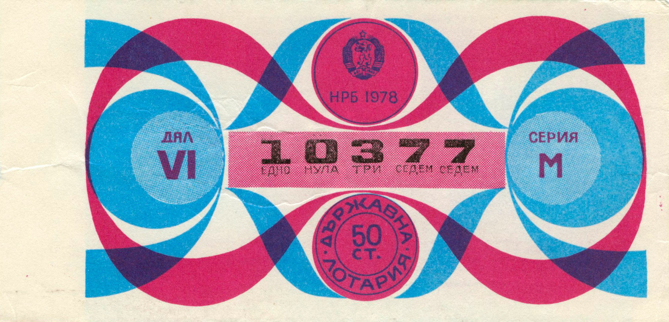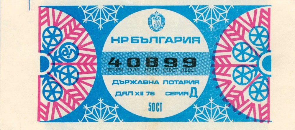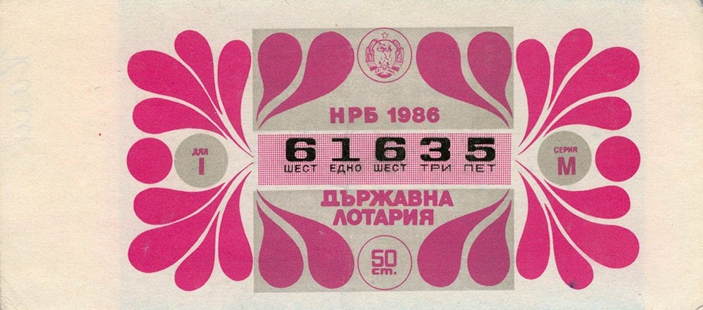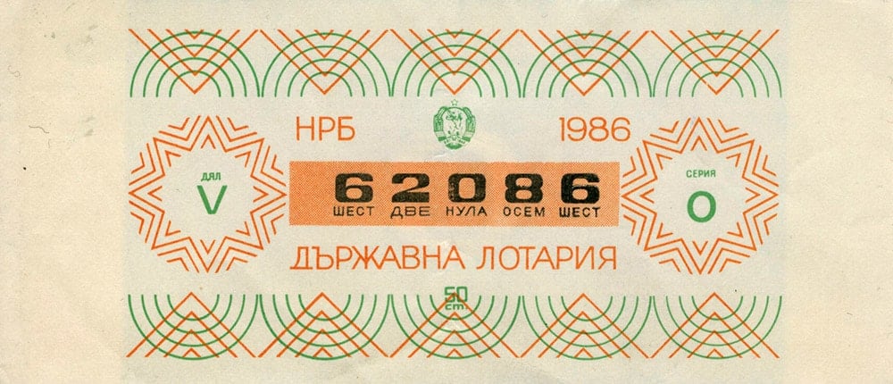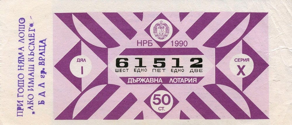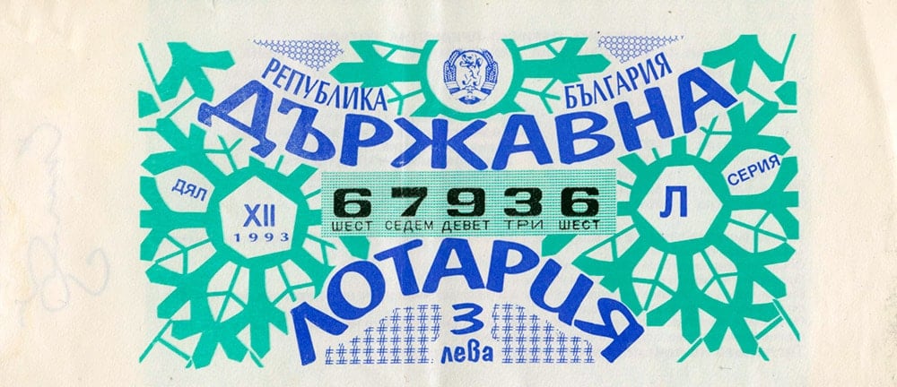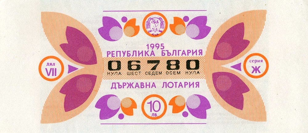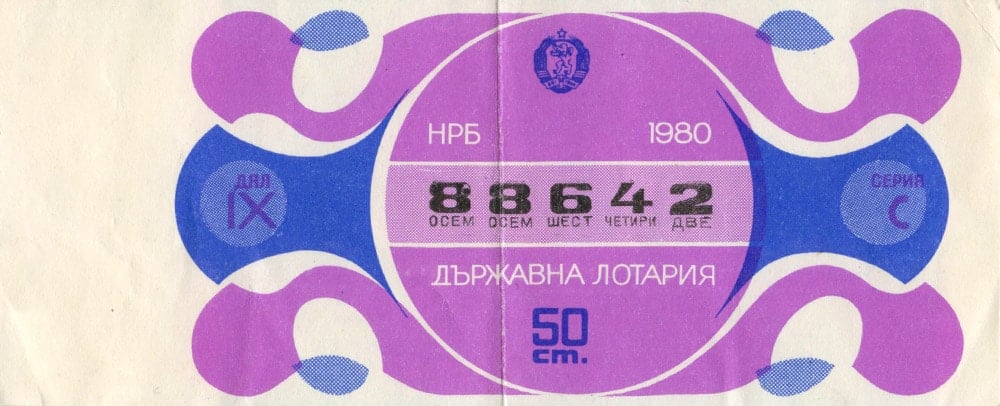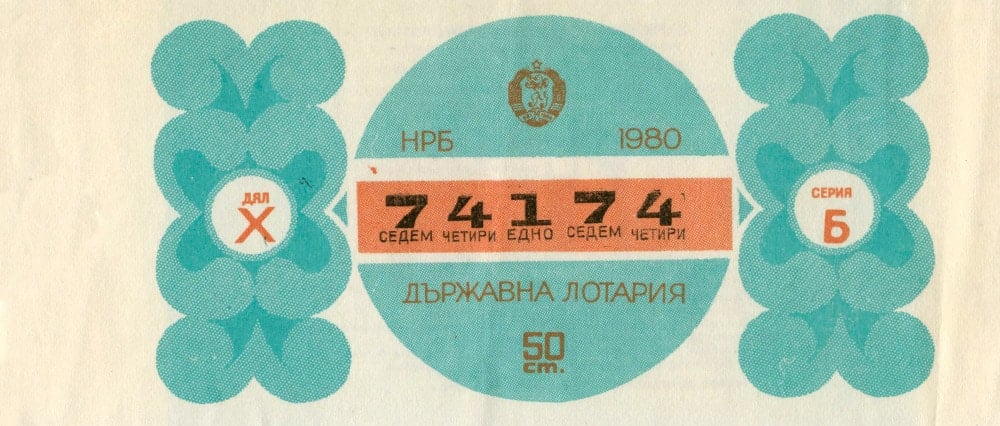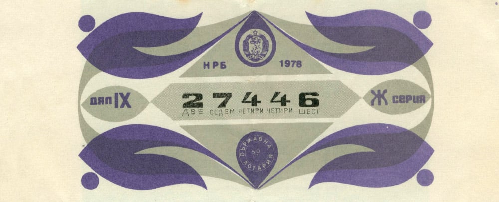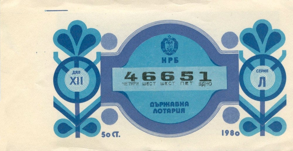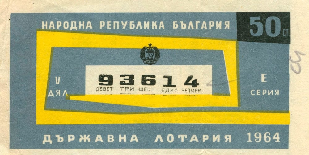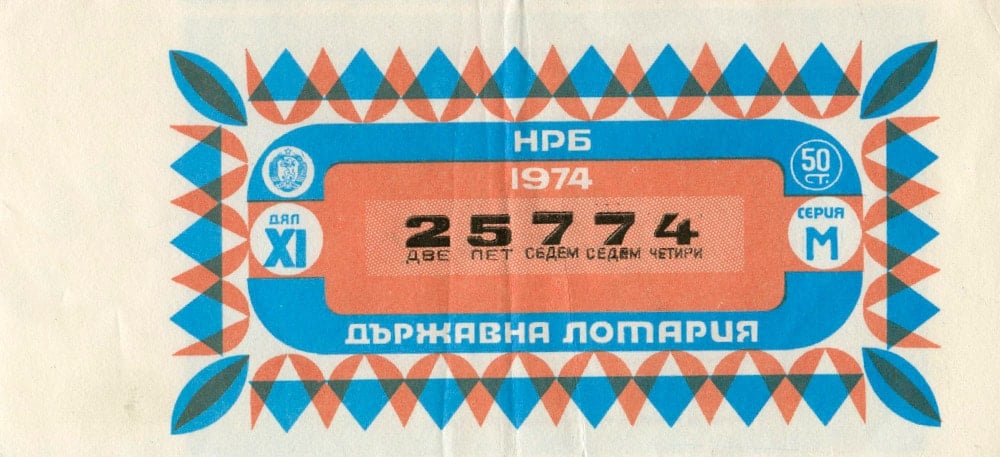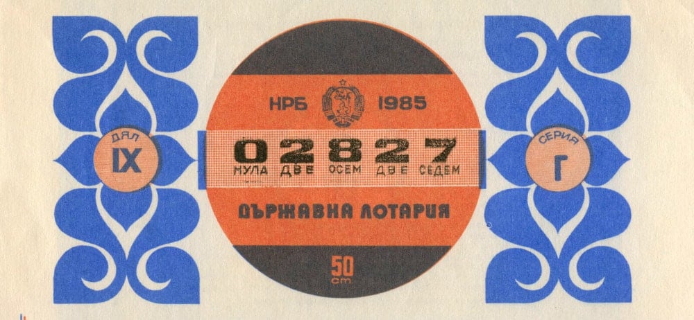
This collection of Vintage Bulgarian Lottery Tickets Curated by Maraid Design is just mind-blowing, and a stunning example of how something as mundane as a lottery ticket can be made to look oh so beautiful.
Thee’s not an awful lot of information up with Maraid’s blog post, other than this reference:
I have Tobias Frere-Jones to blame for this new obsession. His new Conductor font is influenced by vintage Bulgarian lottery tickets and I have to agree they are things of beauty. He told me French and Argentinian ones are good too – it seems these are just the tip of the iceberg!
I’d love to know a bit more about this Vintage collation, such as: where they came upon these in the first instance?
What I love is seeing the overprinting of colours, not to mention the sheer variety of design styles going on! Extraordinary.
Anywho, I’ve picked just a handful from Maraid’s post so head on over to their website to see the whole dazzling collection in it’e entirety.
Vintage Bulgarian Lottery Tickets Curated by Maraid Design
