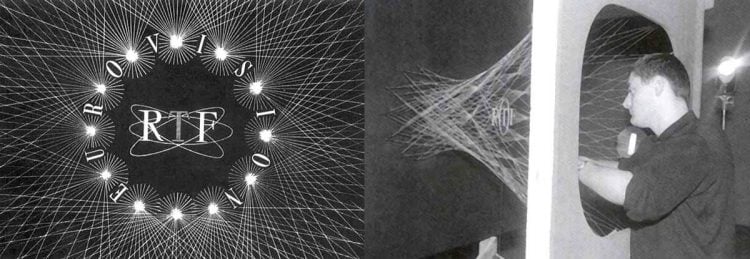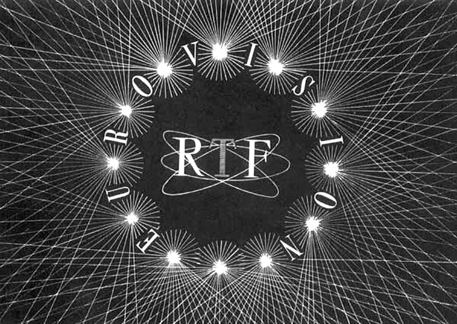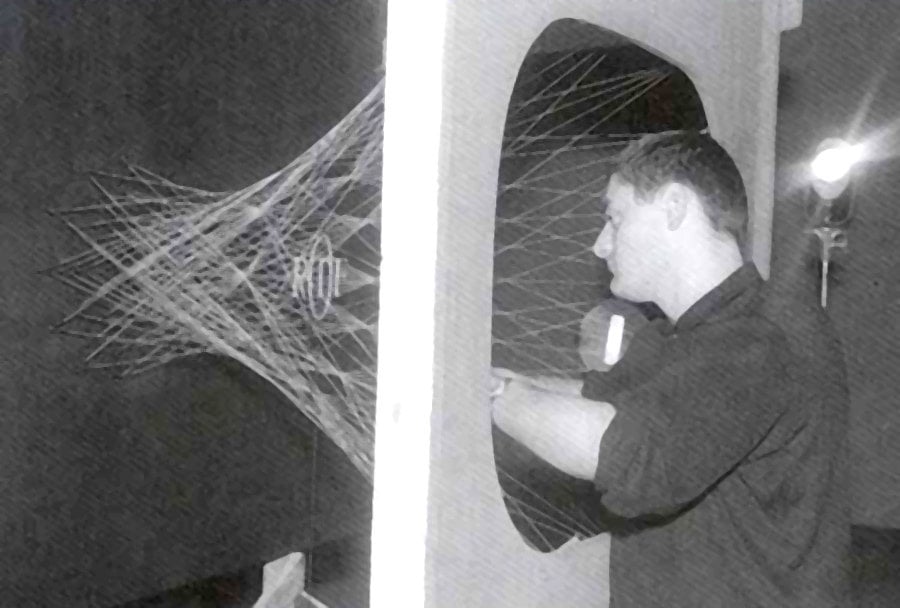
This old photograph showing the making of the very intricate RTF Eurovision TV logo (Ident), is absolutely fantastic in every way imaginable, especially if you are a logo designer!
I originally found this on Reddit, then proceeded to Tweet it; frankly, was quite amazed at how popular this Tweet became:
When TV show #logos were physical objects. https://t.co/nEt2HFaTcc pic.twitter.com/tAPxyNWT2N
— Graham ‘Logo’ Smith (@thelogosmith) May 14, 2017
I can openly admit to having no idea that some of the old TV logos had to be created with such painstakingly attention to detail.
This is true creative workmanship.
Unfortunately, I can’t find any more background on this photograph, as much as I have tried to search through Google.
There’s very little online about this, other than a few articles about RTF in general.
Found via Reddit


