WiP (Work in Process): Logo Design Exploration for Tateside
Here’s an initial logo design exploration that I’ve been tinkering with for Tateside, a London based audio and visual company. The general idea for the logo mark came about whilst looking more at the overall geography of where Tateside is based.
What do you get when you put a network engineer, electronics technician and audio-visual geek together? Apart from the most boring dinner party guest list ever, you get a company that are knowledgeable and enthusiastic, providing bespoke solutions utilizing the most up to date technologies available on today’s market.
Based in the center of London, Tateside is a technology company that offers a diverse range of audio-visual services.
This logo project is more of a logo update, than a rebrand, even though everything about design is different to what they are currently using.
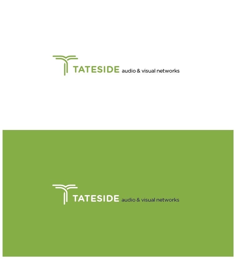
The logo mark takes in a few subtle links to the travel system: roads, subways etc, as well as little nod to the Thames (wavy lines).
Also, and more importantly, the standalone initial T created with lines that can also be associated with cable routing, and such like for the audio and visual networks that they install.
These associations are really pretty subtle, and a little tenuous. First and foremost the logo mark is a stylised linear initial T, but these ‘associations’ are there as optional extras to the client.
Not really thought too hard yet about colouring, so have utilized the lime green currently used by Tateside.