

The Typography A to Z of Broadway by Hopes & Fears
The Typography A to Z of Broadway is quite a remarkable ‘post’—to call it a blog post is really quite a disservice, as it’s more of a legit magazine article; just look at the credits at the end of this post—that takes an in-depth look at the astonishing styles and history of typography that can be found in and around Broadway.
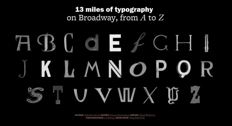
As Ksenya Samarskaya explains: “Starting out at Broadway and W 181st St, the team, together with typography expert Ksenya Samarskaya, traveled by bicycle down Broadway to Bowling Green on the lookout for outstanding lettering, documenting around 200 samples. We then worked to identify and classify each specimen. With Samarskaya’s help, we narrowed our choices to 26 images, focusing on exhibiting as diverse a range of type category, classification and method of production as possible, while showcasing a distinct letter or digit for each in the alphabet. While the vast majority of samples we found are one-off designs, we also identified similar or influential typefaces.”
I’ve counted 26 examples: each instance (the right hand side) of the Broadway typography has been recreated so one can clearly see the style of typography used. This is fascinating stuff, and even more so if you are within travelling distance of Broadway.
I’d certainly want to go round and check these places myself, so The Typography A to Z of Broadway almost becomes a City Guide of Typography, now there’s an idea…
![]()
The Typography A to Z of Broadway by Hopes & Fears
Hopes & Fears: A to Z Typography of Broadway “Broadway is easily America’s most famous thoroughfare. Starting in lower Manhattan at Bowling Green and running the entire length of the island, it strings together some nine to fifteen neighborhoods—depending on who you ask—before bleeding over into the Bronx, serving as a cross-sectional study of the City’s diversity in ethnicity, utility and design. As the Main Street of Manhattan, Broadway exhibits a catalogue of lettering—from neon lights to mom-and-pop shop signs, from theater marquees to building names. Join Hopes&Fears as we tour the typography of Broadway.
Credits
Author: Gabriella Garcia Expert: Ksenya Samarskaya Graphic Design: Sergii Rodionov Photography: Lia Bekyan Developer: Oleg Mokhniuk