AT&T Bell Logo Redesign Pitch Video by Saul Bass from 1969
The famous AT&T Bell logo, for which Saul Bass did this marvellously meticulous ‘video’ pitch, remained in commercial use till 1983.
Saul Bass then redesigned the Bell logo yet again, but this time creating the ‘Death Star’ logo to replace the chunkier ‘bell’ version.
That really is some pitch, and it important to see just how Saul didn’t just rest on his laurels, and worked hard to prove he was indeed the man to take the AT&T logo into the coming decades!
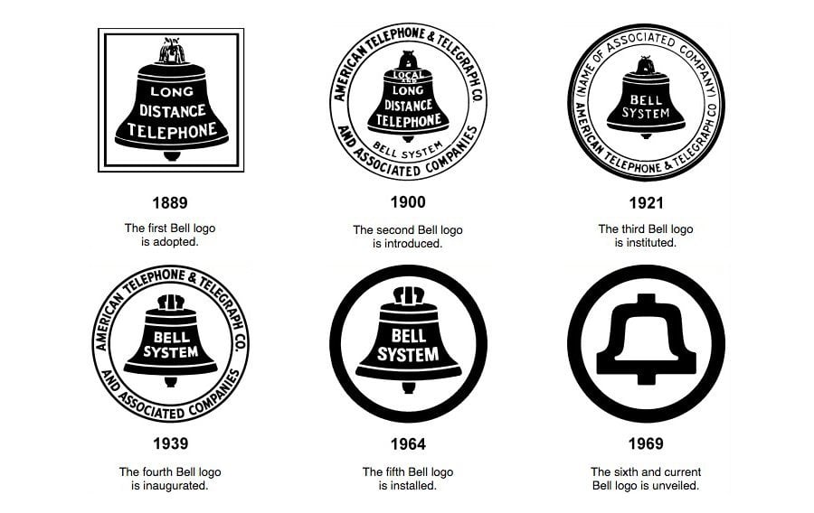
There’s a hugely detailed write-up covering the various Bell logo designs from 1889 through to 1969 via the following link:
Bell Logo Design Evolution: The design development of the AT&T globe symbol began in late 1982, with the agreement between AT&T, the U.S. Department of Justice, and Federal District Court Judge Harold M. Greene that AT&T would divest itself of the 22 Bell Operating telephone companies as of January 1, 1984.
Initially, the globe symbol was shown in conjunction with the logotype “American Bell” to identify an AT&T subsidiary providing terminal equipment and enhanced service on a unregulated basis. Later, Judge Greene ruled that the ‘Bell’ identification must be assigned exclusively to operating companies. Thus, the symbol was joined with the new name and logotype ‘AT&T’ to form the identification signature for the restructured AT&T.
Bell Logo Design Evolution
F
Found on Kottke: http://kottke.org/15/09/1969-bell-system-logo-redesign-pitch-video-from-saul-bass
