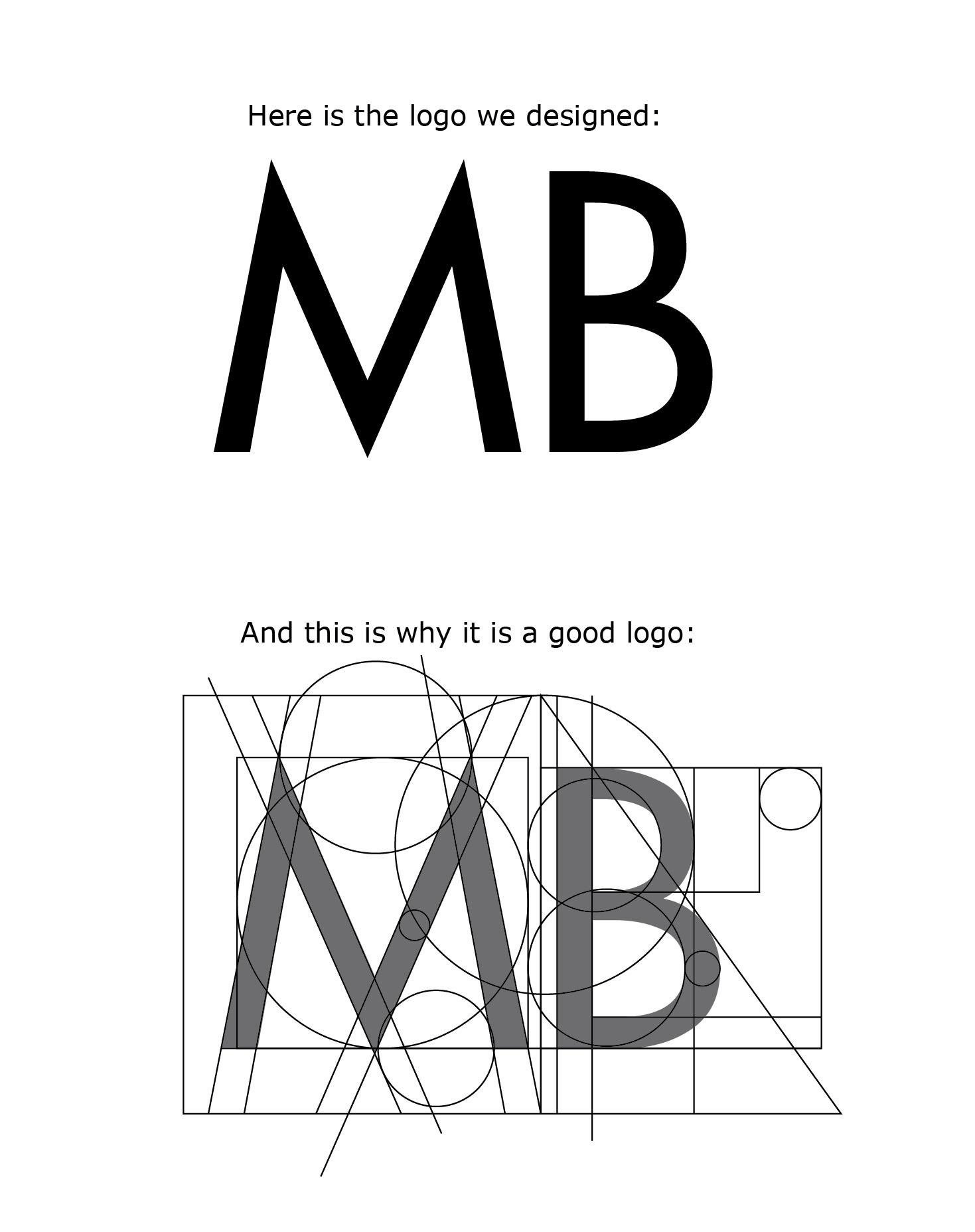

This image came up in my Reddit stream a little whole back, and whilst I cannot vouch for its authenticity, I still felt myself having to reshare it as if it were legit.
It’s either a hilarious piss-take, or more worryingly, it’s actually someones genuine attempt to convince themselves that there MB logo is a… ‘good logo’.
Whilst we’d all like to think this is a hilarious piss-take, I just know that someone somewhere would actually view this as a great logo, just because of the application of a ‘grid’.
Too funny.
Hilarious, yet scary…https://t.co/wrVZwUfB06 pic.twitter.com/vwzxTNL3PI
— The Logo Smith: Design Studio (@thelogosmith) October 29, 2018
And remember, if you don’t want to fall foul of getting a shit logo designed, then please do remember you could always hire Hire The Logo Smith Freelance Logo Designer to design you a non-shit logo.
Sales pitch coming up:
