
In Progress: Custom Lettering-Preliminary Design Sketches
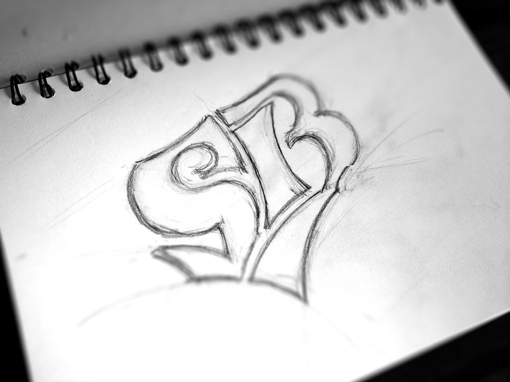
Nothing like a blank-slate when tasked with designing some custom lettering for a new logotype. Far from what will be the final design, but I just wanted to sneak out a few preliminary sketches that I have been working on.
This version here must be sheet 20, or something close, but none of the earlier iterations were ‘a waste of time’, as each new blank sheet of paper allows you to really explore a wide gamut of ideas, some promising some purposely crazy.
Sometimes where the promising and crazy collide, that Eureka moment could slowly manifest itself as you once again put lead-to-paper.

I’m actually liking how this custom lettering is going, but with a few days since doodling this example, I can now see that the S is somewhat too bulbous on the top left, but now I can see that flaw, I can once again whip out another sheet of paper and hopefully address that issue. For sure, only to find something else that doesn’t quite fit with my vision.
The sketching process can be fun, challenging, frustrating, even damn right arduous, but it’s rare to come out at the end without something solid to work on for that final logo iteration.
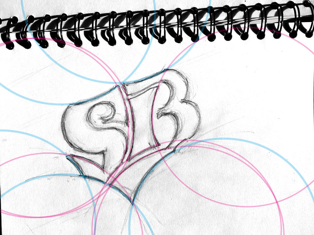
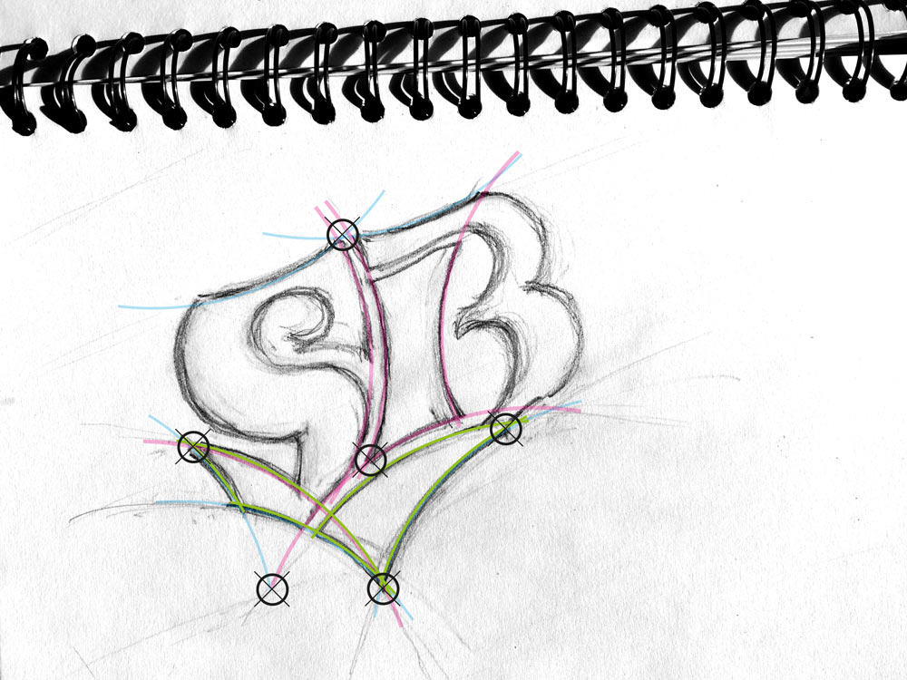
For shits-&-giggles, I just quickly placed some pretty coloured circles to show the sort of the flow that I’m bringing into the custom lettering and overall structure of the logotype. I like things to converge, to line-up, to intersect, where it’s naturally appropriate to do so. In this case it’s actually the green area that I have started each sketching session with, as this is the base platform from which the S & B rise from. Lots of sweeping curves, behind-the-scenes, that share the same overall circumference, and that all work together in one way or another.

