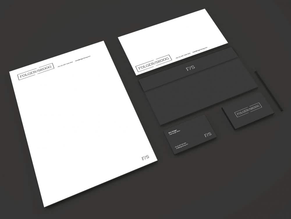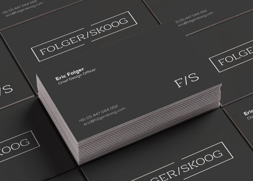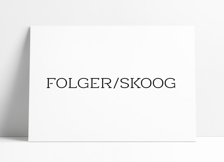
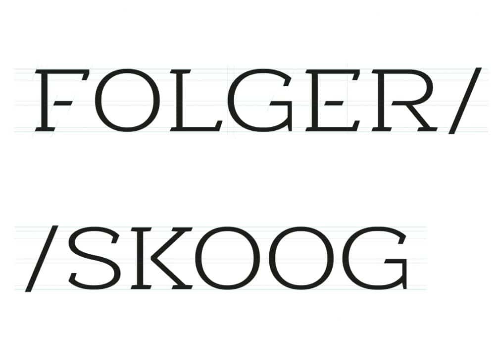
New Brand Logo Design for F/S, which also included the creation of a custom slab serif for the main FOLGER/SKOOG logo type.
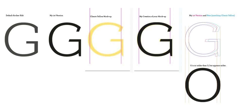
The lettering for F/S was created from scratch which was sased off a generic Slab Serif.
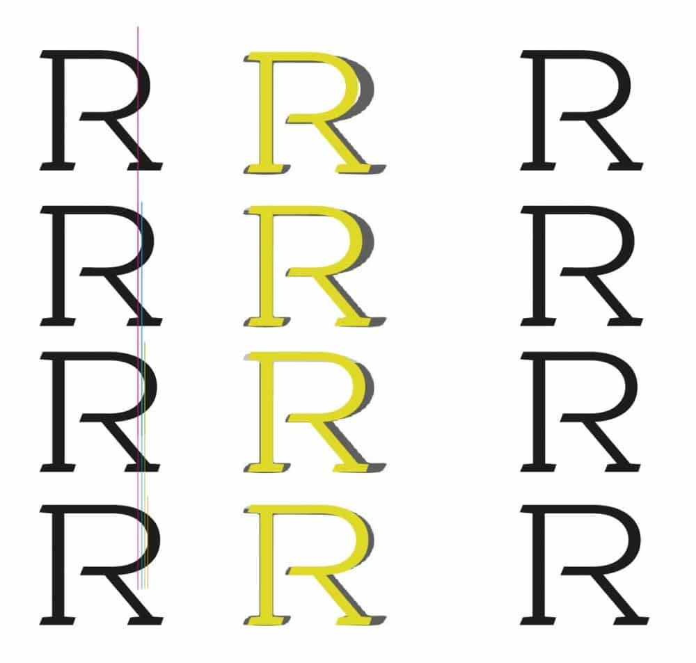
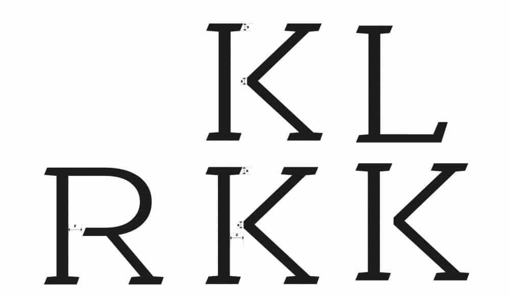
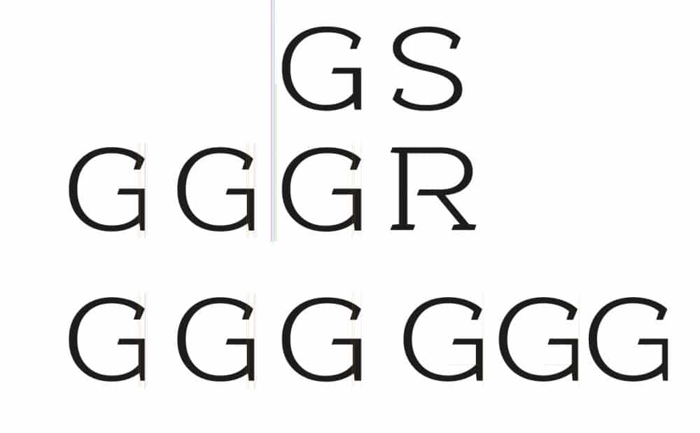
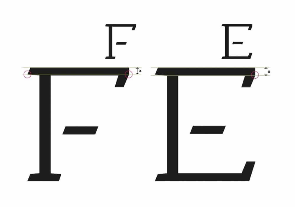
There have bene a number of unique modifications to make this completely ownable to F/S, from the angled back slabs, to the gaps between the horizontal bars.
These typography customisations were extremely detailed, and time-consuming, but a very rewarding experience for me.
I’m going to let the following images tell the story of the various changes I made:


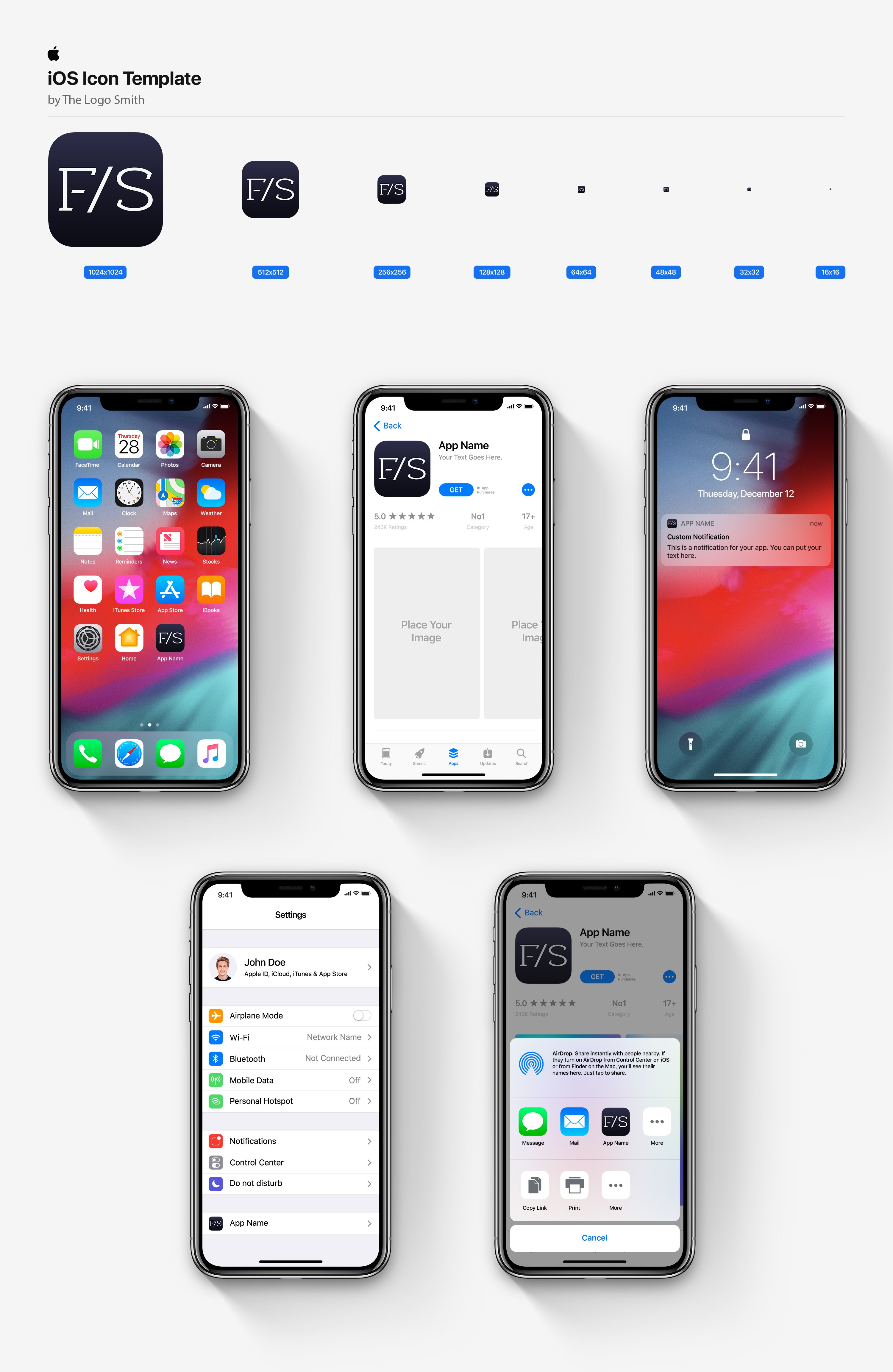

Unused Designs & Mock-up’s for Business Cards and Letterheads
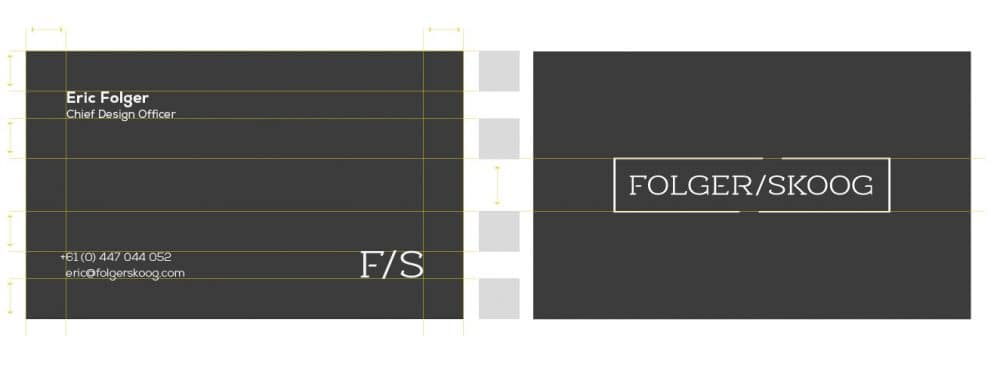
The following stationery mock-up’s were used to help provide context for the development of the logo design, but were not ultimately used by the client.
A few changes were made to the logo type during this phase, one of which was removal of the outer box, leaving just the logo type.

