My Favourite Word Marks from Brand New
I decided a few weeks back to simply collate some of these recent typographical logo designs into alogo collection.
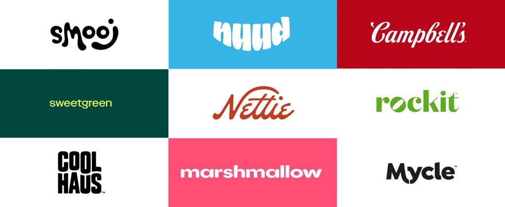
So what you’ll see are Word Marks / Type Marks only; no other visual element (combination logo), just wording in whatever shape, size and style.
I’ve picked out the ones that I particularly love for any number of reasons, but mostly the choices are simply based on my first-impression on seeing the word marks either on the Brand New Twitter feed, or via the Brand New website.
Some of these word marks that have been updated and refreshed, where the new design is clean and rejuvenated, whilst keeping a clear reminder of the original; 2 examples are Campbell’s & Marshmallow.
Credits
I’ve added appropriate: Designer, Studio, Agency link credits; Client and Company details and links, and finally the corresponding link back to the original Brand New post.
Part 3 (→ Read Part 1) of another 10 beautiful Word Marks, courtesy of Brand New, within the next week or so.
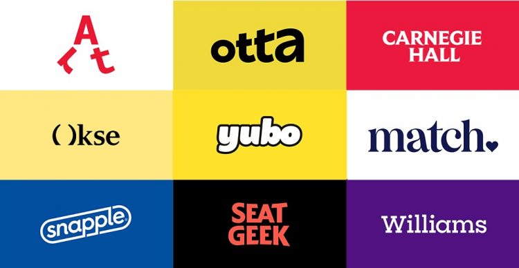
10 Brand New Word Marks – Part 2
1. SeatGeek – Designed by In-house with Hoodzpah and Mother Design
→ Brand New Post: You are what you Seat
→ Brand New Post: A Heaven Made in Match
→ Brand New Post: It’s a Moo-d
4. Carnegie Hall – Designed by Champions Design
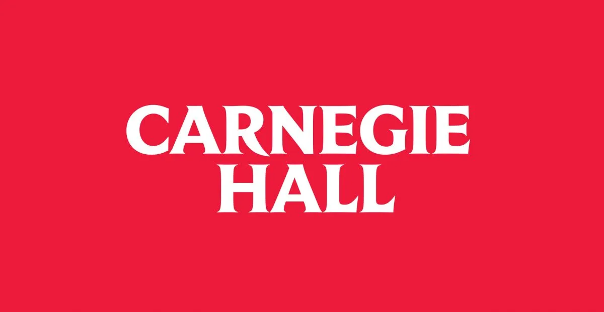
→ Brand New Post: Beam with Pride
→ Brand New Post: Bo Knows
6. Piedmont Art Walk – Designed by Mucho
→ Brand New Post: Walks like a Charm
7. Knowdonia – Designed by Thisaway

→ Brand New Post: A Sheep in Wolf’s Clothing
8. Otta – Designed by Ragged Edge
→ Brand New Post:A Bang-up Job
9. Okse – Designed by Studio Oker
→ Brand New Post: Seeing is Bullieving
10. Snapple – Designed by N/A
→ Brand New Post: How do you like them Snapples?
Why?
The last few months I’ve been increasingly impressed by the number of Brand New Word Marks and Logos being designed, as well as redesigned.
After way too long mulling over subscribing to Brand New, I decided to go for it, and now I’m glad I did.
Seeing all these beautiful logo designs coming out on a regular basis has given me a renewed sense of faith in logo design/redesign in general.
Over the last few years it had seemed like the quality of almost every new redesign/rebrand coming out was less than desirable.
Now feels we’re over that.
I get the sense that whilst designers’ are creating some beautiful logo designs, they are also seemingly practicing restraint, whilst keeping true to the original brands roots.
I’ve felt somewhat spoilt for choice as each week several new Brand New posts and tweets showing yet another gorgeous word mark.
10 Beautiful Brand New Word Marks – Part 1