Learning about Typography: Typography Primer is an absolutely terrific typography and font book, covering a healthy portion of typography, as well as a decent size Glossary of Typographic Terms, provided by Adobe.
Learning about Typography: The Typography Primer Book was actually first published waaaay back in the day, circa 2000, but the contents are still very relevant over a decade later, and includes Glossary of Typographic Terms.
→ Download: Typography Primer
Sure, there are a few references that some of you may not be familiar with, mostly based on software and tech: Adobe Type Manager®, Multiple Master Fonts, for example, that has since been put out to pasture, but for the most part it’s all still relevant.

From Adobe’s blog post on the Typography Primer: “This primer for learning about typography, and Glossary of Typographic Terms, was written back in 2000, but its content is still relevant today. It talks about things like using the right character, choosing and using typefaces, combining typefaces in a publication, and loads of other interesting typographic tidbits.
If you follow our blog, you probably already know a lot about type. If that’s the case, why not take a look inside anyway? Think of it as a fun refresher when you need a break from work. Perhaps it’s even something you might share with a co-worker who longs to know more about the mysterious world of x-heights and optical sizes.”
Learning about Typography: The Typography Primer Book is an absolute treasure trove of typographical knowledge; to say it’s just primer is a slight understatement in my opinion, then factor in the Glossary of Typographic Terms!
If you’re new to graphic design, and/or typography, fonts, editing, etc, then you really have a great resource here at your finger tips, and all you need to get going learning about typography.
Even for those seasoned designers and self proclaimed typographers, this is a good resource book to have close by.
I’ve printed mine out, and actually had it spiral bounded and laminated. This is one thing that Adobe has done for you, for free. Take advantage of it…
The Index
There isn’t an index, so here’s a run-down of what’s included within the Typography Primer, the glossary at the end runs to 7 pages in and of itself!
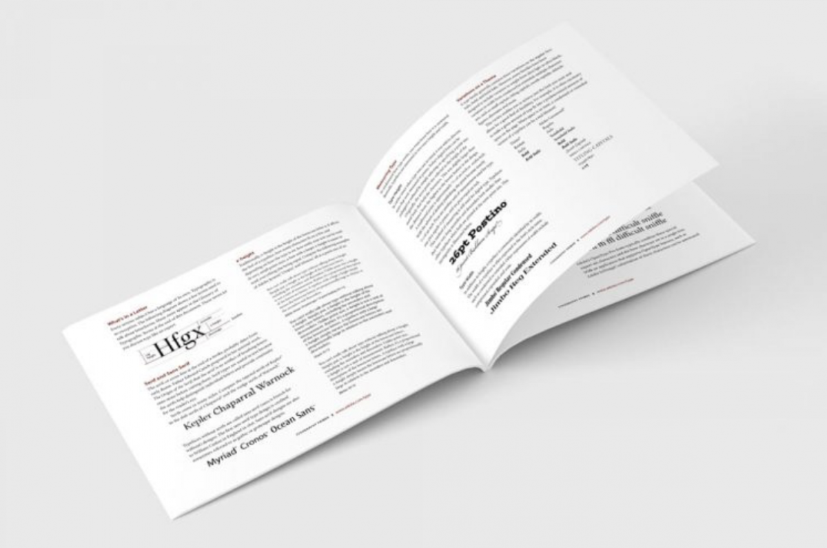
1. What’s in a Letter
2. Serif & Sans Serif
3. x-height
4. Measuring Type:
— Type Height, Type Width
5. Variations on a Theme
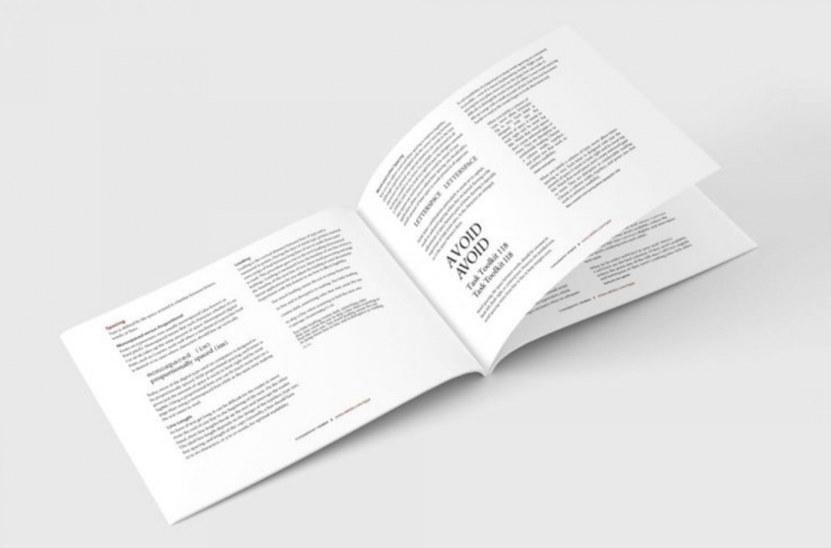
6. Spacing
– Monospaced vs Proportional, Line Length, Leading, Word and Letter Spacing
7. Typographic Colour
8. Using the Right Character
— Italics, Boldface and Uppercase, Optical Sizes, Getting Your Quotes Right, Using the Experts, Upper and Lowercase Numbers, Small Capitals
9. Alignment
10. Copyfitting
11. Choosing and Using Typefaces
12. Choosing Text Fonts for Body Copy
13. Choosing Fonts for Headlines
14. Serif versus Sans Serif
15. Display and Decorative Typefaces
16. Combining Typefaces in a Publication
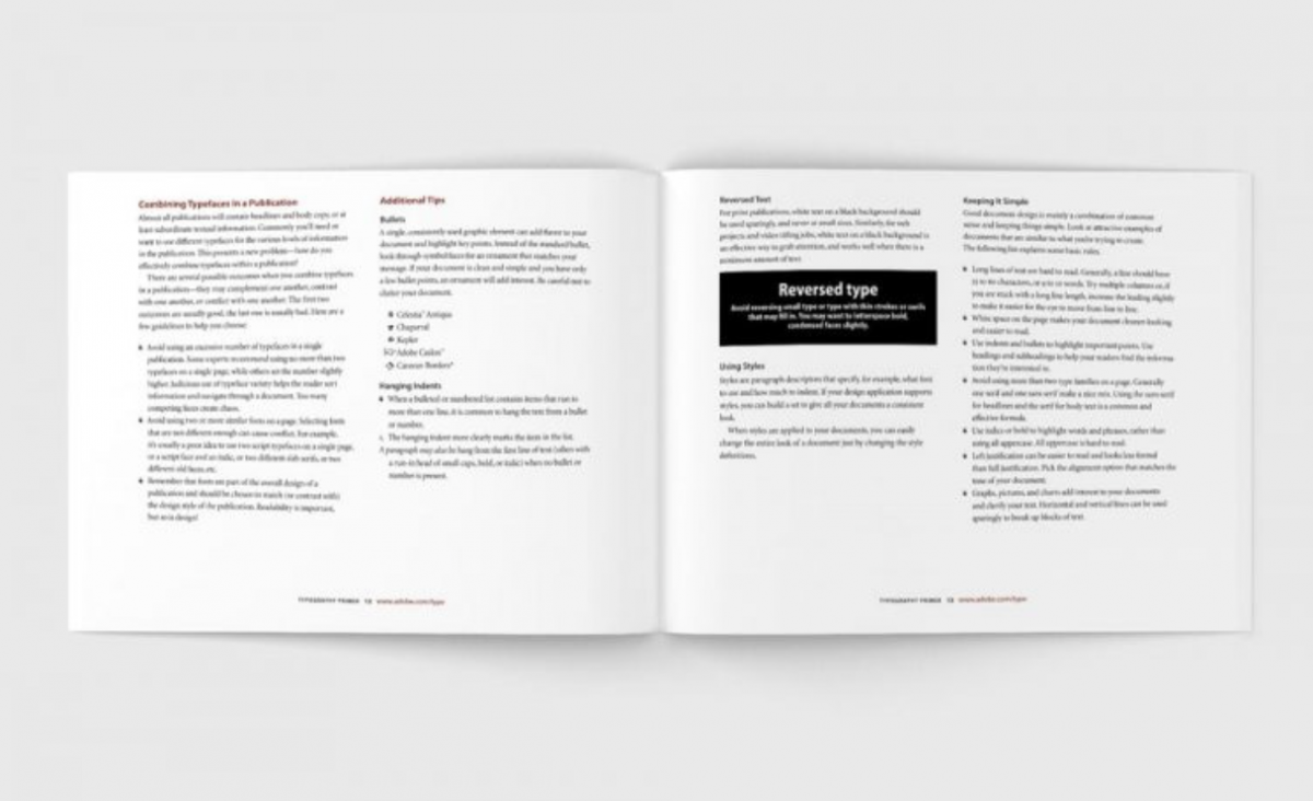
17. Additional Tips
— Bullets, Hanging Indents, Reversed Text, Using Styles, Keeping it Simple
18. Glossary of Typographic Terms
→ Download: Typography Primer


Glossary of Typographic Terms
This section of the Typographic Primer provides a small example of terms frequently used in the type world:
alignment — The positioning of text within the text block or frame. Alignment can be flush left, flush right, justified, or centered. Flush left and flush right are sometimes referred to as left justified
and right justified.
ascender — The part of lower case letters (such as k,b,and d) that ascends above the x-height of the other lowercase letters in a font.
Adobe Type Manager® (ATM®) — ATM Light is a system software component for the Windows® and Mac OS platforms that automatically generates high-quality bitmapped character shapes on a computer monitor from PostScript® Type 2 or OpenType outline font data. ATM Light also allows you to print PostScript fonts on non-PostScript printers. ATM Deluxe is Adobe’s personal font management application.
baseline — The imaginary line on which the majority of the characters in a typeface rest.
bodytext — The paragraphs in a document that make up the bulk of its content. Body text should be set in an appropriate and easy to read face, typically at 10 or 12 point size.
boldface — A typeface that has been enhanced byrendering it in darker, thicker strokes so that it will stand out on the page. Headlines that need emphasis should be boldface. Italics are preferable for emphasis in body text. Some publishing applications allow you to apply a computer-generated, or fake, bold style to a regular weight font. Using this technique is not recommended.
bullet — A dot or other special character placed at the left of items in a list to show that they are individual, but related, points.
capheight — The height from the baseline to the top of th euppercase letters in a font. This may or may not be the same as the height of ascenders. Cap height is used in some systems to measure the type size.
Centered — Text placed at an equal distance from the left and right margins. Titles are often centered. It is generally not good to mix centered text with flush left or flush right text.
character, character code — A single letter, punctuation mark, number, space, or any other object or symbol in a typeface set. In the context of modern computer operating systems, it is often defined as a code with a meaning attached to it. For example, the decimal character code 97 represents the letter a. Also see character encoding, keyboard layout, OpenType, Unicode.
character mapping — See character encoding.
character encoding — A table in a font or a computer operating system that maps character codes to glyphs in a font. Most operating systems are moving from a platform-specific single-byte encoding system that limited the number of possible glyphs in a font to 256to a new two-byte international encoding standard called Unicode. Unicode allows for the inclusion of up to 65,000 glyphs in a single font. Adobe’s OpenType fonts are based on Unicode. Also see character, glyph, keyboard layout, Unicode.
color — See typographic color.
condensed — A narrower version of a font, used to fit a maximum number of characters into a given space
contrast — A subjective feeling that graphic elements (such as fonts) are different but work together well. This gives a feeling of variety without losing harmony. Within a particular font, contrast also refers to the differences of stroke thicknesses that make up the characters. For example, Myriad has low contrast and Bodoni has high contrast.
copyfitting — The process of adjusting the size and spacing of type to make it fit within a defined area of the page.
decorative font — An appearance-based or usage-based category of fonts. Decorative fonts are often ornate and attention-grabbing. In her book The Non-Designer’s Design Book, Robin Williams has provided a useful working definition of a decorative font: “…if the thought of reading an entire book in that font makes you wanna throw up, you can probably put it in the decorative pot.”
descender — The part of lowercase letters (such as y, p, and q) that descends below the baseline of the other lowercase letters in
a font. In some typefaces, the uppercase J and Q also descend below the baseline.
dingbats — Symbol characters such as decorations, arrows, and bullets.
