Caught this great article on the official font for the Tokyo 2020 Olympics, via the official Olympic website, and the whole thing is just utterly fascinating.
It’s an interview with Morisawa, who are the official font providers for the Tokyo Olympics.
What really drew me in was learning about the actual history of the company, and how much it had contributed to the very first phototypesetting device in 1924; considered the most important invention since Gutenberg.
When you realise that an interview is with someone related to such a rich and important past of typographic and print related history, then you know you are reading about something special.
Morisawa Akihiko, President and CEO of Morisawa Inc.: “Morisawa was founded in 1924 by my grandfather, Morisawa Nobuo, who developed and obtained a patent for a printing device that was like a combination of a Japanese typewriter and a camera.
One day he realised that letters in the alphabet have different widths, such as ‘A’, ‘W’ and ‘I’, whereas in Japanese they all fit into a square. This inspired him to develop the phototypesetting device.
Highly recommend heading over and giving the whole interview a read, as it is just so interesting.
If you have a background in traditional print and typesetting, or even if you don’t, I think this will be a good read.
I thought so anyway…

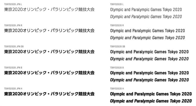
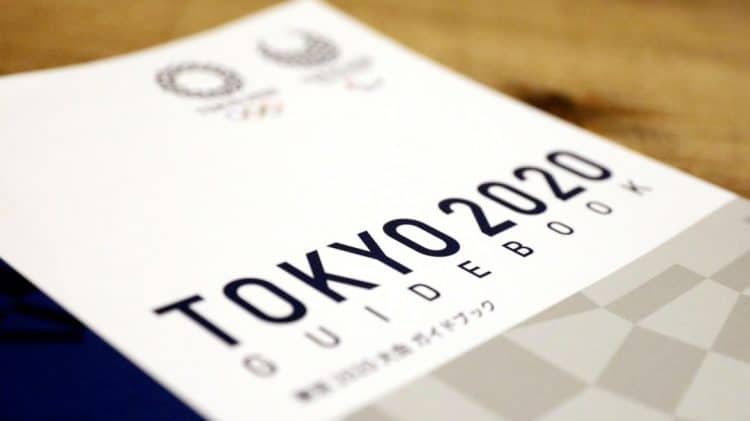
“Morisawa provides the official font for the Tokyo 2020 Games that embodies the image of the Games and is used in Games-related printed materials, licensed products, city-dressing designs, and on certificates awarded to the athletes.
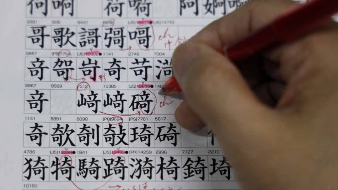
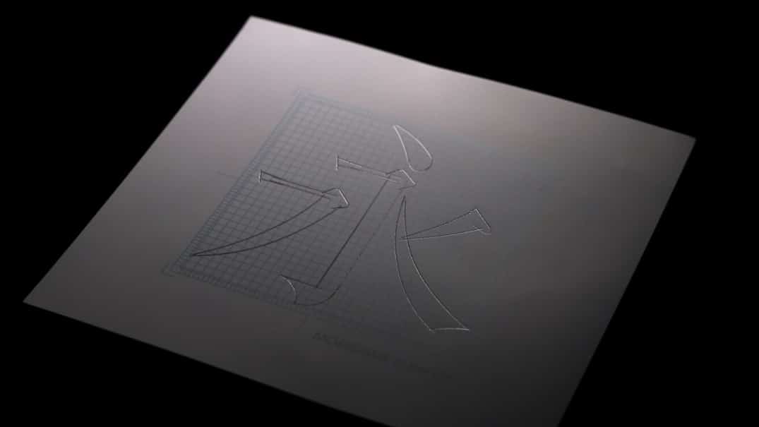
“It takes about two to four years to commercialise a single font. It is a result of a long and detailed process of handwriting each font and using digital tools to complete the development.
