![]()
The New Swiss Airlines Logo & Brand Identity Redesign by Nose Design
Post Written 2011: I have held off voicing my thoughts on the rebranding of the Swiss Airlines logo and brand identity, but I accidentally saw it in passing again today so I just had to get bad stuff off my chest.
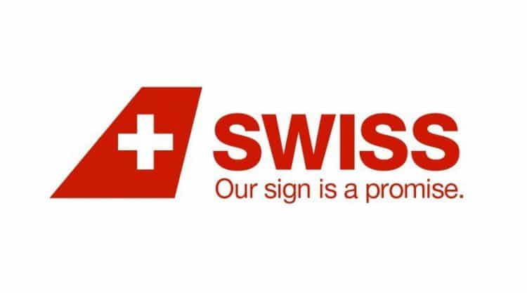
The first moment I saw this new logo, designed by Swiss agency Nose Design, something felt off in a big yet subtle way. There is something very odd with the typography; my brain is telling me something is totally not right with it.
My first thought was that it reminded me of a unicase font where you get those awkward combinations of lowercase and uppercase characters.
I have got my measuring stick out and everything aligns as it should so nothing off with the alignment. The word SWISS is just utterly bugging me with the lack of the dot on the i has throwing me a little. The S‘s sometimes look like they are shifting in some king of weird bi-universe distortion field; the more I look at it the more it feels off.
The tag line also feels off with tracking falling between too much and not enough. The relatively compact and bold nature of SWISS you would think a contrasting font weight would work, but this doesn’t work with the O in Our looking way too tall and thin. I also think the word spacing is off in relation to the tracking.
The whole package feels awkward, tight and a little shouty shouty.
Brace Yourselves
I know people often hate it when a designer goes and shows how they would have done it better so I’m bracing myself for the criticism.
If I am going to verbally criticise the Swiss AirLines logo then the least I can do is stand behind my reasoning by visualising my thoughts.
The logo below is my perception of what I feel would improve the redesign, and for that reason is a subjective study. I personally feel this is a more coherent formatting of the Swiss AirLines logo.
![]()
![]()
And an option with the dot on the I as per the original original brand logo.
My Subjective Rework
So given my thoughts above I have made some tweaks. Just for shits and giggles I have used Helvetica Neue Heavy for SWISS and Regular for the tag line.
I feel that the cross is way too tight within that tail fin, and as they have aligned the top and bottom of the cross with the SWISS wording this is what makes SWISS look so unwieldy.
If you reduce the cross in the tail fin giving it more room to breathe you can then reduce the SWISS wording down a few point sizes. This creates more space top and bottom allowing the tagline to now be tucked in neatly underneath.
My view is that this creates more space for the cross, the tail fin and the typography, and is a neater more compact logo mark. I realise this is only a small part of the overall identity and livery but surly important to get the base logo mark looking sound?

I think the biggest and most effective change is reducing the size of the cross within the tail fin. Once you do that then everything else seems to fall into place.

Surely a case of Swiss Air Lines wanting to make the logo bigger?

I have applied my reworking of the logo to the tail fin as shown in the top plane with the original below. There is certainly a fine line here, whilst the angle of the tail fin does make it awkward to size and position the cross in a way that doesn’t look too small or too large.
I would personally lean towards the cross having room to breathe rather than horribly close to the side edges.
![]()
Given that the original original logo, above, had the cross positioned with plenty of room to breath; the tail fin design leaves me wondering what happened to design finesse and confidence not to have to SHOUT and make everything so damn big.
It’s not like the logo is to be seen on something like a pen now is it. It’s a bloody aeroplane with these things generally being quite big and often times hard to miss.
I welcome your thoughts on the Swiss Air Lines rebranding.
Swissair Logo Design History
![]()
Swissair Logo Designs and SAirGroup from 1931 through to 2010
One a more positive note, worth checking out my post about the history of Swissair / Swiss Airlines, and includes a recreated Swissair Logo Grid for you to download: Swissair Logo Designs and SAirGroup from 1931 through to 2010
![]()