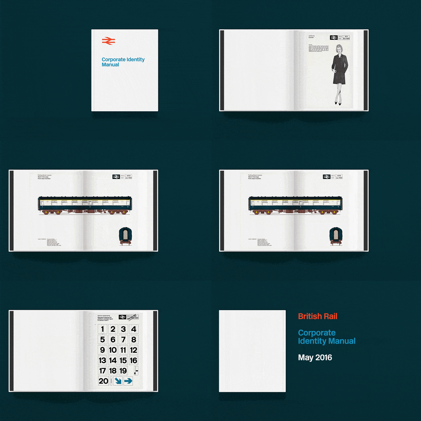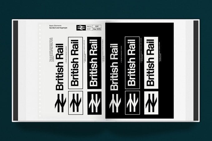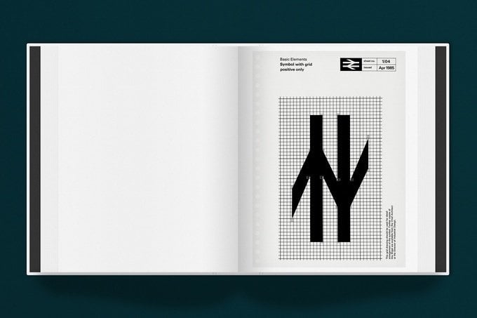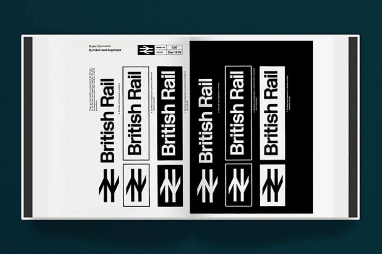
High Spec Reproduction of the iconic British Rail Corporate Identity Manual
Looks like the reproduction of the NASA Corporate Graphics Standards Manual—which I hasten to add I did back, and eagerly awaiting my own copy—has set something quite cool in motion: the reproductions of old and famous logo guidelines, and in this case, the British Rail Corporate Identity Manual.
This is a very good thing.
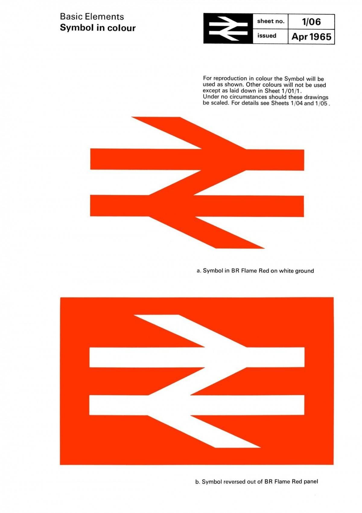
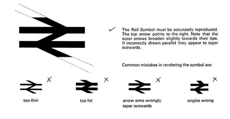
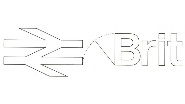
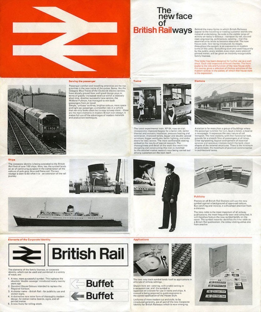
The British Rail logo was created by Gerry Barney from the Design Research Unit, and has become one of those most famous iconic and enduring logo designs of UK branding.
In 2011, the readers of Creative Review voted British Rail’s ‘double arrow’ logo as their sixth favourite logo.
So to ensure that the original manuals, which spanned four volumes, Wallace Henning, with the full backing of the DoT (Department of Transport), and obviously sufficient backing on Kickstarter, will look to reproduce all original four manuals as a new, high production book.
As a keen graphic designer, this is a KIckstarter project I will also be backing for sure!
The manuals
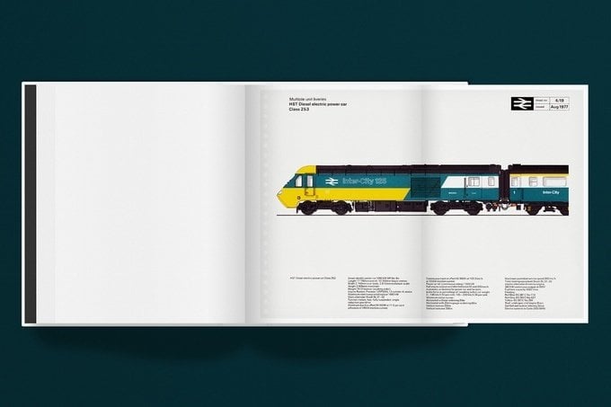
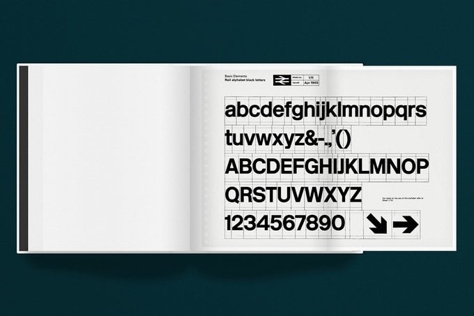
The original manuals spanned four volumes, all utilising a MULT-O 23-ring binder system. Issued in July 1965, binder one contained information on the core brand elements such as the symbol, logotype, lettering and colour palette. Binder two, issued in November 1966, contained guidance on printed publicity. In 1970, binders three and four were introduced containing guidance on architecture and signposting, rolling stock, lineside equipment, road vehicles, ships, liner trains, uniforms and stationery.
