
Pantone Color Bridge Plus and CMYK Cheat Sheets
These Pantone Color Bridge documents: Pantone Plus Color Bridge CMYK & Pantone Color Bridge Plus Coated on Scribd are really very useful as an online resource for Pantone to CMYK colour conversions.
Note: In order to partially view these Scribd documents you do need to sign-up, and at least trial Scribd for a month in order to access the full documents.
I have previously written about the Pantone Color Bridge Swatch Books and how important these Pantone book are for any designer.
There are limitations with an onscreen version of these cheat sheets, namely you can’t see how a specific Pantone colour actually looks printed. It is still useful as a casual reference guide in searching for CMYK value breakdowns of a Pantone colour.
There is nothing like having the actual printed Pantone Bridge swatch book to hand. They are incredibly valuable when it comes to finding and specifying colours for a logo design.
No one likes guess work with something as crucial as colour for a brand identity. Bonus feature: you get the RGB and HTML conversion values along with CMYK.
Buying yourself one of these Pantone books is a solid tip from me…
Pantone Color Bridge Cheat Sheet documents: Pantone Plus Color Bridge CMYK & Pantone Color Bridge Plus Coated


[AQFG] – A Question For Graham
Gav Cooper asked me about colours and how one should approach it given the various options open to us when designing a logo.
There are a myriad of colour systems such as: Pantone, CMYK, RGB, HEX as well as trying to work out which system you need for each project.
The management of colour is a huge, and often times complex, business to get your head around.
I spent over 20 years of my working life working in commercial print and prepress reprographic departments trying to ensure accurate colour reproduction. Even with all this experience I still get caught out.
I can’t possibly answer cover everything to do with colour, but I can tackle the specific question that Gavin asked about managing Pantone, CMYK and RGB breakdowns for logo and brand identity projects.
I will also keep this brief and to-the-point, but on the understanding that my answer is just one method to keep things relatively controllable, and your sanity intact.
I will also not assume that we all have the knowledge, practical experience and resources to ensure that our equipment is expertly calibrated with each client and printer we might deal with.
A Typical Scenario
So let’s assume we have a logo and identity project where we are having to design stationery that will be commercially printed as well as well as for screen.
Let’s also say that the client has been tempted with using a Pantone colour plus black for print applications which makes it mostly a 2 colour job. We also know that the client needs the Pantone colour to be able to convert, as reasonably as possible, to CMYK as well as the Pantone looking good on the website.
Some people would argue that having to make sure a Pantone colour can convert to CMYK is pretty much pointless. Surely we use Pantone colours for the large selection of hue’s that cannot be achieved through CMYK? That is true for sure, but we can also use Pantone to ensure consistency of ink application, and appearance, from printer to printer.
When we are printing CMYK, and we have a large area of a recurring solid colour, the results can vary a great deal from printer-to-printer due to any number of circumstances.
So one of the questions that needs to be asked: is consistency of colour just as important as a distinguishable colour for the brand identity? I would say this is a yes for most people, and if it isn’t then I would question why.
Assuming we have designed the logo, and are now looking at the main brand colour to which to build the identity upon, which is a good way to find the best colour? You may have a kind of colour in mind so it now just comes down to fine-tuning it.
We need a colour for the logo that is available as Pantone, that can be converted to CMYK when needed, and will also work in RGB/HMTL.
An Easy Answer
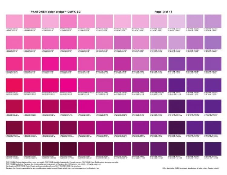
There is an easy answer to this particular situation, and that would be get yourself a copy of the Pantone Color Bridge guide.
Out of all the various Pantone colour books, the Colour Bridge guide should be your go-to-guy for any print/screen colour requirements.
- An Essential Guide for Designers, Pre-press and Printers
- Bridge solid PANTONE Colours for process printing or Web design
- The new PLUS SERIES COLOR BRIDGE provides process colour simulations of all solid PANTONE Colours – including the 224 new solid colours – in a convenient side-by-side comparison format, on coated stock
- An invaluable multi-use colour reference tool, the COLOR BRIDGE can be used to select and specify solid PANTONE Colours, to determine how a PANTONE Colour will appear when reproduced in CMYK, or to create optimal display of PANTONE Colours on monitors and Web pages
- HTML and sRGB values are provided, for applying colour selections across media
- Includes colour index, lighting evaluation tool, digital image colour-correction tool, and design software
Not only does it list Pantone colours, it also shows you how each Pantone looks when converted to CMYK, for process printing, as well as the exact CMYK values needed.
Also, it provides the colour values for RGB and HTML.

With this book you are able to accurately, and confidently, determine which Pantone colour can be used that will degrade nicely to CMYK.
This will ensure that whatever print process your client needs they should have the tools in place to ensure output is consistent as possible.
You are then also provided with RGB/HTML colour values that will allow you to create screen only versions of your precious logo design, and in the process know that you have built in a solid level of consistency.
We will rarely have complete control: each monitor will display slightly differently as well as not being able to control the lighting environment which all contribute to colours being discerned differently.
What we can do, and provide out client with, is a level of predictability and consistency we can feel good about.
I used the Pantone Colour Bridge book in a recent project for Abacus Insurance. I knew the client needed a nice green for the logo design which would appear on: the website; various external building sign gage solution; and printed materials like stationery and brochures.
Given this wide selection of needs we had to ensure the green we used was of a hue that would work well as a Pantone colour as well as converted to CMYK for cheaper process printing.
Pantone on Wikipedia
Wikipedia: Pantone began in New York City in the 1950s as the commercial printing company of M & J Levine Advertising. In 1956, its founders, advertising executives brothers Mervin and Jesse Levine, hired recent Hofstra University graduate Lawrence Herbert as a part-time employee. Herbert used his chemistry knowledge to systematize and simplify the company’s stock of pigments and production of colored inks; by 1962, Herbert was running the ink and printing division at a profit, while the commercial-display division was $50,000 in debt; he subsequently purchased the company’s technological assets from the Levine Brothers for $90,000 (equivalent to $5,880,000 in 2018) and renamed them “Pantone”.[3]
The idea behind the PMS is to allow designers to “color match” specific colors when a design enters production stage, regardless of the equipment used to produce the color. This system has been widely adopted by graphic designers and reproduction and printing houses. Pantone recommends that PMS Color Guides be purchased annually, as their inks become yellowish over time.[4] Color variance also occurs within editions based on the paper stock used (coated, matte or uncoated), while interedition color variance occurs when there are changes to the specific paper stock used.[5]