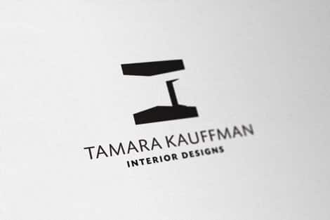
Logo Tutorial: Add subtle Depth of Field to your portfolio images
This is a follow up to my previous logo design tutorial ‘Logo Tutorial: A logo seemingly photographed on textured paper‘ in which I showed you how to make your portfolio images.
It’s not a complicated procedure and only has a few steps, but it’s a subtle finishing touch for some of the images you may show to your clients. As with anything to do with Photoshop there are often multiple ways to achieve similar results and often gazillions fine tune options to play with. So what I show you is just the initial basic process where you can play around with the finer details.
Be realistic
Having some knowledge of photography and lens DOF (depth of field) is certainly useful here. If you have played with shallow depth of field in your photography you will know what I mean, especially portraiture and even macro photography. But this isn’t a photography tutorial. :)
The final result will depend on the extent of perspective you have applied to your images, the angle and also the final image resolution. These factors determine the values you need to apply.
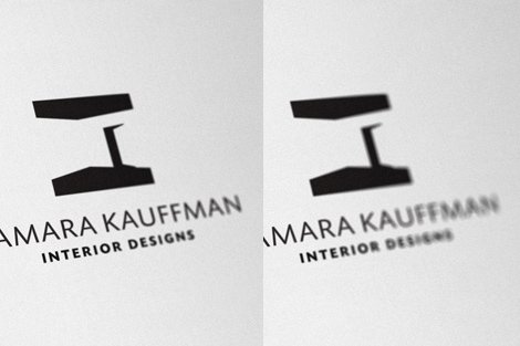
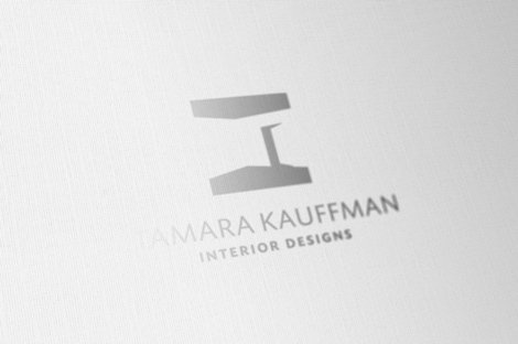
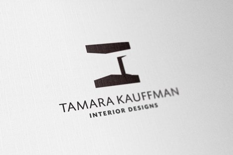
It’s easy to apply an effect that looks a little too OTT, like the example below. Doesn’t look ‘bad’, but I guess depends on what rocks your boat.
Side by side comparison. The left image is quite subtle whereas the right looks pretty dramatic.
Ultimately comes down to the angle of perspective you have used and how far in the distance the logo seems to go, this will determine how much DOF you should use.
Tip
A good way to see what fits in with a real camera DOF effect is to use a camera, preferably with a SLR Print a few logos off, take some photos, experiment with the DOF, the angle at which you are taking the photo and see what works.
Let’s crack on with the important stuff. Make sure you have a suitable image to work from, ideally one that used the style of logo created from my previous tutorial ‘Logo Tutorial: A logo seemingly photographed on textured paper’.
The only difference you will see is that I work from a logo on a separate layer to the texture, whereas the tutorial combines the logo and texture. No problem, it just reduces the steps you need to do, whereas I have to duplicate the DOF for both the logo and texture layer. But I find I get a bit more flexibility with these separate layers
Step One
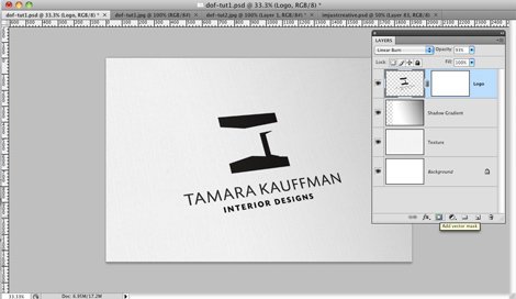
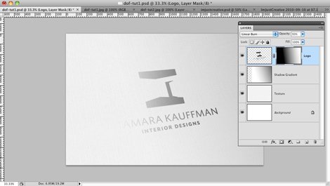
On your logo layer, add a ‘Vector Mask‘ using the ‘Add vector mask‘ in the layers palette (the icon where the yellow tab is shown), this creates a white 2nd thumbnail next to you logo highlighted in by the blue layer at the top.
Step Two
We will first draw the gradient on the ‘vector mask‘, this image shows you where to start drawing it from. All we use is a default black/white gradient. I find it’s quite important where the gradient starts, so I start it from the beginning of the logo image, as shown by the red line and follow the angle of the logo and off the page.
Ensure you select the ‘Vector Mask’ thumbnail to the right of the logo layer, select the Gradient option in the floating toolbar. Drawing the gradient on the ‘Vector Mask’ creates the thumbnail image above.
Step Three
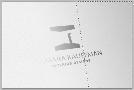
Holding down the ‘Apple/Cmd‘ key, press and select the ‘Vector Mask‘ thumbnail you created the gradient on, this turns the ‘white\grey’ areas of the gradient into a selection, as shown by the ‘marching ants’ above. This creates the area that will be affected by the DOF blur we will be adding shortly.
Although the selection looks like a hard line, it’s not. Turning the gradient into a selection has similar effect to a wide area feather in that any thing you apply to this selection will fade rather than end abrubtly.
You need this selection active for Step Four.
Step Four
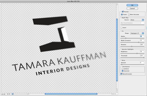
To create the DOF blur, we will use a blur filter called ‘Lens Blur‘. In the main menu go to ‘Filter‘ then select ‘Lens Blur‘ and you get the window you see above. There are a host of variables here to change, but for our project, all we will playing with is the ‘Radius‘ value.
As you can see I have opted for a lowish value of 21, if you increase this to say 40, you will get the more ‘ballsy’ the example I showed you above. The amount of ‘Lens Blur’ also changes depending on the resolution of your image, so the value may need adjusting depending on your image resolution.
So this is a great time to play around with the values and see what works best for you.
Step Five
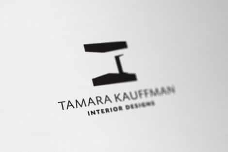
After applying the ‘Lens Blur‘ we end up with this, a combination of the blur and the original gradient.
If you are working with the logo on a different layer to the texture as I do, then you need to apply the ‘Lens Blur‘ to the texture as well. So keeping the ‘marching ants’ selection active, select your texture layer and reapply the ‘Lens Blur‘.
If you have been working with the logo combined with the texture, then we can delete the ‘Layer Mask‘, so make sure you select the ‘Layer Mask‘ to the right of the gradient layer and delete it. If the logo disappears as well this means you need to ‘select all’ on the ‘Layer Mask‘ first before deleting.
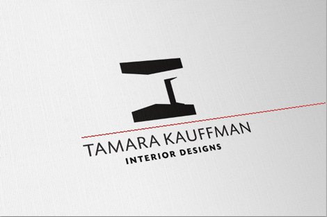
We end up with this.
Pretty much job done.
Just to finish things off I’m going to play with the settings for the logo transparency layers as we did in the previous tutorial. A few tweaks and I have managed to get a slight ‘ink shine’ to the logomark. Subtle, but a nice finishing touch.
Nice. ;0)
