Here we go with Part 17 of the Logo Design Round-Up, and you can catch-up with Part 16 Logo Design Round-Up. As with Part 16 I am really chuffed to see so many designers submitting their own brand logo designs for this logo design round-up series. Read how I butchered Helvetica to create my own logo design.
Please note that all submissions are included as this series isn’t a best-of, or some elitist logo display. In this post the logos are displayed in alphabetical order.
If you have your own brand logo for your creative business then you are welcome to be part of this logo design series.
Take Part
If you would like to join the fun and have your own brand logo showcased with a written description then flick through this post: Submit Your Logo For Logo Design Round-Up Series
All there is to do now is present ten of your logo designs with some juicy descriptions to boot. Enjoy.
I have taken the liberty of pinning all the logos to Pinterest: http://pinterest.com/imjustcreative/logo-design-round-up as well as adding a Pin button to each and every logo design featured.
Logo Design Round-Up Part 16
Chris Beaumont: Beaumont Design: Logo & Brand Identity Design — http://dribbble.com/Beaumontdesign
This is my current logo to represent me as a freelance designer. I have recently finished a redesign of it which involved tweaking it’s proportions, adding the use of the golden ratio and softening the points making it easier on the eye. The result of changes also allowed it to look more balanced when combined with text as well as working better at smaller sizes.
The Mark is a combination of the tip of a pencil and the use of negative space to represent snowfall at the top of a mountain. The reason for this is that my surname, Beaumont, means ‘beautiful mountain’ in French.
The font I use is Novecento wide in both bold and normal weight. I chose this font as it is a very crisp font with a minimalist style that would transfer the information needed without drawing the attention away from the mark.
The colour scheme is a basic black and white to allow the negative space on the mark to really appear like crisp white snow and to conform with the minimalist style of the rest of the branding.
Constantinos Dobrovolski: cutdsgn — logo & brand identity design — http://cutdsgn.com
While still on my 3rd year as a Graphic & Advertising Design student, i was looking for a «cool» brand name (since my actual name is kinda difficult to be read/pronounced) that would be affiliated with simplicity and minimalism, as design styles. Since i love the process of subtraction in my work, i ended with the word «cut» & «dsgn», which brought me finally to «cutdsgn». The best part is that the initial letters of the two words, are the respectively initials of my full name.
The actual logo process lasted for a few months of brainstorming, sketching and design on my free time. I have to admit it although, if i would be my own client, i would tie a rock to my neck and i’d throw myself into the bottom of the sea. Yeah, the process hurt a lot since i didn’t put a deadline or any design restriction from the beginning.
After a long time, i decided that my goal would be to design a logo mark that would represent «cut» in a minimal way and on the other hand, it would combine the initials of the two words. Being a fan of the «Smith» style, i ended up with a square logo mark that contains in negative space the «c» & «d» characters, that stand from each other with the use of two «cuts». The typeface i used for the naming is a slightly edited Breuer Text Bold, which in my mind it could be the modern child of Helvetica & Din families.
For the moment, i use a neutral grayish color palette which to be honest, it suits me as a personality; although a new color scheme is not impossible to be developed, parallel with the actual website design. Concluding, i’m quite pleased and probably proud with myself as i managed to present an overview of my personality as a designer and as a character into such a simple logo.
David Bauer – David Bauer Photography Design
I love minimal and clean design so I knew from the start that my logo would have to reflect that. And since I’m using my name as the name of the company I wanted to include my initials into the design. It did not have to really say anything about what I’m doing but it would have to be usable as a standalone symbol and/or watermark.
I’ve gone trough like 10 different ideas in the last few months and finally this one grew on me. One day I just flipped my initials to the vertical and there it was! And I was quite surprised to see some things that go together well – a smiling face, ‘Victory’ sign and a computer mouse. And I’m sure I will find more things in this symbol over the time.
Searching for the right font took me even longer and I finally settled with one of the cleanest ones – Gotham (still have a possible runner up – Avenir). It was used for all the typography as well as for the symbol.
Everything is just black&white at the moment. I’m still working on my website so if there will be any colors, they can be also implemented into this logo.
Eric Coddington: Graphic Designer — http://ericcoddington.com
When it comes to designing for a client I am very focused, straight forward, and on target. Like every other designer I am definitely my own worst critic, which had lead me in the past to be very schizophrenic when designing for myself. Not knowing what aspects of my personality, or style to highlight. I’ve used so many personal logos over the past 10 years I’ve lost count.
When I recently moved to a new city (Portland, OR) I decided I need to start fresh again, but this time I needed to create a personal brand that really showed who I am. Not what I like to design, not what I want to be or become, but something that is just me.
Then it hit me, nothing is more me – than me! At that moment of realization I knew my logo was done, and I didn’t even design it, my mom did, with her Polaroid camera, in the early 80’s. Whether you know my logo Is a photo of me jumping off the living room chair or not, it doesn’t matter. You can feel that person in the logo. It’s someone you know, or more likely than not, it was you at some point in your life. And at my core, that’s who I am still today… just bigger.
Now, when handing out my business cards to potential clients, no previous logo has had the success at breaking the ice as this one has. It makes them not only want to know about what I do, but also who I am. It gives potential clients a sense of familiarity with me. It’s an instant relationship builder. And at its essence, isn’t that all a logo really is, a relationship builder.
Kelvin Farrell — kelvinwins: graphic/web designer — http://kelvinwins.com
I’ve found nothing more difficult than designing a logo to promote myself as a designer. I could never settle on anything that I felt truly portrayed me in the right light. To be honest, I hadn’t even settled on a name for a long time after I’d started designing – I was just using my personal name.
What kicked off my thinking was a jokey phrase that my then-housemate used to say; “I win at life”. I thought nothing of it at the time but eventually it creeped in to my vocabulary and I’d mix it up by saying things like “I win at cooking/football/watching TV etc.” One night I replied to someone by saying “I win at design”, and that’s how I initially came up with my brand and domain name, kelvinwins.
From there it was pretty simple to come up with my logo. The idea of playing on that ‘win’ phrase was all too tempting. I thought of a range of ways of doing it; trophies, medals, podium, but eventually settled on a ribbon/badge as it was a bit more understated. I didn’t want to come across as arrogant, which I felt some of the other ideas could have.
The logo has been through a bit of development and has evolved across it’s life. Recently I’ve refined it, given it a bolder font (Frutiger LT 95 Ultra Black) and made it single colour. I’m very happy with it in it’s current form. It’s cheeky, but more in a fun manner, rather than anything unprofessional.
Lisa Dale: Graphic Designer — http://lisamariedale.tumblr.com
My logo came about during an exercise on self promotion and I was having such a nightmare thinking of what to design for myself. Seems silly really when you cant think of how to design for yourself but when working with clients the job seems much more straight forward. I looked around me for inspiration at the time and decided that my logo had to say something about me and my personal style within design.
The idea came from my love for Typography which keeps growing, and my logo has a handwritten feel to it which was deliberate and inspired me at the time. The font I used is called Stars From Our Eyes. This font is perfect for my self promotion as my work has a more personal feel to it, like the hand rendered effect from the font.
I have a keen eye for colour and the colour I chose for the typeface is a pastel calm soothing colour. This does not mean to say I wont use vibrant bright colours in my design! My work has a consistent colour theme in terms of light shades and delicate colours. Each colour compliments the other and balances the type perfectly. The good thing about this logo is it works just as well reversed in black and white, and when I see this logo it may appear to be simple and not much thought has gone into the idea but for me its legible, adaptable on all media and professional.
These are the things I want my logo to say about myself. Altogether the logo probably took me a total of two months because I could not find my direction at first. The process was difficult and I found myself questioning at times whether this logo was really me but now it is a working logo I couldn’t be more happier with the outcome.
Mat Ranson & Izabella Bielawksa – Mandala Studio: Art Direction, Design & Branding – http://mandalastudio.net
As most designers can attest, branding yourself is difficult. It quickly becomes clear that you are the best and worst person to do it. You’re the best person because you know your business intimately and will spend as much time as necessary on it. You’re the worst person because without factors to ring-fence the process (namely self-discipline, a budget and a finite amount of time) it will never be finished. But, we knew this and so we tried hard not to fall into the trap.
So we went through a quick rejection process to arrive at the name and the logo:
• Instinctively, we both wanted to use a basic shape for the logo: either a square or a circle
• We wanted the word Labyrinth, so that was the original concept, and the shape could be square
• We’re based in Asia so ‘Labyrinth’ didn’t feel like a word people would be familiar with
• Mandalas feel like the Eastern equivalent of Labyrinths
If you are not familiar with mandalas – they are traditional Hindu and Buddhist images which depict the Wheel Of Life. A mandala is essentially a detailed decorative image and they come in many different designs. We weren’t personally concerned with the religious connotations so much, more the shape and the pattern potential. We referenced a lot of imagery to draw them – mostly mandala designs of course – but also pattern work from our huge copy of Owen Jones brilliant book ‘The Grammar Of Ornament’.
The type went through a few iterations. We wanted the mandala as the focus, with type that balanced it. Originally we had chosen Erik Spiekermann’s Officina Serif in caps at quite a small size. But it was dwarfed by the mandala and not a heavy enough weight. We settled on Clarendon because the serif decoration sits well with the vibrant symbols and it is a heavy typeface with a hint of nostalgia, which gives gravity to the two things together.
Mandala Studio is two people and one’s favourite colour is sky blue, the other’s is blood red. So that was a simple, but important decision on colour. It also means we have front-and-back business cards: one of us on the blue side, the other on the red and we use the blue for non-urgent correspondence like estimates and mail-outs, and the red, of course, for invoices.
Michael Warren: Design + Direction — http://makewithmichael.com
Born with a common name, I knew I would have to anchor my brand with a strong symbol. Not only did I want the design to be minimal, simple and easy to read, but I wanted it to reflect the type of work that I produce.
My initials – MW – have many interesting features that helped me glean design cues. Toying with shapes and pattern reflections, I wanted to convey my brand-mark using four simple triangles that would outline the “m” and “w”.
Offset for the quirkiness and creativity of my work, I managed to merge the triangular shapes into a stylized, yet easy to read, symbol of my initials. However, it wasn’t all smooth sailing for me during the design process. In seeing that the triangles were pointed, it made my design feel too aggressive, so I added subtle hints of rounded edges to help soften up the symbol.
I wanted to keep my brand in black & white to convey professionalism and minimalism, so the symbol stayed in it’s native conception color. The typeface I use to accompany my brand is Din, for it perfectly complements the modern feel of my symbol, with a nice touch of friendliness.
Rick Raby: Graphic Designer & Student — http://rickraby.tumblr.com
I came up with the logo when I first started my FdA, I was probably no more than 2 months into the course. I was sat in a contextual studies lecture and instead of taking notes I though I’d do some doodling. That night, I went back to my flat and made it in illustrator and I’ve stuck with it ever since.
The logo is just my initials (My full name is Richard Adam Raby) but it’s clean and I love that about it. At the time, I didn’t know much about fonts and all I really wanted was one with straight legs for the R’s, so I went for Akzidenz Grotesk. At the time that choice didn’t really mean to much to me but ever since I’ve had a tendency to use this type of modernist typeface – I use DinPro throughout my stationary and on every presentation I’ve made in the last year.
The colour of the logo is a bit of a funny one. When I first started putting work on my blog, it was all converted from CMYK to RGB, so the black was never a proper screen black but I always liked that for some reason. So ever since I’ve been using this 94% CMYK black in my logo and stationary. It also turns out that its the same colour as the default background in Acrobat Pro – and yes, I did have a mini panic when I found this out and wondered where half my PDF had gone.
Paul Attard: Graphic Design — http://wearegoat.com
Goat is a small design studio based in London, made up of myself and my Russian colleague.
I’ll first have to start out with the naming of the studio; to cut a long story short, my colleagues surname is Golev and mine is Attard. We started working on project while still studying at University and felt that we had a very good back and forth so decided to create a name for the collective. We chose to call it goat as a combination of the two surnames put together symbolising the connection of two halves joining together to create a whole entity.
With the name out of the way it was time to start the long process of self-branding, which somehow feels like the hardest job. We settled on the font LTC Twentieth Century which is basically Futura with some fancy alternatives thrown in. We were looking for this slight peculiarity in a font and LTC Twentieth Century just seemed to have something we both completely agreed upon.
We then wanted to include a feature to draw attention to the two separate halves, which later came in the form of the yellow line down the middle. It works in two ways; firstly the separation down the middle, which we then incorporated into all aspects of our brand. Secondly it was inspired by the peculiar pupils of a goat’s eye.
With everything put together the final touch was the yellow colour which was decided upon due to the vibrance of yellow. It is a nice contrast from the black and adds something small that stands out.
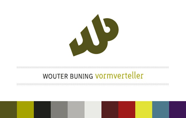
Wouter Buning: vormverteller —brand identity designer – http://wouterbuning.nl
As a young creative professional I believed working under one’s own name was a sign of uncreativity: a creative person should have a creative brand name. And I was convinced that potential clients would take a corporate brand more serious. I wanted to stay away from the ’21-year-old-working-from-mum-&-dad’s-attic’ image. So for many years I struggled in finding the brand name that suited me well.
I switched the name three or four times (once because of a pending lawsuit…). None of them endured. I never planned on expanding into a business (it always was going to be just me), so at some point I managed to let go of my former prejudices and finally decided using my own name as brand name. It’s been running for 5 years now and I’m still completely happy with it. Even now, my brand identity keeps growing on me.
Since my brand name wasn’t that creative there was room for a creative job description ;D So 2 years ago I invented the title vormverteller. That’s Dutch for ‘shapeteller’ derived from ‘storyteller’.
About the same time I added a few supporting colours to the existing pallet, enabeling me to promote different design services under separate colours. And in an identity project I always like to create a rich black and grey spectrum that fits the main colour, so each brand has it’s own black and greys. I guess that’s just an aspect of my design-lunaticness.
The logo mark is a typographical design solution. The idea was to create one strong shape for my initials, like a graphical/geometric signature, with an interesting balance between round and sharp edges. While I was sketching, I added a hint of 3D movement within a 2D shape. The rotation of the logo mark suggests looking upward and forward, adds some dynamic and I feel it makes the logo optimistic/future minded. I adjusted the ‘w’ to keep a solid base.
A little joke I implemented was a hint to the old ink dip-pens in the shape of the ‘b’. But the funniest thing happened a few months ago, when one of my students came up to me and said he thought the logo mark was a drawing hand: he never saw the initials. How is that for a bonus!
Andy Valde: Graphic Designer — http://StoneSoup3.com
Hi! My name is Andy Valde and I am a graphic designer for my company Stone Soup 3. Below is the description of our company and we can be found at StoneSoup3.com
“Stone Soup” originated as a French tale about 3 soldiers returning home from the Napoleonic Wars. They arrive at a village where they quickly learn that, because of war times, the villages are unwilling to share, trade or sell any food or supplied. So the Soldiers decide to bring an empty pot to the village square, fill it with water, place it over a fire and drop a large stone into the pot. One villager becomes curious and asks them what they are doing. They explain that they are making Stone Soup even though some potatoes would really make the soup taste much better. After hearing this, the villager decides they have some potatoes to spare. He brings the potatoes and drops them into the pot. As he does this, other villagers follow and contribute what they have.
This is a story of people coming together to reach an over all goal. This is exactly what our company Stone Soup 3 is. Each one of us contributes individually with our expertise to an overall goal. This way we help our clients, like the soldiers from the story, achieve success for their company. The number three at the end of our logo signifies our company trinity: Audience, Concept, Execution. Eric Lamkins, Heather Murray, and Andy Valde are the current contributors to the overall pot of creativity and execution. Learn more about us by visiting StoneSoup3.com.
