UPRAW Logo and Brand Identity Design with Letterpress Business Card
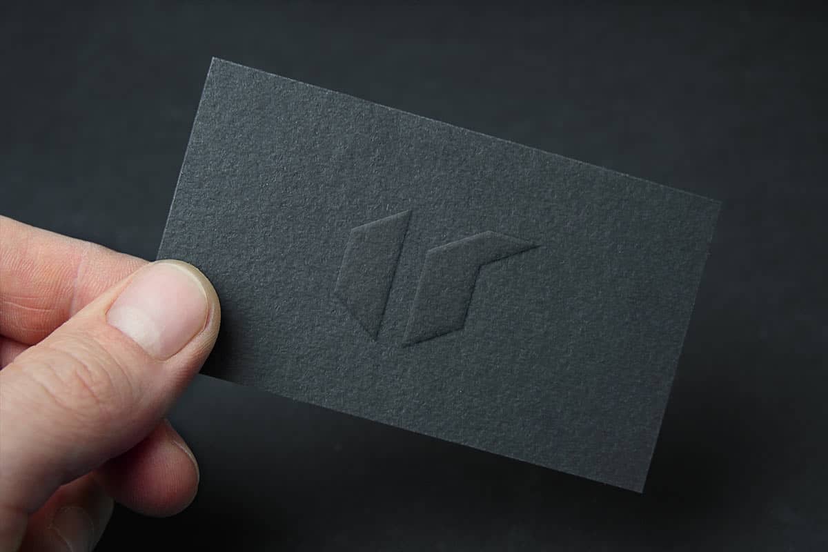
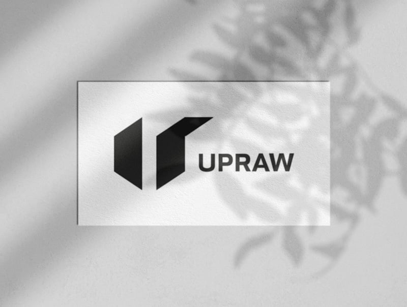
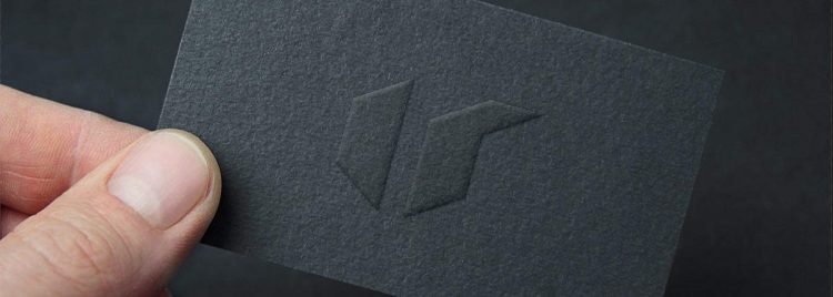
Really pleased with how my logo design for UPRAW has turned out, especially when seen as a letterpress business card, on some heavy textured black card.
As you can see from the image, the angular nature of the UPRAW logo mark, seems to work so well within the shape of the business card, and looks clean and precise as a raised mark on the surface of the card.
This is going to look nice in my logo portfolio.
UPRAW Negative Space Logo Design Process
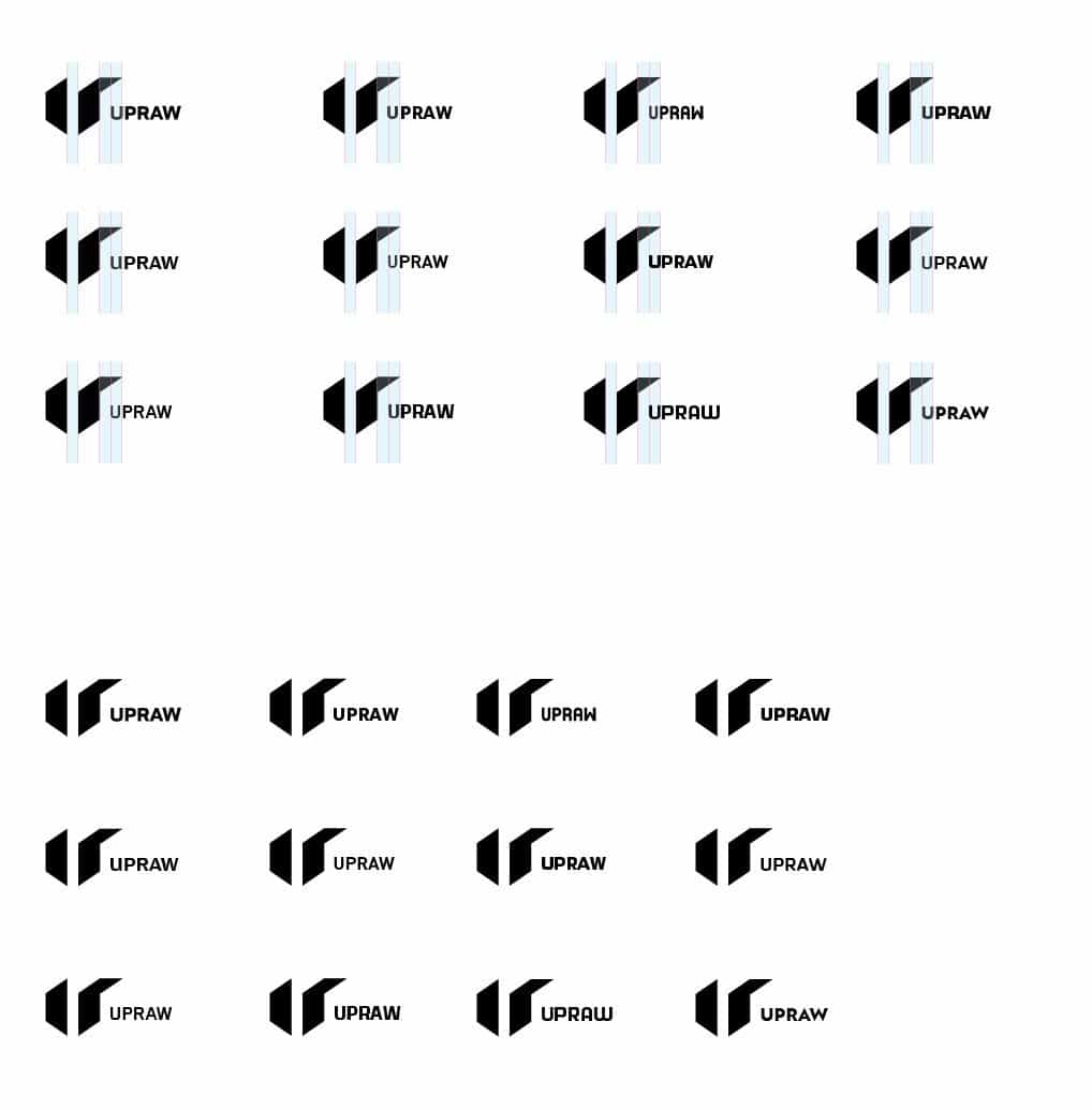
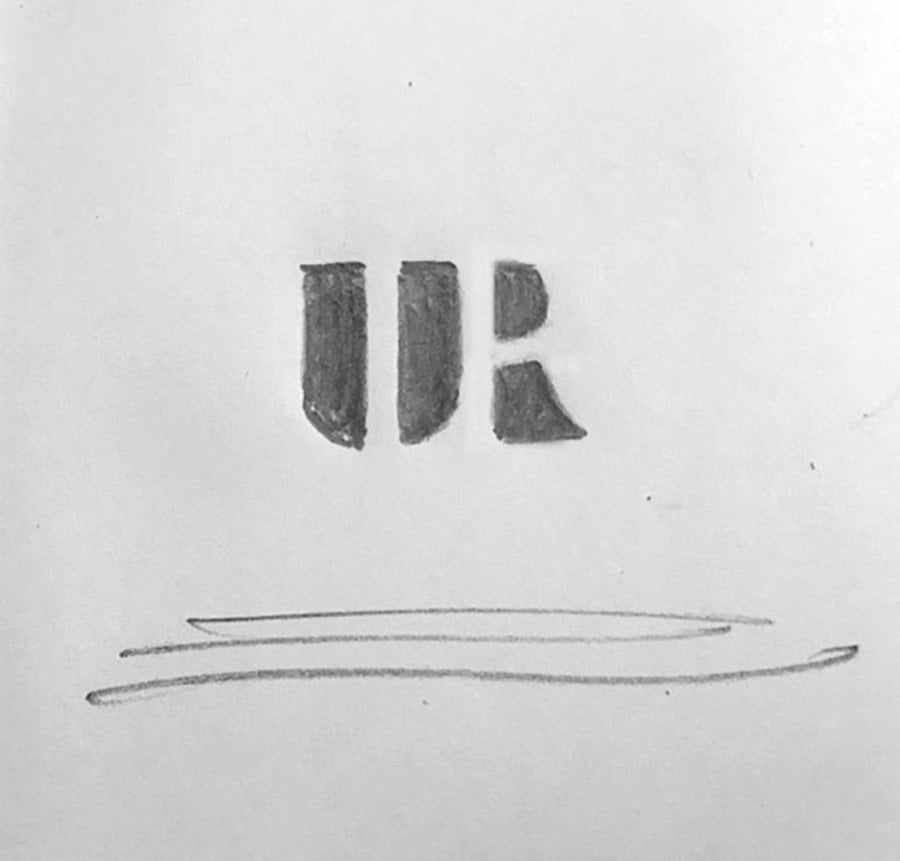
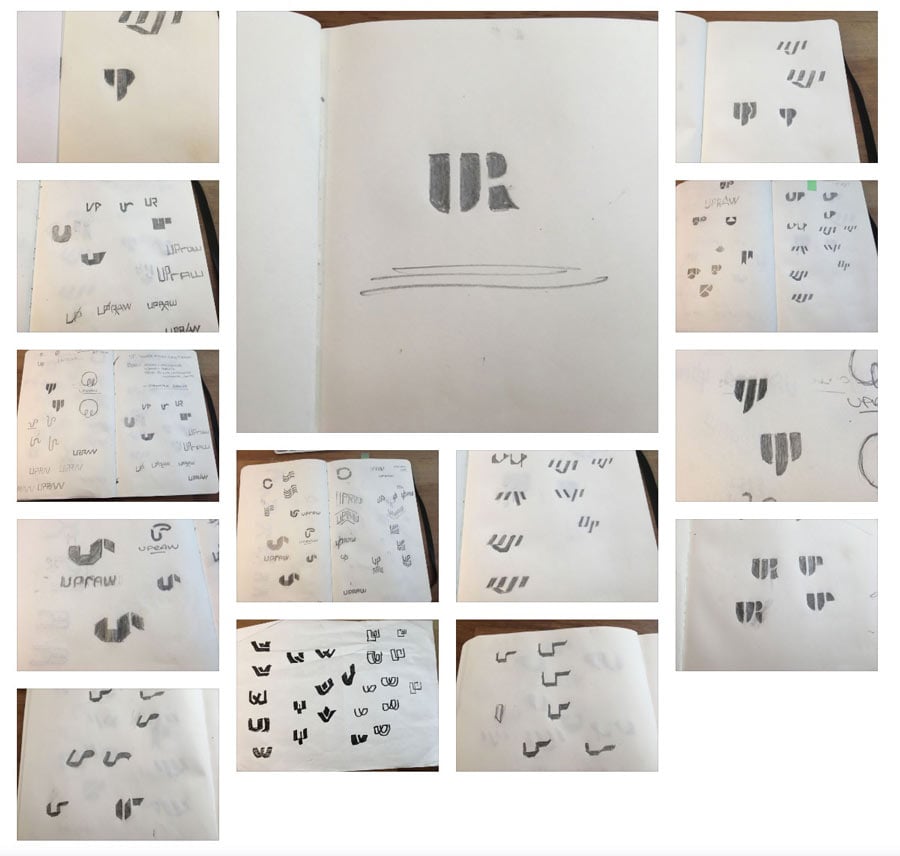
Here’s the very first attempts at vectorising the UR negative space logo sketch (below), that I have been working on over the last few weeks, for UPRAW.
The sketch shows how I’m trying to create a balanced set of initials, formed from the ‘U’ and ‘R’, but creating the ‘R’ from it’s own negative space.
Notice how i need to keep an eye on the proportions of the negative space, compared to the proportions of the ‘U’.
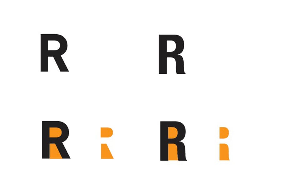
The proportions, mostly the overall width, of the ‘R’ need to look cohesive next to the ‘U’, which is relatively wide. You can see that the regular capital ‘R’ has very narrow negative space elements; shown in orange below.
Used two font styles (below), to get an idea of how the uppercase ‘R’ is styled in various fonts, and how the negative space elements (in orange) can vary from font to font.
The proportions of the ‘R’ need to be carefully created, so that it doesn’t look out of place.
It’s super important that when making this letter ‘R’ from such narrow elements, that it still needs to look like it could be a regular ‘R’, especially when viewed after the ‘U’, which is pretty much a regular shape ‘U’, but just cut into two, so more like a stencil.
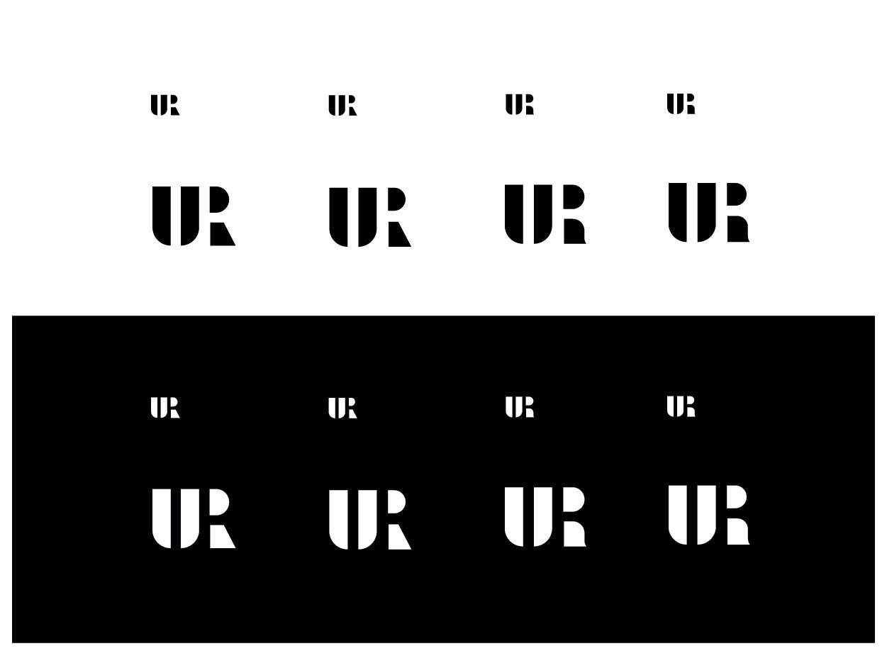
The image (above) shows my progress in recreating the UR in Illustrator as a vector.
I have created four slightly differing versions so far, to just get a feel for what form of ‘R’ will look the most cohesive, and natural looking, when viewed next to the ‘U’.
As I’m using the right hand side of the ‘U’ for form the R’s vertical left side, creating the right side of the R out of it’s own negative space, is actually pretty tricky, at least in a way that looks as normal as possible.
Further Updates
I’ll be updating this Case Study page, with additional images and text, during the life span of this logo design project.
Update: 7th January 2017
Taken a decision to move away from the ‘negative space’ style of logo design, and instead we’re now going with this stronger, bolder, cleaner and more impactful design.
Still based on the ‘ur’ initials, but in far more robust and angular way, which is far more in keeping with the UPRAW brand name.
Wikipedia: Letterpress printing is a technique of relief printing using a printing press, a process by which many copies are produced by repeated direct impression of an inked, raised surface against sheets or a continuous roll of paper.[1] A worker composes and locks movable type into the “bed” or “chase” of a press, inks it, and presses paper against it to transfer the ink from the type which creates an impression on the paper.
In practice, letterpress also includes other forms of relief printing with printing presses, such as wood engravings, photo-etched zinc “cuts” (plates), and linoleum blocks, which can be used alongside metal type, or wood type, in a single operation, as well as stereotypes and electrotypes of type and blocks.[2] With certain letterpress units it is also possible to join movable type with slugs cast using hot metal typesetting. In theory, anything that is “type high” or .918 inches can be printed using letterpress.[3]
