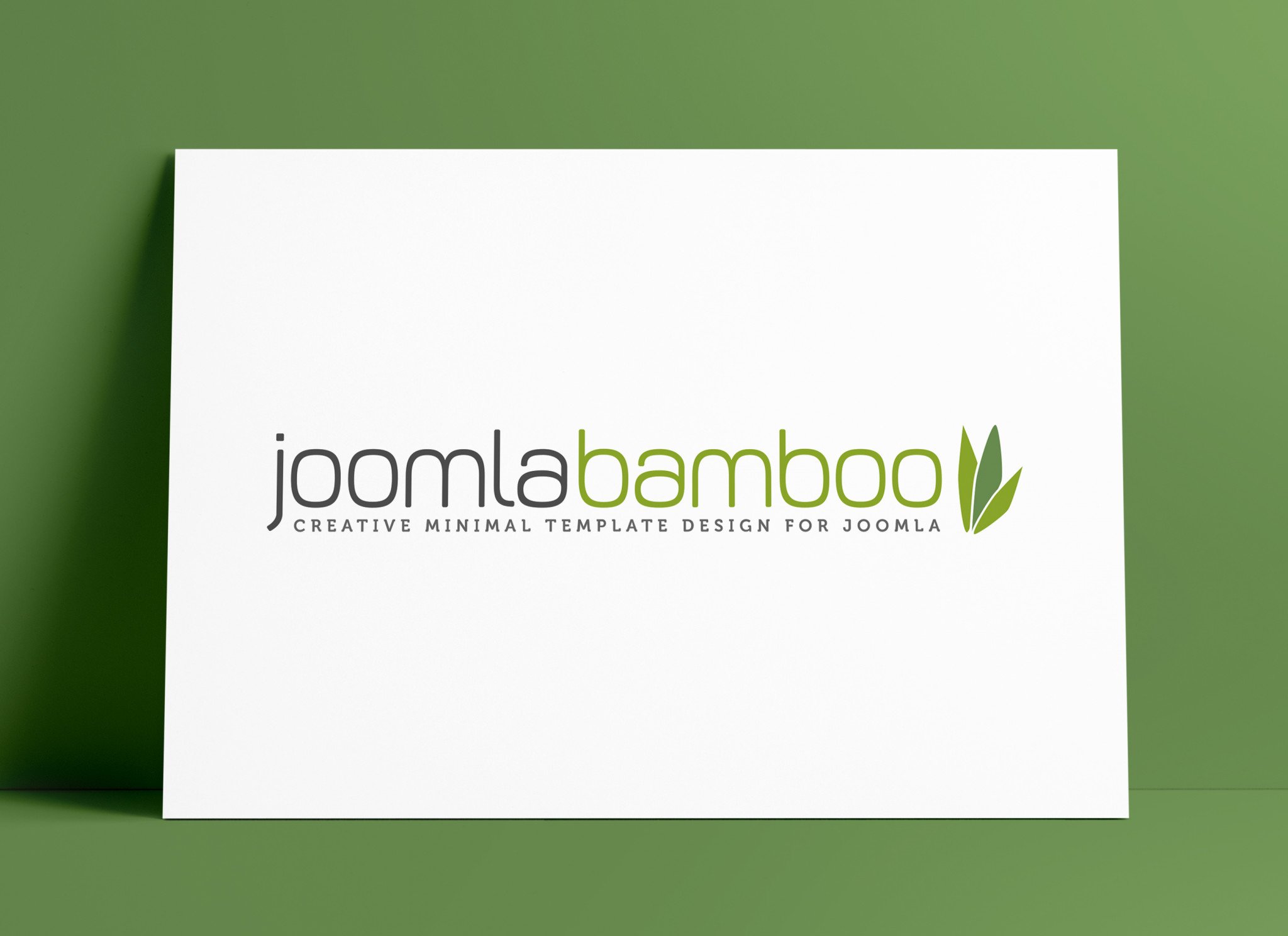
A relatively simple brief, and thus logo process and case study post, for this Joomla Bamboo logo design project. Right from the beginning I was able to get a handle on what the client wanted pretty instinctively.
About Joomla Bamboo
The Joomlabamboo family is a small collection of developers and designers who have one thing in common – we all love coding, designing and developing for Joomla.
One of the benefits of working in a small team for our club members is that you get direct access to the people who write the code, so our support is top notch and knowledge of our templates and extensions is deep and intimate … well enough of the spin – scroll down and meet the Joomlabamboo team.
Anthony Olsen – Lead designer and Head Bamboo
This logo is for a website, specializing in minimal Jooomla templates, so the ‘minimal’ bit was a pretty good clue.
It was one of those jobs where the client almost didn’t need a brief. Just pointed me to some previous site designs and say, “go for it.” It was for all intense and purposes, full artistic license. Woot.
The Initial Thoughts
Something very clean, minimal yes, but also in tune with the other obvious association, bamboo. The client himself is a experienced web developer, so with his previous template designs, I was able to get a very good feel for the style required.
Nice when this sort of project comes along, as they are pretty painless and just seem to flow.
Check the competition
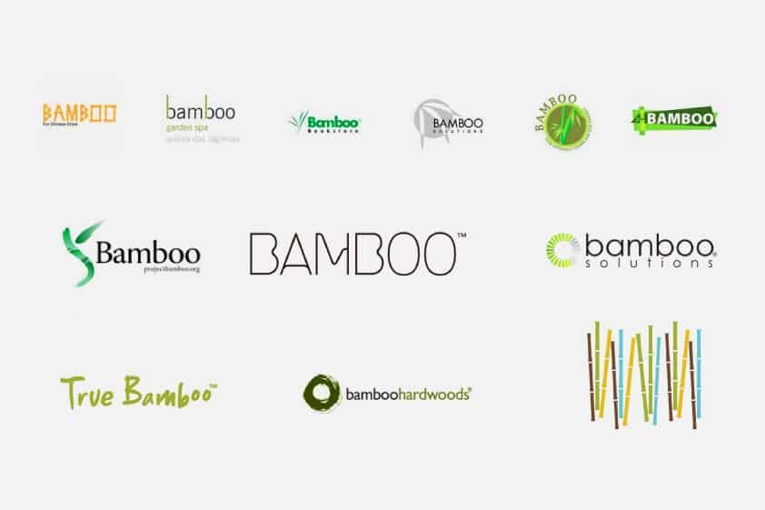
One of my few concerns was the cliché association of bamboo. I Googled bamboo logos and was not overly surprised to see a fair few bamboo orientated designs.
Many focusing on the iconic element of bamboo. This I desperately wanted to avoid, yet, you can’t totally ignore it given it’s a fundamental part of the company name.
Also, given the prolific nature of bamboo logo’s many variations and styles exist, so being totally original can be tricky. Being totally different for the sake of it can have complications with brand associations.
The logo mark
This proved to be a little more tricky, just because I had the overwhelming stench of ‘cliché’ stuffing up my senses.
In order to try to be as novel as possible, I referred back to the Google search of existing bamboo style logos and took a good look around.
This proved to be very helpful as I was able to sketch a few simple ideas that seemed to do the trick. Very simple shapes at the end of the day, bold and clean. And of course not overpowering in anyway, so thus avoiding the stench of ‘cliché’ nausea.
In the end it did not take too long to find the right one, a few ideas then it just seemed to work. So rather than fiddle and tweak for the sake of it, decided to leave it.
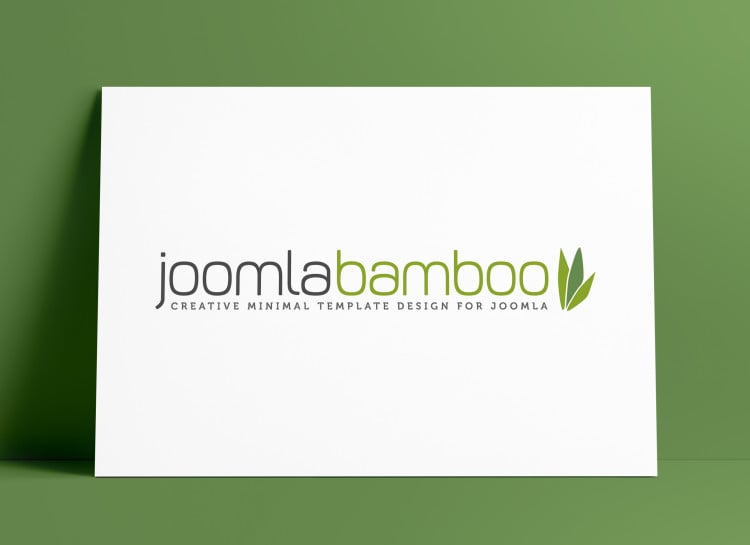
The test was putting it along side the wording and finding a position that worked, left, right, top, middle etc. The far right option was the least obvious option I felt, another method to distance myself from any cliché association. But also, it meant it was able to ride next to the word bamboo, so this felt right.
At the beginning I did play with some Joomla orientated marks, tried a few variations but almost felt more cliché than the bamboo.
The bamboo part is what distinguishes the brand over other Joomla designers, so this was the reason I left the Joomla association alone. Not to mention the Joomla logo is not a pretty thing. :)
Fonts
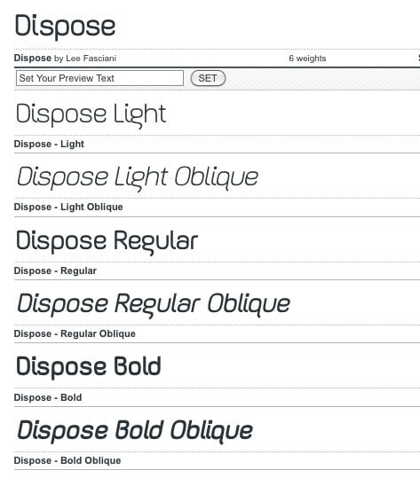
First step then, as usual for me is locating some suitable font choices. Fortunately for me, I had seen the perfect font just a few weeks ago.
The font in question is called Dispose from TypeTrust. I had not yet purchased it, but decided this would be the font. To me it instantly felt right, created the perfect mental image in my head. Think of bamboo and this font seemed the logical choice.
Yes, it was a reasonable purchase in terms of cost, I purchased the whole family, but it was a no brainer for me to buy. It was a significant asset to the overall design. Well worth the investment. And given the cost of some font families, the $150 actually seemed like a real bargain.
The Result
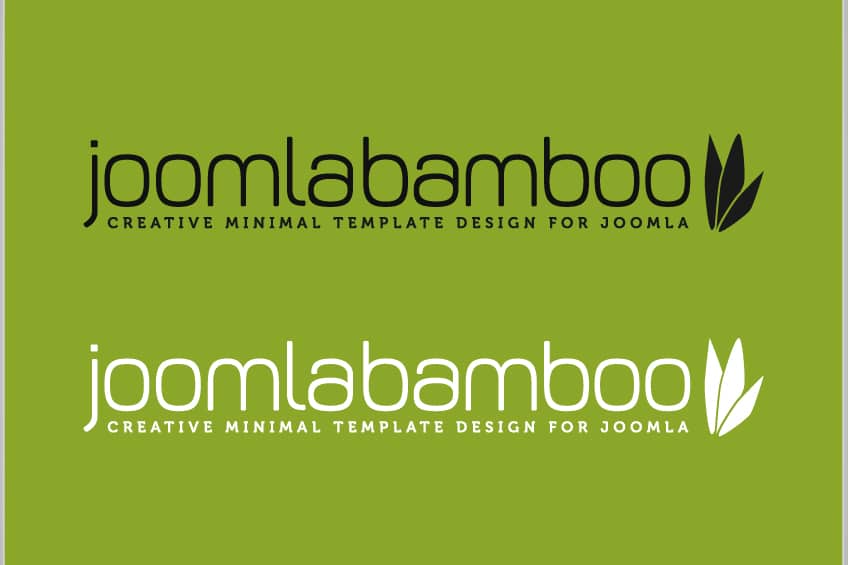
In keeping with most of my logo designs, this logo works in any combination of colours and backgrounds, from single colour monochrome to reversed out, gray scale etc.
It is just as vivid white on black background as it is black on white background.
This keeps the logo focused on delivering the message, not just the brand name but also helps clarify the nature of the brand itself, clean and minimal Joomla web site designs.
It was a fun project to work on, and thankfully, I was able to get over my deep disdain for anything overly cliché.
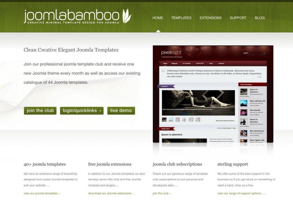
The finished Joomla Bamboo logo in context
The following image is the final logo design in place on the Joomla Bamboo website. This version shows how well the all white version works, relying on the background colour to highlight the logo.
Website : http://joomlabamboo.com
Twitter : @joomlabamboo
Client Testimonial for Joomla Bamboo
Client Testimonial: “Usually when two designers get together you can expect a little conflict in terms of design direction, but working with Graham was incredibly seamless.
I had a good idea of what I wanted for the redesign of the Joomla Bamboo logo but Graham made it infinitely better.
The final product shows his impeccable knowledge and sensitivity to typefaces – he ended up combining two – while the logo highlights his flare for creating minimal and yet powerful vector logos that help to convey the core essence of your business in a seemingly effortless way.”
Anthony Olsen – Lead designer and Head Bamboo
