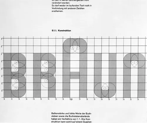
My goodness, when I first read the text on the Herman Miller (Read: Herman Miller logo design history) Logo Guidelines, I realised how quickly time has passed by.
As an apprentice in: traditional paste-up, artworking, platemaking, film planning etc, back in the 80’s, I remember vividly working with the biggest camera I’ve ever seen!
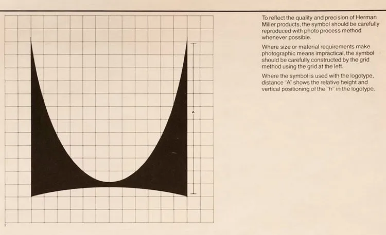
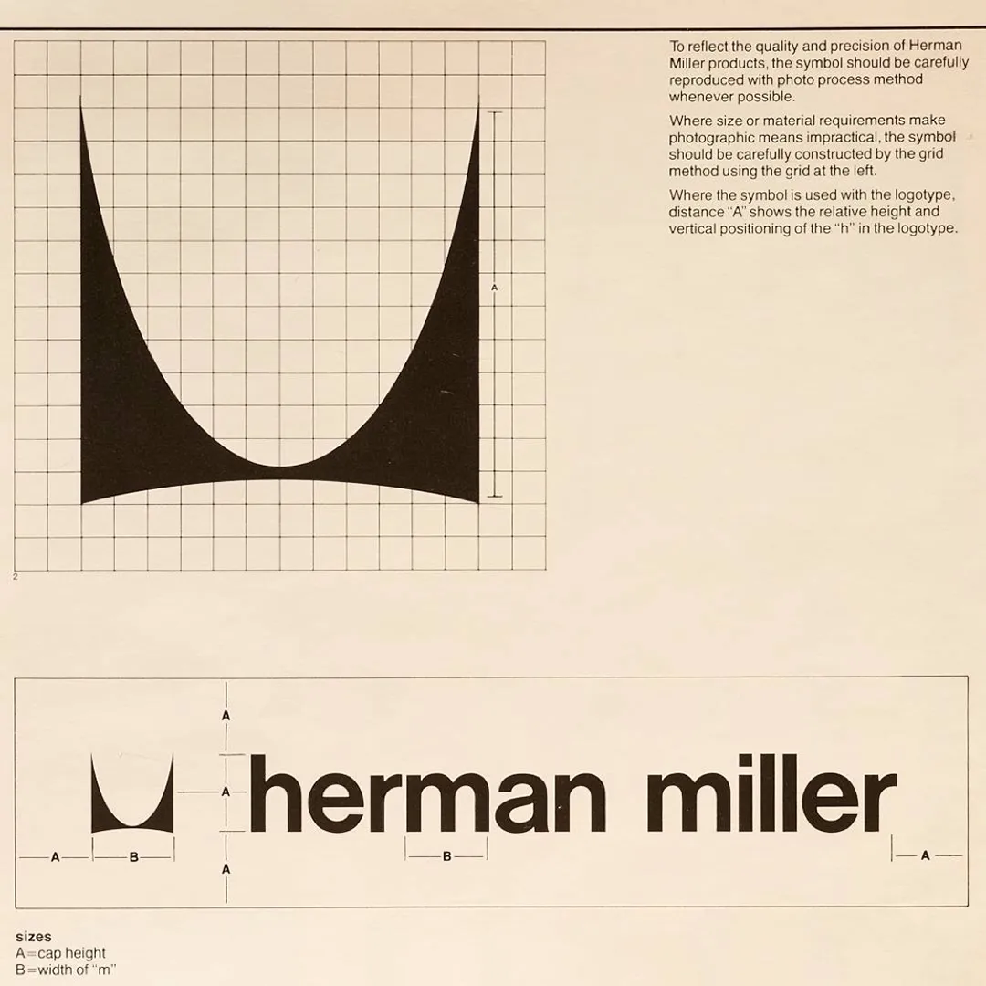
To reflect the quality and precision of Herman Miller products, the symbol should be carefully reproduced with photo process method whenever possible.
Where size or material requirements make the photographic means impractical, the symbol should be carefully constructed by the grid method using the grid at the left.
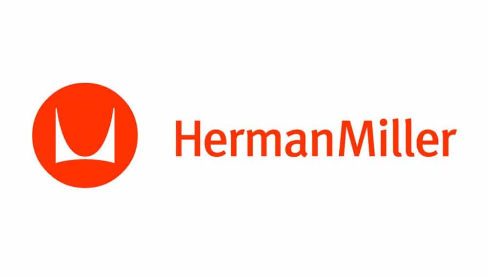
Where the symbol is used with the logotype, distance “A” shows the relative height and vertical positioning of the “h” in the logotype.
So after reading, “…carefully reproduced with photo process”, I instantly get taken back to these good ‘old’ times, where pretty much everything commercial print wise, required: precision, patience, hell a lot of skill, and pride.
I already know how I would have had to use the large format camera to reproduce this Herman Miller logo at various sizes, with camera film up to A2 in size!
And in the cases where using the camera wasn’t possible, so sizes upwards of A2, then yes, I’d have to redraw the logo on a card grid.
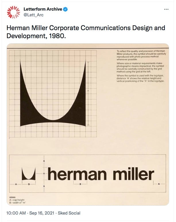
So anyway, this is a super cool find from the Letterform Archive, who tweeted this earlier.
I thought I had collected the majority of old and vintage logo grids, but obviously I was quite wrong.
So another nice piece of logo history to add to the collection, and one thats already on my list to recreate.
Herman Miller Logo Guidelines – Wonderful Piece of Logo History
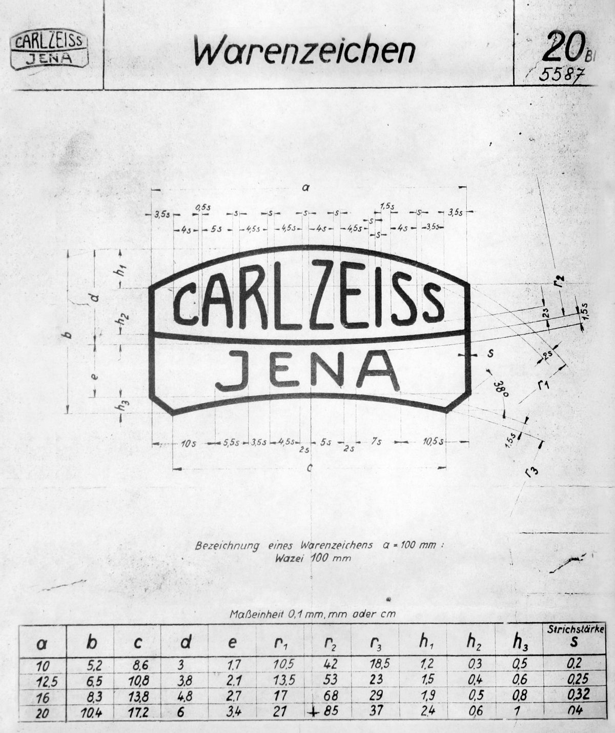
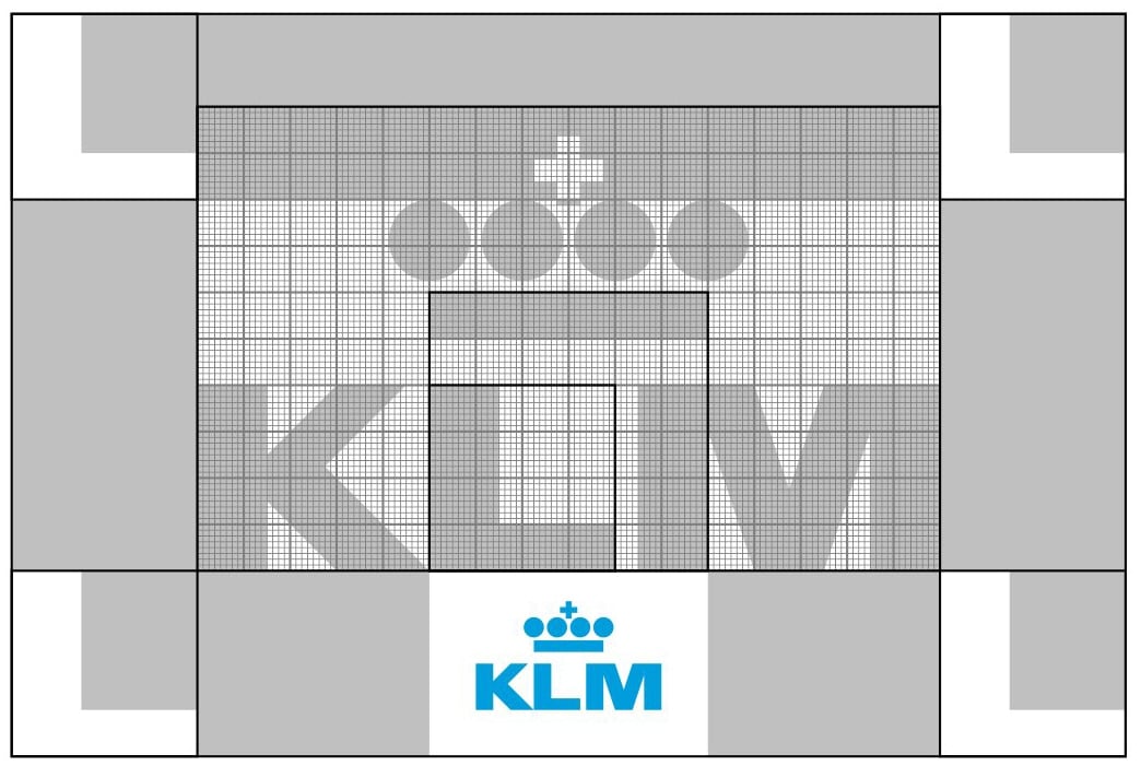
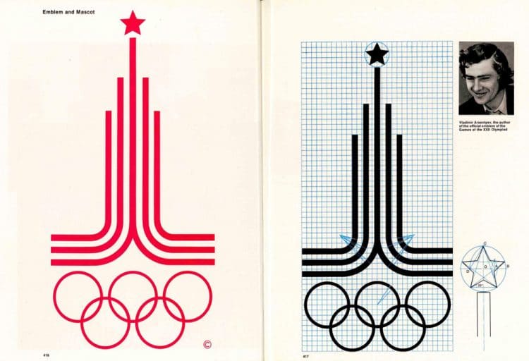
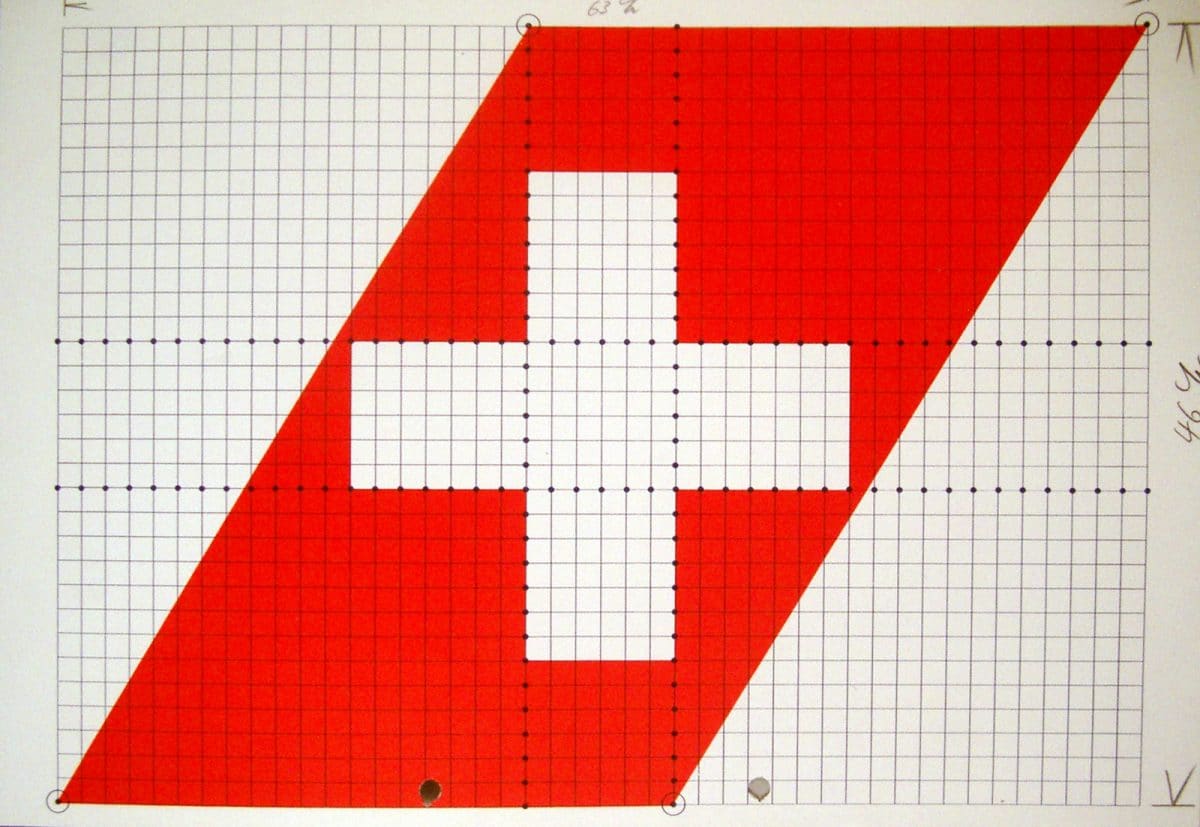
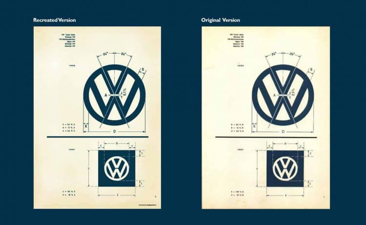
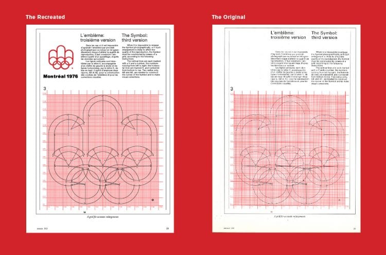
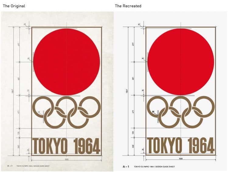
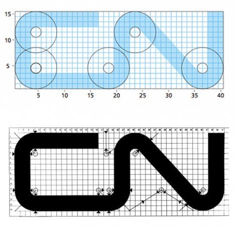
More examples of historic and famous logo designs, and their construction:
