
A Brief History of the Virgin Logo
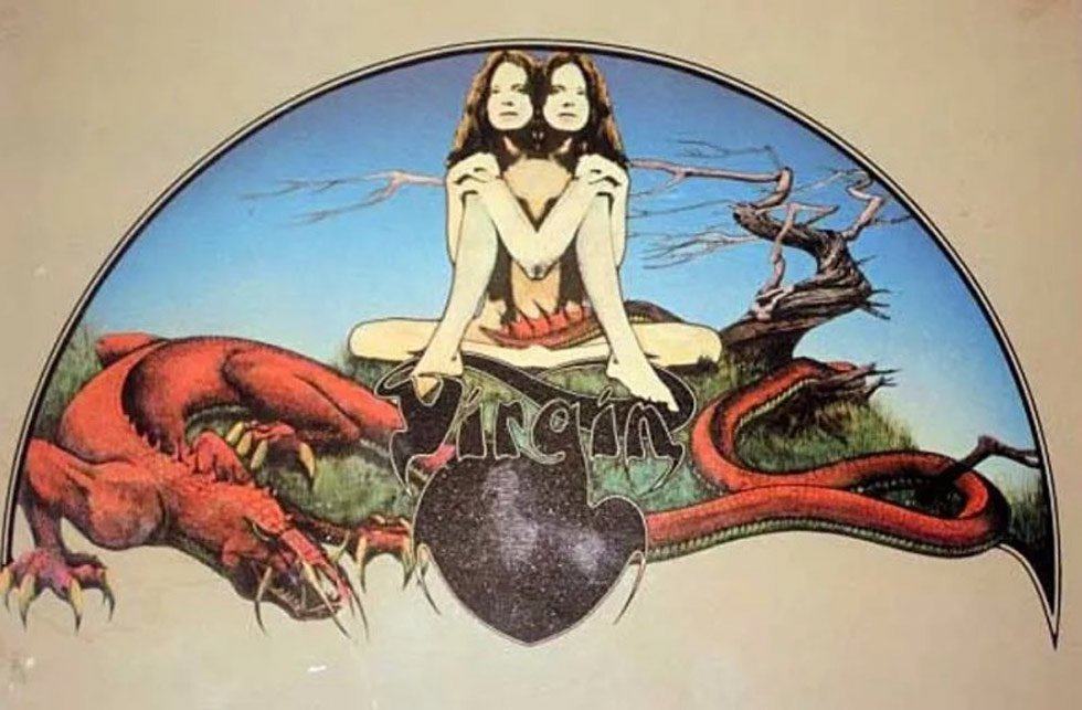
The original Virgin Logo Design was used for Virgin Records way back in the 1970’s, and the logo was designed by English artist, and illustrator, Roger Dean.
→ Came across this post on Virgin’s official blog: Virgin Logo Design
Biography
ROGER DEAN was born in England in 1944,and is an artist and designer internationally renowned for his, album cover designs, posters, books, the revolutionary publishing companies, Dragon’s Dream and Paper Tiger, Eco architectural, furniture and stage design, as well as typefaces, logos and iconic designs for computer games company, ‘Psygnosis’ and redesigned the Tetris Logo.”
Read the rest of the Biography on Roger’s official website: http://www.rogerdean.com/biography/
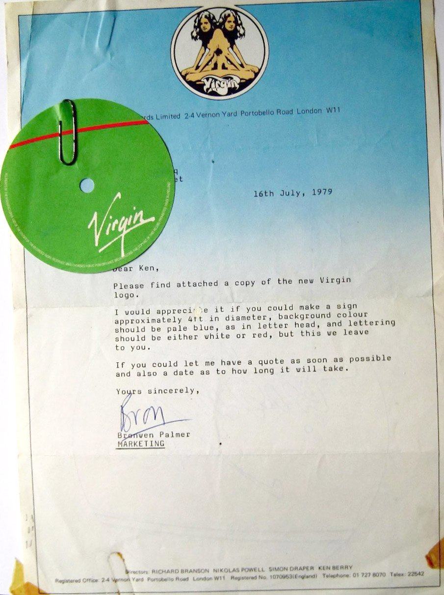
Dear Ken, Please find attached copy of the new Virgin Logo.

The letter shown below was sent in 1979–attached to the letter with the original naked-twins logo letterhead) is a copy of the more familiar Virgin logo.
Virgin: It [the twins logo by Roger Dean] was an embodiment of the early-70s and really summed up the feel of the brand and the artists we represented.
However by the time 1977 rolled around, and we’d signed The Sex Pistols, the logo began to feel a little dated, and didn’t overly reflect the direction we were headed.
Edgy and Less Hippy
So it would appear that in this later period of Virgin’s business, a more ‘edgy’ and less ‘hippy’ logo design was called for. Got to love the word ‘edgy’…
Part of the reason for this logo update were due to plans to expand Virgin into other industries, so something ‘stylishly simple’ was needed.

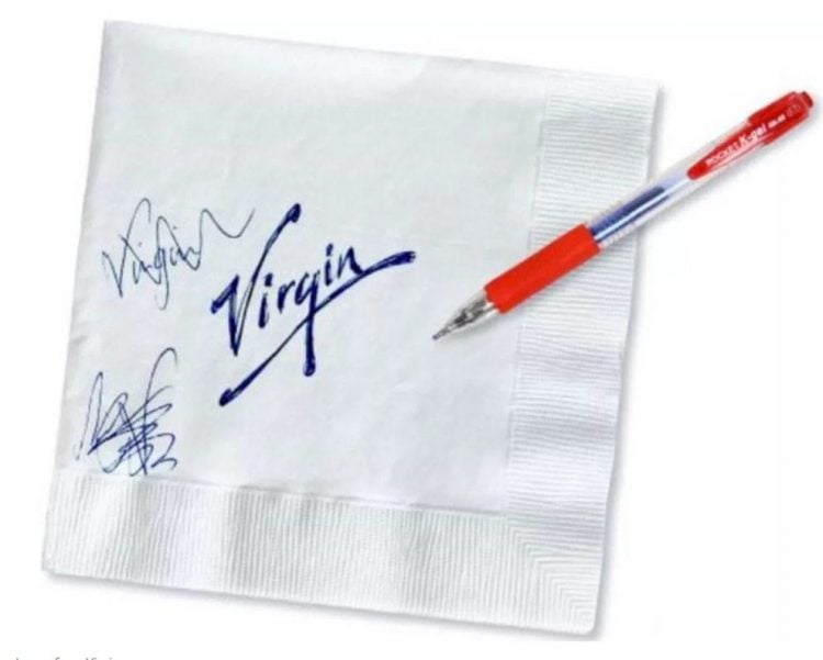
The Original Virgin Logo Napkin Doodle Sketch
This is my favourite part, as I’m always referencing the ‘napkin doodle’ to my new clients.
A way to explain how some of the creative brainstorming process can come about, something as rough as a few words sketched on a napkin can lead to mighty mighty things.

I’ll be referencing this in my client communications from now one, as some of my past clients don’t seem to believe me when I say ‘napkin doodles’ can often lead to the chosen logo design.
In Virgin’s case, it was a young designer who came to meet Mr Virgin on his houseboat, and whilst talking about about the logo, scribbled what you see on the napkin.
And that was it, it was love at first sight!
Mr Branson: “It looked like a signature. It had attitude. It had energy. It was in-your-face simplistic.”
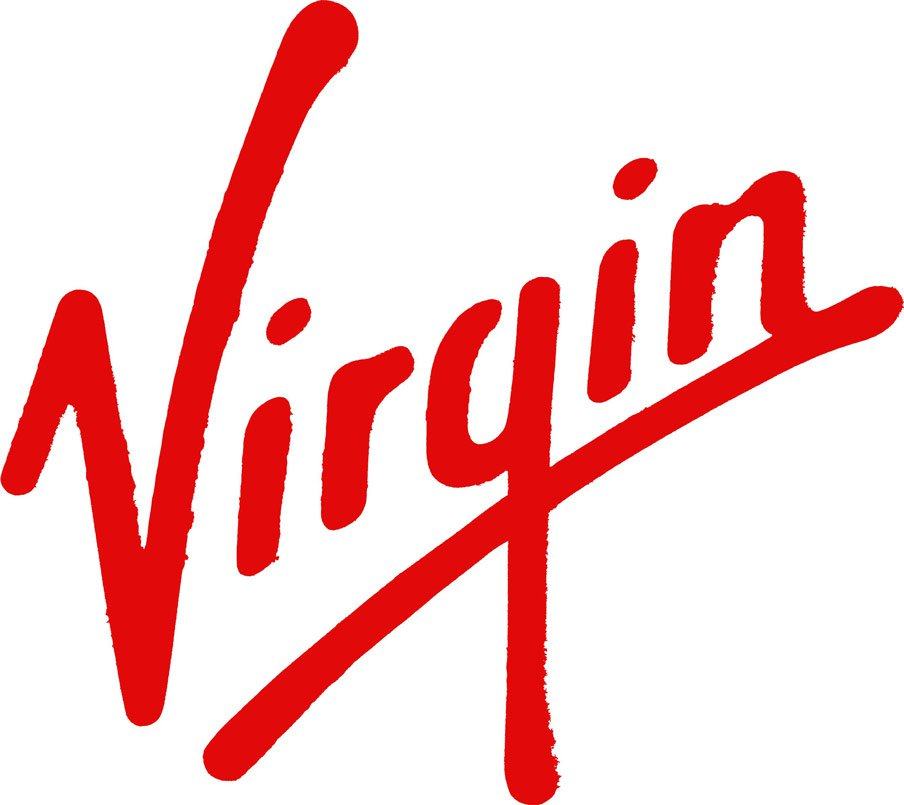
This original Virgin logo sketch became the official brand mark of Virgin in 1979, and has since disrupted everything from air-travel, to banking, health clubs and hotels.
No denying that the Virgin logo is one of the world’s most recognisable brands.
Virgin Logo Refinements

Apart from the original naked twins logo, the Virgin logo has seen a few subtle refinements over the years, but nothing has dramatically changed in these intermediate updates.
I wonder when and if the next Virgin logo update will happen…