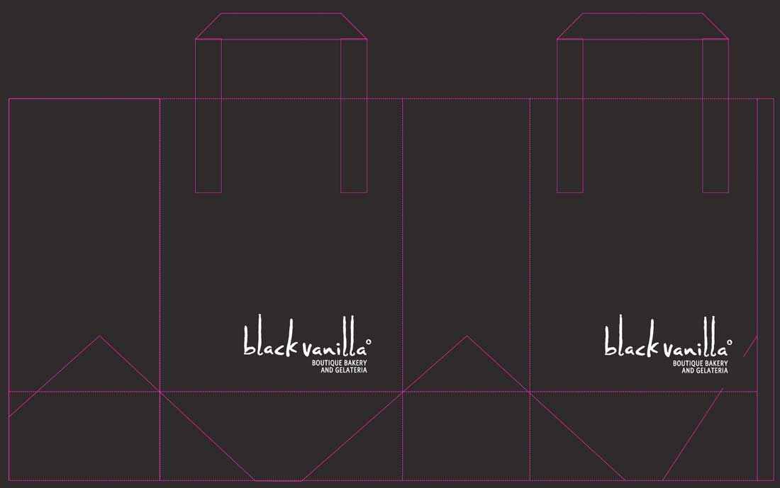
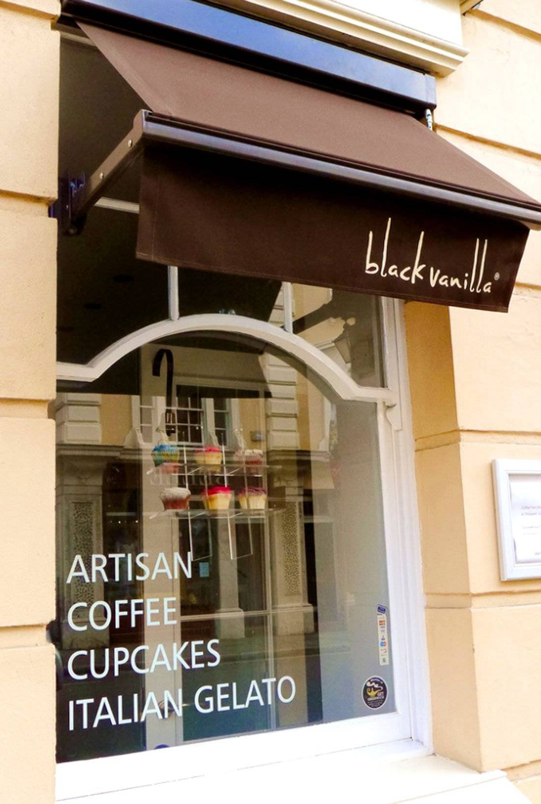
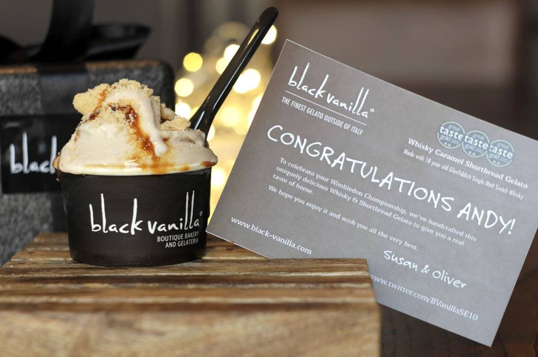
The Logo Smith designed the Logo & Brand Identity Design for, BlackVanilla – Boutique Bakery & Gelateria, which included: Logo Design; Stationery Design; Design and Artwork for all Interior and Exterior Shop Signage; Design artwork for Packaging: Cups, bags, boxes etc

Since the opening of the initial Blackheath location, they has opened another location in Greenwich which is a “Champagne Bar and Gelateria.”
There are now two subtle variations of the logo, each one with the appropriate location tag-line.
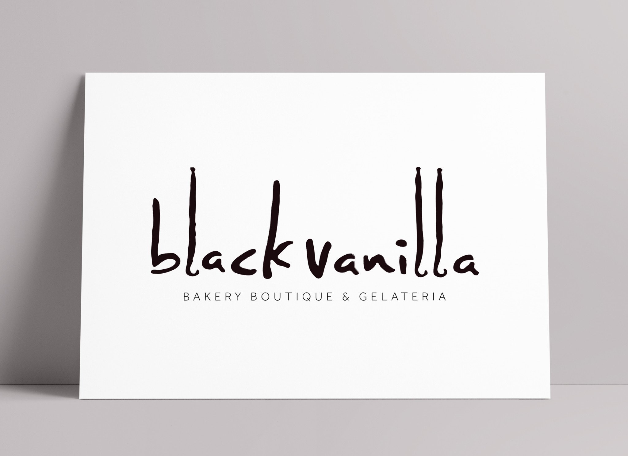
The Logo Design based on Vanilla Pods
The final logo design has settled on a visual link to Black Vanilla, the 3 letter L’s. These are the shape of actual Black Vanilla pods. Interestingly, the client said that one of the things that should be avoided was any kind of handwritten font, yet here we have a handwritten style font.
Rather than any obvious cup cake, coffee, ice cream style references, we have a direct link to the shop name, and one of the key ingredients, the very expensive Black Vanilla pod.
Typography and Custom Lettering
Whilst scratching my head for inspiration, I was just playing with some random fonts and ‘accidentally’ selected a certain hand styled font, which happened to be right next to a photo of a vanilla pod on my pasteboard.
I saw the similarity with the shape immediately, and pretty much knew this would be the subtle ‘play’ needed. Once the client first saw the font he was quite surprised at how much he liked the hand written style of lettering.
The Black Vanilla wording has been redrawn from scratch, using the initial font as a rough template so it fits better with the actual shape of the vanilla pods.
The edges have a subtle rough texture, so when the logo is blown up for the shop signage, it should look half decent. Repeating letters have also been modified so each occurrence is different, namely the a’s.
To be able to, and quite neatly, integrate the visual suggestion of a vanilla pod into the logo, created a nice natural association to the brand name.

Client Testimonial from BlackVanilla
Client Testimonial: “Well, what can we say: a job fantastically well done! You should be feeling very happy right now as we are overjoyed with the final version it has really exceeded all our expectations.
The only other occasions I have said this was looking at both my newborn girls.
Thank you for all your help and patience and always being so very versatile. We were so surprised to have someone so willing to go the extra mile to make sure it was just right (a quality which is hard to find with designers).
But your patience and hard work has paid off, and I think that we are onto a winner here.
Great job, but would not really expect much less from you!”
Jeremy & Susan Stretch
