Skip to the content
The Logo Smith
Website & Logo Design Studio
  • → Work with Smith.™
    • Contact
  • Monomarks
  • Portfolios
    • Logo Portfolio – Page 1
    • Logo Portfolio – Page 2
    • → Download Portfolio PDF
    • The Brand Gallery
    • Logo Grids
    • Logo Redesigns
    • Logo Sketches
    • Logo Case Studies
    • Brand Logo Reversions
    • Logo Designs for Sale
  • FAQs
  • About
    • Website Info
  • Testimonials
  • Blog
Search
Menu
Close search
Close
  • → Work with Smith.™
    Show sub menu
    • Contact
  • Monomarks
  • Portfolios
    Show sub menu
    • Logo Portfolio – Page 1
    • Logo Portfolio – Page 2
    • → Download Portfolio PDF
    • The Brand Gallery
    • Logo Grids
    • Logo Redesigns
    • Logo Sketches
    • Logo Case Studies
    • Brand Logo Reversions
    • Logo Designs for Sale
  • FAQs
  • About
    Show sub menu
    • Website Info
  • Testimonials
  • Blog

© 2020 The Logo Smith.™ Logo & Brand Identity Design Studio.

Anatomy of a Logo: The Star Wars Logo Evolution by Alex Jay


star wars logo

Anatomy of a Logo: The Star Wars Logo Evolution by Alex Jay

This is referencing a super detailed blog post by Alex Jay, that covers every variation of the Star Wars emblem, badge, lettering, and logos.

I had no idea so many variations were used prior to the famous final logo designed by Suzi Rice.

I’m not going to expand or even attempt to belittle Alex’s post, except to very briefly summarise the key stages in the Star Wars logo design evolution.

For the full detailed commentary, with lots of photos visit Alex’s post a breathtaking examination of the Star Wars branding:

Anatomy of a Logo: The Star Wars

My plan is that I’m going to pick one image from Alex’s post that is representative of each the logos iteration. This post is brief, but hopefully shows you a quick look at how the logo evolved.

Logo #1: Film’s pre-production decal

During the film’s pre-production, a decal (above) was produced. In the first Official Star Wars Fan Club newsletter, reprinted in the Star Wars Scrapbook (Chronicle Books, 1991), there was an explanation about the decal by Ralph McQuarrie, who did the art.

Logo #2: Corporate Letterhead Version

star wars logo letterhead

The decal designed by Ralph McQuarrie was dropped, and a new version was used for the coporate letterhead, which was designed by Joe Johnston.

Notice that the figure & sun illustration, from Ralphs first decal, was still used with the new lettering designed by Joe, for the letterhead.

Below: Banner with the revised logo with a super young Mark Hamill at the 1976 San Diego Comic Con.

Logo #3: Book Cover art using Helvetica

star wars logo in Helvetica

Yes it’s true! Helvetica even made it into a Star Wars logo.

In December 1976, a novelization of Lucas’s screenplay, ghost-written by Alan Dean Foster, was published by Ballantine Books. The cover art was by McQuarrie and the cover fonts are from the Helvetica family.

Logo #4: Vanishing Point Logo

vanishing point star wars logo

The 4th variation of the Star Wars logo was designed by Dan Perri, which was meant to be used for the opening sequence, but it was not used.

Instead, it was used for various print posters and advertisements.

This is where we start to see the more familiar look of the modern day Star Wars logo, but it took 2 more designers to end up with the final Star Wars logo.

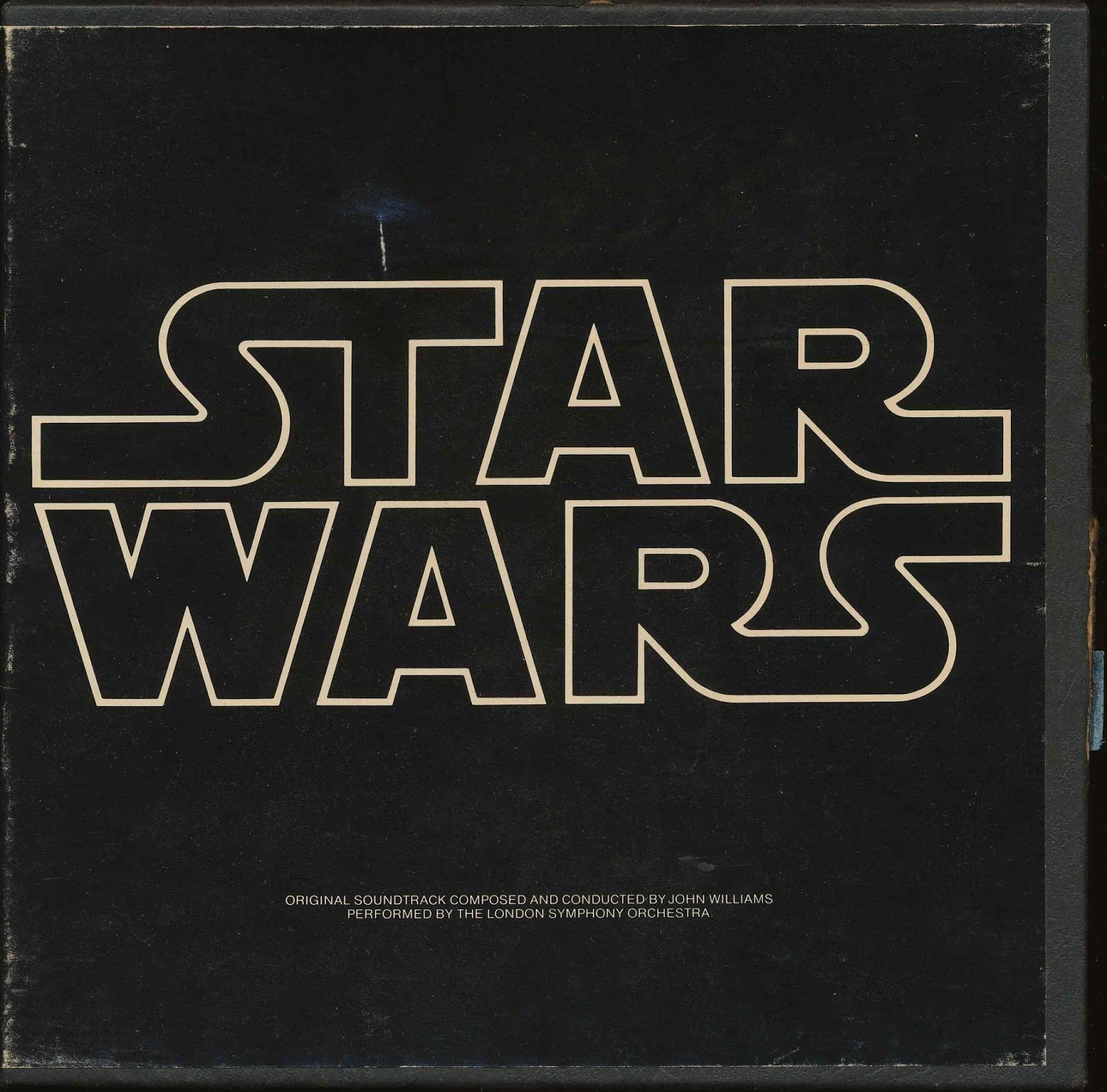
Logo #5: The New Star Wars Logo

Star-Wars-logo-designed-by-Suzy-Rice

This is where we get to the more familiar version of the Star Wars logo, and this version was designed by Suzi Race.

George Lucas turned to Suzi to design the logo, which is documented in the Star Wars Poster Book (Chronicle Books, 2005):

“…Though the poster contained no painted imagery, it did introduce a new logo to the campaign, one that had been designed originally for the cover of a Fox brochure sent to theater owners….Suzy Rice, who had just been hired as an art director, remembers the job well. She recalls that the design directive given by Lucas was that the logo should look “very fascist.”

“I’d been reading a book the night before the meeting with George Lucas,” she says, “a book about German type design and the historical origins of some of the popular typefaces used today—how they developed into what we see and use in the present.” After Lucas described the kind of visual element he was seeking, “I returned to the office and used what I reckoned to be the most ‘fascist’ typeface I could think of: Helvetica Black.”

Inspired by the typeface, Rice developed a hand-drawn logo that translated well to the poster campaign, and ultimately to the movie itself. “I did have the screen in mind when I drew the logo originally,” explains Rice, who “stacked and squared” the words to better fit the brochure cover. It was an aesthetic choice that has lasted nearly three decades.

The now-familiar “S” ligature extensions that Rice drew were modified a bit after Lucas “remarked that it read like ‘Tar Wars,’” says Rice. “He asked me to make some revisions on the leading and concluding ‘S’.

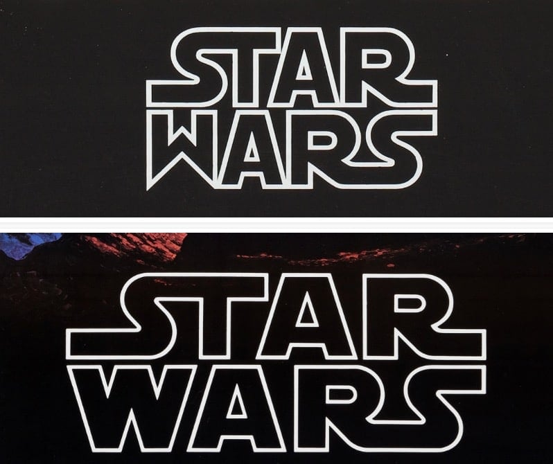
Logo #6: The New Star Wars Logo Revised

Although Suzi Race is credited for designing the Star Wars logo, it did take a few tweaks from Joe Johnston to create the final final version of the Star Wars logo.

The most noticeable change being to the W, along with some other lettering tweaks.

Suzi’s version top, and Joe’s version bottom:

The End

So there we sort of have it.

I’ve literally condensed down Alex jay’s comprehensive breakdown into just a few images, but you really must visit Alex’s thorough post to see all many images and explanations for each of the versions.

But today is the day I first realised that Helvetica was used, in a very small part, as a Star Wars logo.


  • Post categories In Famous Logos, Logo Design
  • Tags Logo Design Evolution, Star Wars, Star Wars Logo

Post navigation

←Previous post:Solara Car Wrecks – Acrylic Colour Paint on 144 Scraped Cars by Zoer
→Next post:Tokyo Olympics 1964 Logo Guide by Yusaku Kamekura – Download Recreated Vector Poster

View Posts by Category


Subscribe To Updates

→ RSS Feed

I'm not a prolific blogger, usually 1-3 posts a week, sometimes there maybe a few weeks of nothing. If you'd like to receive Blog updates, then you can subscribe by a generic RSS feed which you can feed into any RSS compatible app/reader.


Posts of Note

→ 1970’s Vintage Racing Logo Decals.
→ Manor Racing F1 Posters.
→ Brand Reversions: Logo Swap.
→ Unevolved Brands: Logo Simplification.
→ Typography Primer: Free PDF Book.
→ Paul Rands Unused Ford Logo from 1966.
→ Vintage NASA Animated Logos.
→ Retro Apple Corporate Identity Guidelines Notebook.
→ IBM 8-Bar Logo.
→ Fender Logo Design Evolution.
→ Download the new Formula 1 Fonts.
→ Vintage 1960's Air Canada Poster.
→ NYC Transit Authority Graphics Standards Manual.
→ Denver 1976 Olympic Bid Poster & Logo.
→ 1976 Olympics Discover Denver Hockey Poster.
→ Pantone Colour References for Boba Fett.
→ Unrealised DC Metro Subway Map Designs.
→ Tokyo Olympics 1964 Logo Guidelines.
→ Behind Sony's Vaio Logo.
→ Vintage Pepsi Ad – Pepsi Cool Cans.
→ Vintage Polaroid Branding, by Paul Giambarba.
→ CN Logo Designed by Allan Fleming.
→ Pantone Colour References for Boba Fett.
→ 1980 Moscow Olympics Logo Grid.
→ Vintage Beano Brand Guidelines.
→ 1976 Montréal Olympics Logo Standards.

→ WipEout Logo History.
→ NASA Style Guide - The Full Version.
→ Historic Coca-Cola Logo from 1890.
→ NASA Graphics Standards Manual, 1976.
→ Evolution of Batmans Logo 1941-2007.
→ British Steel Logo 1969-1999.
→ 80’s TV Show Action Figure Brand Logos.
→ Social Decay Brand Logo Series.
→ Ideas for the 1st iTunes Icon.
→ Susan Kare: Apple Macintosh Icon Prints.
→ Famous Logos Redesigned in Retro 1980’s Style.
→ Monster Compilation of Record Label Logos.
→ Vintage Swissair Poster Designs.
→ Vintage Carl Zeiss Jenna Logo Specs.
→ Argentina Football World Cup Logo 1978.
→ Vintage Porsche 356 Color Charts.
→ Vintage Colour Charts through History.
→ Famous Brand Logos MUCH MUCH Bigger.
→ 3M Logo Evolution, 1906-2012.
→ Evolution: 007 James Bond Movie Logos.
→ 5 Phrases Of Massimo Vignelli.
→ Chinatown: Western Logos Translated to Chinese.
→ The Evernote Logo & Icon Design.
→ Sony Playstation 1 Logo Concepts.
→ 1968 Mexico Olympics Logo & Brand ID.


Thank you for Visiting The Logo Smith aka smith.™ Forging the Highest Calibre: Logo Marks, Brand Marks, Type Marks, Word Mark, House Marks, Signature Marks, Emblems, Symbols & Icons, way back since the 1986's.


Smith’s Footer

  • Smith at Home
  • Hire Smith
  • Portfolio’s
    • The Monomarks Collection
    • → Download Portfolio PDF
    • Logo Portfolio – Page 1
    • Logo Portfolio – Page 2
    • Brand Logo Reversions
    • The Brand Gallery
    • Logo Sketches
    • Logo Grids & Construction
    • Logo Redesigns
    • Logo Case Studies
    • Logo Designs for Sale
  • About The Logo Smith
    • Client FAQ & Q&A
    • Client Testimonials
    • Website Info
  • The Design Blog
  • Contact Smith

Smith has over 29 years of commercial experience, and has accumulated a wealth of knowledge in: Logo & Brand Identity Design; Logo & Brand Redesigns & Updates; Website DesiPrint & Digital Design; Typography; Photography; Reprographics, Lithographic & Digital Printing; Advertising & Marketing.

speak: +44 7816 527 462
write: hello@smith.gl
google: g.page/thelogosmith
tweet: @thelogosmith
subscribe: RSS Feed

The Logo Smith aka Smith
10 Badgers Copse
Seaford
East Sussex,
BN25 4DF. Great Britain.

© 2021 The Logo Smith aka Smith.

Hey! Work with Smith