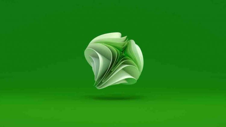
A Beautiful and Official ‘Unused’ Xbox Logo Animation, by ManvsMachine (www.mvsm.com), in which I’m loving everything about it.
Just look at the Xbox logo; how it beautifully reveals itself, almost like the reverse of a flowering tulip. Those hues of green are sublime.
This is some seriously fine animation right there!
About
Man vs Machine: “When Microsoft launched the Xbox One they commissioned Man vs Machine to design their global motion brand identity.
The Xbox logo animation is one of their most iconic brand elements and our task was to translate their new logo into a full 3D brand language, with this item being the long form brand expression.
A key aim was communicate how the brand has made the transition from core gamers to people who love music, television, films and apps.
It’s evolving towards broad entertainment. Xbox has become a premium experience.
As a result we wanted to play on the idea that Xbox is constantly reinventing itself. The brand development film focused on a rhythmic self-generating X; a dynamic spherical form which simulated the evolving nature of the brand.
We designed the resolve to feel clean and effortless, seamlessly folding together multiple layers into the logo.”
Credits
Client: Microsoft
Concept, Design & Direction: ManvsMachine
Creative Director for Xbox: Ramiro Torres
Xbox ~ Motion Brand Identity from ManvsMachine on Vimeo.