
Making Geometric Type Work by Ian Moore
If you are into designing type, creating letters and words for logo designs, then I highly recommend your read this article by Ian Moore: Making Geometric Type Work
It covers the most crucial aspects when designing any kind of geometric type, details that are often not considered at the beginning, but make all the difference when applied.
Here are a few examples from the article:
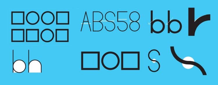
Stroke Widths

The horizontal and vertical strokes should not be the same thickness. If they are, the horizontal strokes will look heavier. An example above shows how a visually monolinear typeface such as Futura, has subtle adjustments to the horizontal strokes to make them appear even.
The Joins

At the point where two strokes meet or cross each other, the join is liable to “clog up”. A typical example above, shows a circle attached to a vertical line to create a ‘b’. A heavy area appears where the curve tries to pull away from the straight. By trimming a little from the inside, it pushes the curve down in the right direction.
Overshoot

Unfortunately, lining up straight and curved edges using guidelines does not work. In the above example, the circle is the same height as the two squares, but appears to be significantly smaller. To compensate for this optical illusion, the curve needs to increase in size so it seems level with the horizontal lines.
The S
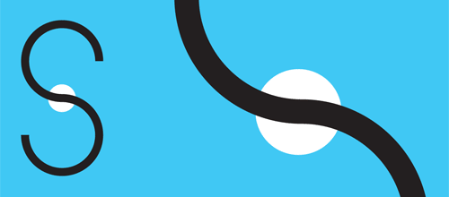
The ‘S’ is a difficult character to get right, it relies on a careful balance of two open counters both horizontally and vertically. The classic “cut and shut” technique of pushing two semi-circles together leaves a tell-tale kink in the middle. This meeting point has to carefully smoothed out to give the impression of one long stroke.
A small clip from the article:
For graphic designers beginning to experiment in type design, a geometric or modular typeface is a natural starting point. Illustrator and other programs offer a simple collection of elements such as circles, squares, and triangles which can be combined to create a passable alphabet.
This is the same route I took when dissatisfied with the limits of commercial fonts at the time. I twisted and distorted each character to fit into a few simple, incredibly strict rules of construction. Invariably this produced a wide range of exotic letterforms, some more legible that others.
Read more on: Making Geometric Type Work by Ian Moore
Ian Moore works as a full-time graphic designer and in his spare time as a type designer for The Colour Grey. This is an updated version of an article originally posted on Design Assembly. It’s been re-edited and expanded for Typographica.