Virgin America Brand Update: The Best Rebrand Ever?
Virgin America Brand Update: There have been far too many recent examples of such poorly designed, and executed rebrands.
It is with happy heart that Virgin America has really upped the game when it comes to famous brand redesigns.
I for one will be carefully watching how future brand redesigns use Virgin America as a benchmark for quality and sheer creative professionalism, as well as the utter commitment required when taking on an epic responsibility of a logo redesign.
It’s such a joy, and blessed relief, to finally witness a logo and brand identity redesign that really gets it.
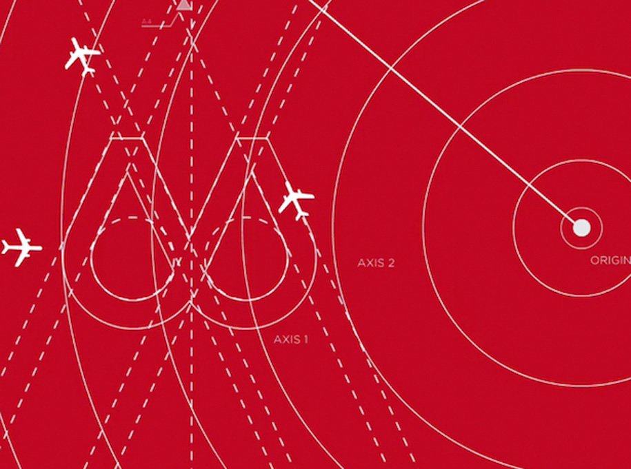
Virgin America: “To achieve the look and feel, a team of 15 designers spent over 2,500 hours perfecting the precise shape of the circles. In fact, if you look closely, you’ll see that each circle is designed to mimic the nose of our Airbus A320 aircraft.“
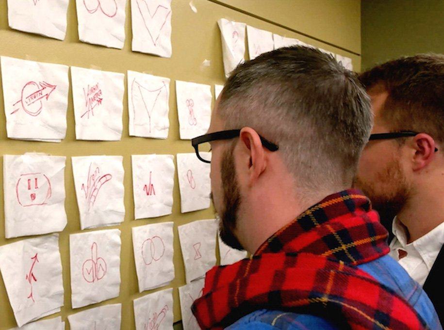
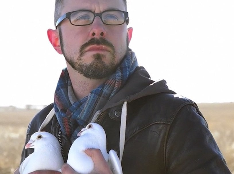
“From a series of eight simple dots that reflected each year we’ve operated as an airline to long, hard tubes that were meant to convey our upward trajectory as an airline – we explored every angle. Connor soon struck inspiration at an N_Fuzion retreat in Northern Wisconsin – a safe haven for unfettered brainstorming – an area Virgin America doesn’t fly to and has no association with.”
Changing the World
Virgin America: “We hope you love this logo as much as we do. We think this new face for our brand will not only upend the design norm, but also fundamentally change the entire world for the better.
When you look at this logo, you’re not just looking at a drawing or shapes. You’re looking at what it means to be human.
It’s a reminder that Virgin America is more than just a company that moves people from point A to point B – it’s a way of being.
We truly understand the essence of humanity, and when you fly on our aircraft, you feel it.”
Select Quotes on Virgins Successful Brand Redesign
Bryan Young: “Love the brainstorming ideas… they all look like boobs, penises, and vaginas. That’s a brand I can sink my teeth into! ”
Joe: “While some may see a pair of breasts, others see a pair of intricately groomed testicles. Coiffed genitalia soaring at 35,000 feet, touching the face of god. Virgin America”
Joseph Reesha: “I am LOVING this Logo every minute I keep it in front of me. WOW!”
Elizaio: “Well done. A masterpiece! World changing indeed. BRAVO!”
Obviously a prank.


