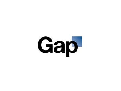
If GAP had planned this as some sort of cunning marketing scheme, so far so good. I have been one of many openly showing my ‘uncertainty’ about the new identity and it is that, uncertainty. We jump on that speeding horse and state our case, knowing that we are not alone.
Company responsible for the new GAP logo – Laird+Partners
Safety in numbers is a great ally when criticizing.
But here’s the thing, here is why I think it is OK to openly criticize a major brand such as Gap. This is not about slamming Gap specifically, it’s more about me saying why I feel it’s OK to openly criticize.
This is me standing behind my own expressions, thoughts and very public opinions over the last few days. And yes, I have also done a version GAP Logo V2
You can’t hide, you don’t want to hide
A brand as global as GAP are out there, simples. If they take the step to re brand, and the result is that it seemingly goes against what we, the GAP customers are used to, alienating us in the process, they frankly deserve all the flack.
They are not the only big brand to create such a stir, and they will not be the last. As a brand they have a responsibility to ensure they dutifully continue to serve their employees, loyal customers, shareholders and investors etc. By taking a decision to go with this redesign, regardless of the brief, regardless of their thought process, reasons and justification, regardless of who ever designed it and who ever made the final decision to approve it, all are at fault in one way or another.
Some more or less than others.
Most of the comments on Twitter, made in posts such as this are basically angled towards this dramatic change in identity, the logo does not make sense when viewed as we would have previously viewed the GAP brand. This is to say the GAP logo, the identity, the brand is within us, we see it, we know it and we acknowledge it for what it represents, like their clothes or not.
But I do shop at GAP. Their blue boxed logo always makes me feel good about walking into that store.
I knew what I was getting, I knew the service, I knew exactly what I wanted. Now I am not so sure what gap is about, all based on a few days of a new logo design. I know I am not the only person, designer or not, to feel this way.
This is what contributes towards a brand. Familiarity, comfort and awareness.
Now I see this, this clinical looking logo and wonder why they brutally killed such a timeless and graceful logo. One of the better identities on the high street. This new identity is a poor reflection of a brand that people have been aware of for decades.
Do you criticize those that criticize?
For those of you that criticize those criticizing the new logo design, I say it is you being naive and simplistic. It is poppycock to say we are all just saying the design is crap. Although when looked at at first impressions, it isn’t one of the last things you feel. And regardless, first impressions ARE important.
But what I am saying is that seeing this design is simply a shock, that it doesn’t make sense, that is seemingly IS a backwards step, that the previous logo was a timeless classic (think Waterstones rebrand). All these thoughts contribute to the level of emotion many are displaying.
140 characters it’s not easy to really fully describe your unhappiness, so we make do.
Social media is our best and worst friend. Brands like GAP have to take it on the chin and suck it up.
Rebranding is a high risk game and criticisms made when it goes wrong are fair game. The designer, designers or artworker may have been ‘ordered’ or ‘micro managed’ to produce this iteration, that’s not so good for them, but they are part of the process regardless. Did they really full fill their role and responsibility?
Maybe they didn’t speak up when they should, maybe they just didn’t care how it was designed, maybe it was some internal designer, maybe it was an agency trying to reinvent the wheel.
Whatever the reason, when a big brand causes so much confusion over their identity, they deserve the public ‘slapping’. As customers, it’s our right. As designers we can understand, we can sympathize and emphasize, that gives us more reason than any to say what we feel.
And in this case, regardless of the real motivations behind the redesign, motivations we are unlikely to see any time soon, all we can go on are our first impressions. That’s the risk with logo and identity design, and we all know it. We know that anything we do, could be savaged by others. That is a risk and it will never change. If you take on a big project, and are of a very nervous disposition, maybe you should not have taken on that project, regardless of the pay check.
Being responsible for a rebrand or redesign is an awesome responsibility.
When it all dies down
When in a few days, we find out that all this was some risky publicity stunt, we can all be safe in the knowledge that regardless, they did have a crap logo. Even if it is for real, they have apparently changed tack, maybe they will try to make it look like a publicity stunt even though it was a sincere attempt at a rebrand, and try to wiggle out.
They wouldn’t be the first major brand to have to do a 360, revert back to the original. I can only hope.
My advice to GAP?
Firstly, you have made Helvetica look bad in a logo. It looks great in all your previous advertising pieces, but falls apart with this graduated blue mark, that just looks too clinical. Secondly, don’t mess with your brand. Thirdly, just revert. Lastly, when will you start selling men’s flared jeans again? Specifically size 32/32. Thanks.
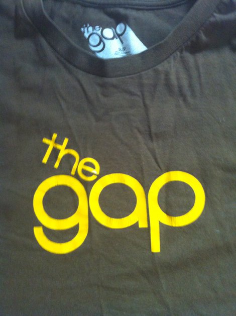
1972 GAP Service Mark
This GAP service mark would have been a far better alternative, still not as beautiful or stylish as the blue boxed original though.
The original “The Gap’ service mark filed in 1972. The origins of this drawing in stylized word form is February 29, 1972 when The Gap Stores filed a service mark application for U.S. federal trademark registration.
I still have a GAP t-shirt with this logo on (below). Very nice.
Other recent GAP logo resources
Gap logos on Dribbble
MakeYourOwnGapLogo.com
Recycling the original vintage 1972 ‘The Gap’ Logo
Gap Speaks Out: Yes, the Logo Is Real, Not A Social Experiment.
Gap Redesign Contest
Mind the Gap


