
Sony Vaio Brand Identity Book & Guidelines
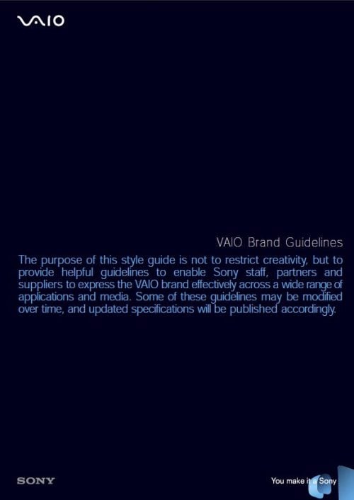
The Sony Vaio Brand Identity Book & Guidelines has actually disappointed me a great deal. Before I downloaded the PDF I had envisaged a visual delight of branding do’s and don’t, but instead it feels really rather dull, uninspiring, awkward and poorly designed.
I totally get that designing and creating these guidelines is a hugely complex and time consuming task that brands such as Adobe, Skype, I Love New York, FourSquare and even vintage NASA (part 1 & part 2) can demonstrate.
Previous examples of branding guidelines have typically been created with care, passion, attention to detail as well as the realisation that the brand guidelines also represent the brand that the brand book is attempting to keep on the straight and narrow.

When a stunning laptop such as the Sony Vaio has a brand book that looks as tired as this one does it really is a shame. Adobe had a monumental task on their hands with their brand book given how many sub brands, applications, icons, logos, logo types are in use at any one time yet they still have taken care with the overall presentation of this valuable book.
The best pages are the colour specifications only because of the lovely range of blues neatly laid out on the page.
The most interesting aspect of the Sony Vaio brand is the meaning behind the Sony Vaio logo. As it happens I have a post about that as well: The Meaning Behind the Sony Vaio Logo
![]()
Maybe I have been spoilt with some stunning previous brand guidelines and need to look past the layout, and focus more on the presented information? Yet—I still come back to thinking—the presentation is just as important as the information when you are talking about brand guidelines? Or not.
Download the PDF of the Sony Vaio Brand Identity Book & Guidelines


