I’ve never particularly been fond of many car brand logos/emblems/badges, something about the way they just sit there, usually in ‘silver’, looking all meh.
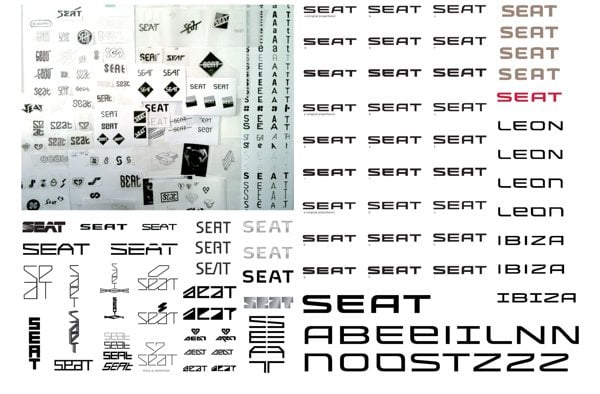
However, seeing the sketches and process behind the redesigned SEAT logo has certainly given me a much healthier appreciation of the work and thought that has gone into this updated logo and brand identity for SEAT.
Not sure about the use of Universe though…
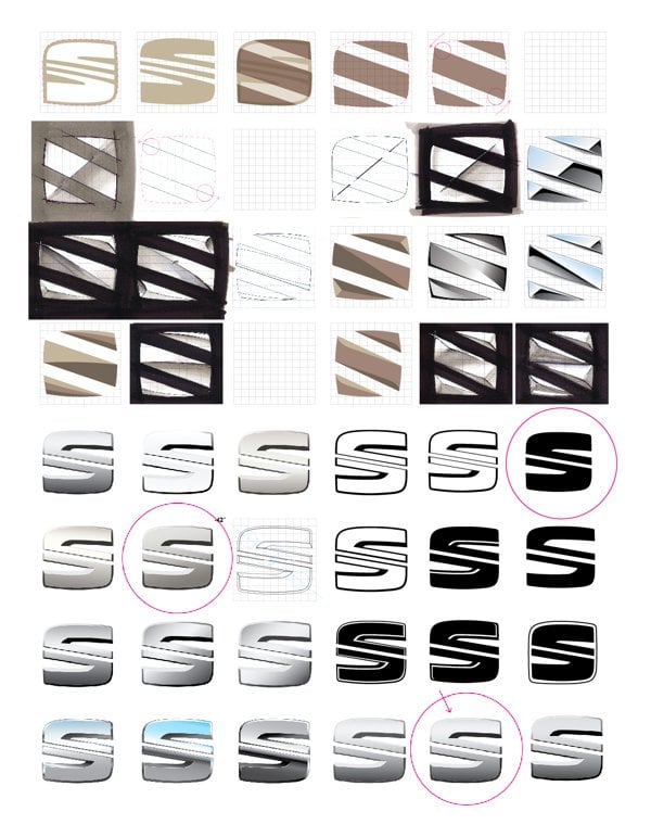
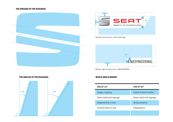
Particularly like this image (below) explaining the ‘Origins of the Diagonal’ within the S logomark.
SEAT Press Release: The new logo represents another step in the continuous development of SEAT’s image, aligning corporate identity and design with the brand’s platform, and openly symbolizing the six values of the company- design, dynamism, young spirit, efficiency, reliability and accessibility.
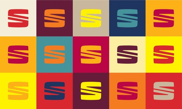
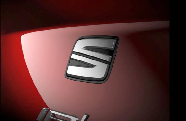
The new visual element comprises the inseparable twosome of passionate red- warm and dynamic- and the unmistakable chrome stamp of SEAT. The evolution of the logo symbolizes the transformation of the company itself, a balance between its rational component and the most emotional part of the Spanish brand. Characterized by its symmetrical lines in permanent tension, the chrome symbol is sculpted with precision and is firmly rooted in modernity, all of which lies below a subtle line of industrial inspiration. Its unique design highlights the renewed commitment of SEAT to precision technology, excellence in engineering and innovation, while the colour red continues to evoke the brand’s Spanish soul.
The origins of the elegance and precision of the SEAT logo are to be found in a diagonal stroke reminiscent of Barcelona’s Avenida Diagonal. This line consolidates a creative vision, and is an essential component of SEAT’s genetic code. Vibrant touches of Spanish design give it life- warm highlights, deep shadows, dynamic perspectives and joyfulness link people to a new hybrid lifestyle (rational and emotional).
In terms of identity and corporate design, the logo is one of the visual elements forming part of the company’s new vision. Although the brand’s main activity is car-making, design takes on special importance amongst the company’s values, and forms an intrinsic part of its genetic code. Design is SEAT’s DNA. To quote Alejandro Mesonero-Romanos, SEAT’s head of Design, SEAT’s new logo design reflects perfectly our love for detail and quality. While keeping the identity of our traditional “S”, this time we have reduced the number of lines, they are now more 3D and the overall perimeter is now more square, more geometric. The whole gives our new logo a more modern, precise and sculpted look.
Along these same lines, the SEAT logo has been a joint effort in design, development and implementation between the SEAT Design Center (SDC) and the company’s department of Marketing-Communication, from the initial research and sketches to the 2D version of the new symbol. Additionally, the exterior design of the New Leon has had an impact on the creative development of the logo, particularly on the conceptualization of the flowing liquid-like surface, projecting quality and precision. The creative process began half-away through 2010 and has had a progressively executed timeline.
» Source: http://logonews.fr/seat-devoile-son-univers-de-marque/
» Via: @TomA_Dix9 BrandingSource & BrandNew
