It’s harsh, but let’s face some facts: Reebok has rarely been cool—using ‘rarely’ in this instance is an over generous application of the word ‘rarely’, and I also know that ‘cool’ is subjective—in all the years I have known the brand, and this is going back to the 1980’s where I remember my parents buying me Reebok’s for school, even back then, this was a shoe of shame.
This was a harsh time for a kid wearing Reebok’s, and one is rarely able to forgive and forget. Tried desperately to paint out the Rebook logo with that cool white trainer polish/whitener.
It’s as though they simply seem to be OK with not being as cool as Nike, Puma, Adidas etc, and are happy to settle for this dull state of existence. The only comparison I can come up with is: Reebok aspiring to be like a supermarket’s own budget brand, like Morisson’s Savers. Nothing wrong with Morisson’s Savers food, I buy quite a lot of it myself.
The 1980’s
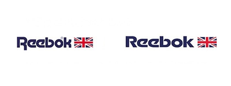
Reebook’s logo has seen much better days, and I’m talking about the really early days, such as my school days back during the 1980’s. When I look at Reebook’s logo evolution, I find myself drawn to both the logo versions used between 1986 through to 1998.
The Union Jack really worked, at least with hindsight, and more so compare the crap they’ve ended up with now. The typography hit a good solid style circa 1996 and onwards, but then took a drastic change in 2006.
The Year is 2006
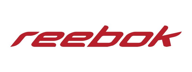
2006 was a drastic change the logos typestyle, and it’s one I dig. Possibly a litter over-top with the forward slanting for my tastes, but it had character, edge, style, distinctiveness, drive, momentum yada yada yada…
Technically, what you see above, isn’t the whole logo, at least I don’t think it was. I believe this was the whole version.
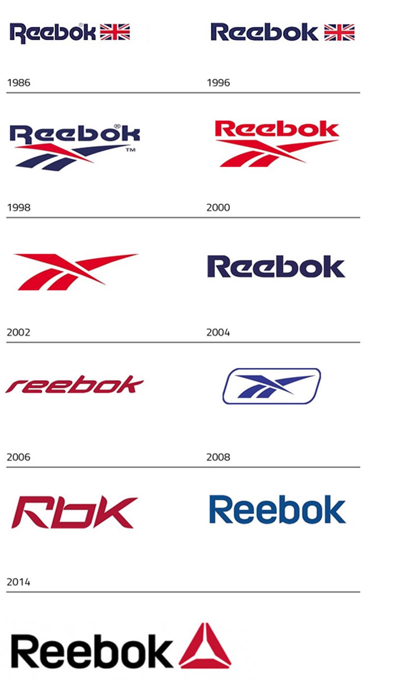
The whole history of the Reebok logo shows a pattern of indecision and design chaos.
Never have liked the typography—the same style they have now—introduced after 2004, with that rather plain-Jane sans-serif font looking all dowdy and corporate. Don’t get me wrong, that style of font is smart, solid looking, and I’ve even used similar styles in my own logos, but I just can’t get myself to accept that it’s an appropriate fit for a supposedly competitive sports brand.
Reebok’s Logo Evolution
Hello? 2014
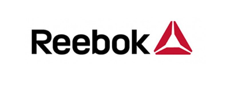
So Rebook’s next corporate strategy was to introduce an already used logomark (cross-fit) that basically looks like a Bank, or some other form of investment/insurance/legal icon style. I even envisage it being used by some form of religious cult: engraved into wood, and seared into the raw flesh of new cult recruits as they all stand inside this chalk drawn version on the mud in the middle of some dark creepy forest conducting all manor of sexual sins upon each other.
My goodness, it really does look dull. It also just doesn’t sit, or fit, with the wording (font style), just seems to be there. In the specific case of Reebok, I find it such a completely inappropriate logomark for a sports brand logo.
Yeah so wonderful, it seems to work nicely in the promo videos, enlarged, cropped, worn on singlets etc, but my word, only just.
Once again they [Reebok] seem quite content on just tootling along, than trying to try just a little harder with an image make-over that could at least have a chance of looking like it’s ready to compete with the big boys.
Clearly I’m head-banging against a wall as I can’t possibly know what the ‘powers that be’ have had, and now have in mind for taking Reebok forward, but for me? I just really think this was ‘another’ miss-mash of existing ideas/elements (their cross-fit logomark), and introducing something recycled to get the next few years sorted and out of the way
What the odd’s there’ll be a tweak, or two, in a few years time?
In fairness, it’s quite likely that that red triangular pyramid thingy could have looked more interesting with a completely different font style and/or brand name, but golly gosh, at the moment it’s just dull dull dull.
