The Pure Storage ( Pure P ) Logo Designed, by Smithographic, has been one of the most prestigious logo & brand identity design projects that I’ve had the pleasure to have ever worked on.
Even though I designed it back in late 2010, it continues to stand the relative test of time, at least when we’re talking about start-up logo designs within the technological industry.
They still use this original Pure P logo mark to this day. Although the Pure brand has been expanded upon by The Signal Company, there was seen to be no need to change the Pure P logo mark in any way, and that is a real real thrill for me.
Designing the Pure Storage Logo Design
A Week to Complete a Logo Design for Pure Storage
Bear in mind this was whilst Pure Storage were in Stealth mode, and the brief was somewhat scarce.
Not an awful lot for me to go on during this stage, not to mention only a week to complete the logo.
It’s quite cool for me to glance back and see how challenging the Pure Storage logo was in the early stages, until I hit upon the Eureka moment.
The Pure P Idea
The client conceded that the ‘Pure’ portion of the name posed some challenges given the prolific nature of the name in pretty much everything and anything.
Pure this, Pure that, so the challenge was to not fall into something so predictable as a rain drop, or water or anything else that has been used a million times before.
Crucially, the logo needed to stand out against many well known brands in their market.
This project saw the most amount of sketches and ideas I have yet done for a project, and thought I would never come up with something appropriate. Then one morning I was making some breakfast and pulled out a tub of honey, which has pure on it.
Then the bells started ringing.
From this I went to bees, then to hives, then to hexagon, then to speed and agility, to organisation, to intelligence, to workers to ‘hive mind’ and pretty much every thing to with bees could be attributed to this company.
The idea spawned some sketches on bees etc, then I focused on the hives. The Hexagon shape ‘P’ was the end result. The initial ‘P’ formed from a pure honey hive.
The Pure P idea stems from the wonderful busy bee: specifically, the pure aspect of the honey that the bee produces and stores in the hives.
Doing a quick mind-map made me realize there is quite a lot in common between bees & pure honey, and the flash arrays made by Pure Storage: the development of the intricate hive network, the characteristics of the actual bee: organized & reliable work horses, fast and efficient.
The logo mark, therefore, captures the initial P, in a shape that encompasses all of the above associations.
The client was ecstatic with the mark, as well as having a solid meaning to it. We both got our simple, clean and bold mark; The Pure P.
I have a list of over 50 direct and non direct competitors and this logo stands well on it’s own as a design, which was the ultimate aim for a new start-up, to give them a fighting chance at being noticed.
A simple Mind Map that showed the path I took from seeing a jar of Pure Honey, that ulimately lead me to the final design.
The Original Pure Storage Logo Design Idea Sketches
I really thought I had lost all my original Pure Storage logo design sketches that I doodled for them, way back in 2010.
To my utter delight, I actually found them tucked away within a project folder for another client, all neatly stapled up. So I’ve quickly took some photograph’s of them, and decided to share them with you.
This was a very happy moment, as there’s lots to be learnt from casting your own eye over your own past work, and those past brainstorming attempts, especially the early sketches.
It can help reinforce the notion: that starting from nothing, can end with something pretty cool.
Marvel at, or pity, how I brainstormed myself to within an inch of my life.
Feel free to have a giggle or two, and see how shakily the creative joinery can start, and with patience and determination, the end comes with fanfare, and a place in the history books (maybe).

Pure Storage has quickly become a major player in the tech industry, and ranked third in the flash-storage market behind EMC and IBM.
TechInsider: According to its S-1, Pure Storage made about $174 million in revenue last year, roughly a 4X jump from the previous year. It has already made $159 million in the first half of this year, putting it on pace to hit nearly $300 million this year.
Evolution of the Pure Storage Brand Identity
Watching my Pure Storage logo growing-up over the years has been pretty amazing; to see how and where the Pure Storage logo has been used and applied, has also been rather mind-blowing.
It’s almost starting to become a little unreal just because when I designed it, Pure Storage were a complete unknown, so I had no idea what was to become of them further down the line.
To see that Pure Storage have not changed the logo design, or affectionately known as the Pure P, in their recent brand identity update (photos above and below), is such a massive acknowledgement of how well the Pure Storage logo has stood the relative test of time.
I’d go as far as saying that 10 years and counting of using the same logo design, is pretty close to designing a timeless logo design.
Sure, it’s not decades like some famous logos, but it’s still a long time, especially in the rapidly changing, and evolving world of technology.
To see that the new branding agency tasked with taking the Pure Storage brand identity into the future have not changed my logo design, is just thrilling.
Who knows, it may be changed tomorrow, or next month, or next year… but for now, I’ll take this as a big win, and proof that the Pure Storage logo is working well for them.
The Pure Storage Logo Design in Use
If there was ever a logo design project to brag about, then this would be that project.
The unveiling of the massive Pure Storage P on Wall Street, has to be the largest ever real world application of any logo I have designed, and it just happens to be the jewel of my logo design portfolio.
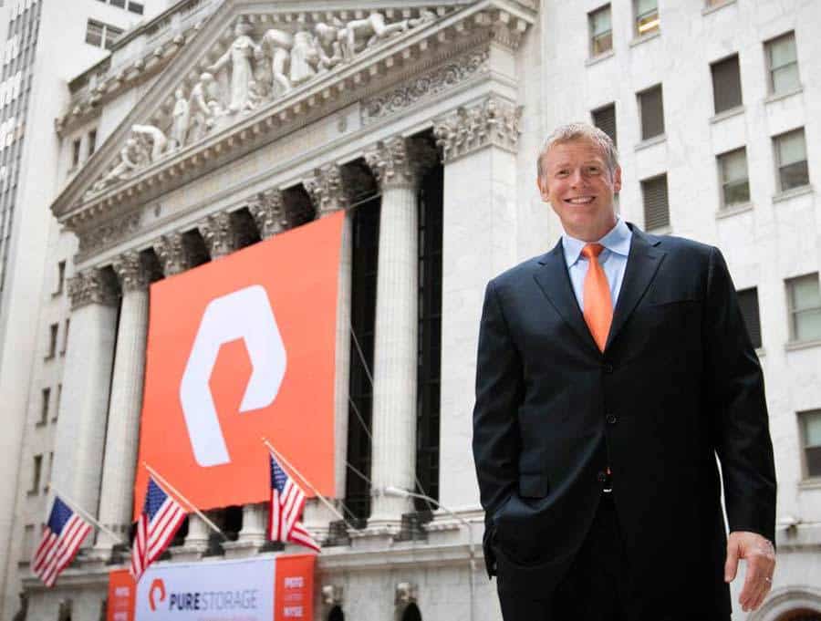
This huge Pure Storage banner hanging up on the side of the Stock Exchange, on Wall Street, was to celebrate the successful filing of their IPO, back in 2015. Standing proudly in the photo, is Pure Storage CEO, Scott Dietzen.
It’s a pretty amazing feeling to see ones own work used in this way, really very proud of myself. :)
This has to be one of the biggest real-world applications of a logo I have designed… #Brands #purestorage #LogoDesign #GraphicDesigner pic.twitter.com/LyFm4vNQCE
— smithographic (@smithographic) August 16, 2017
The manor in which the logomark has been cut-out and raised to take pride of place on the FlashArrays with the vibrant orange set against the gun-metalesque enclosures provides for a pretty strong brand image.
Pure Storage did not stop there with the application of the Pure P logo mark, as they have also shaped each perforation so as to, seemingly, form the letter P.
Please note: Other design agencies were responsible for the Pure Storage branding shown below; these photographs simply show how the Pure Storage logo has been used, since it’s creation over 11 years ago.
I cannot take any credit for any of the subsequent design, and brand identity work done for Pure Storage, since I designed the logo.
There was immense pride seeing how the Pure Storage logo was being utilised by Mercedes F1 (I certainly had/have no professional relationship to Mercedes or Pure Storage, at this time). To see my logo being used in F1 was beyond a dream for me.
It really does look awesome.
![]()