I was approached late in 2010, by Foehn & Hirsch (a subsidiary of Ebuyer.com), and asked if I would consider taking on the job of rebranding their existing identity.
This isn’t just a logo design, this is the redesign and implementation of the core brand identity, the visual personality that speaks and attempts to establishes itself as a worthwhile brand in the eye of the consumer.
This post tries to summarise the process we used to create the above visual identity for Foehn & Hirsch. I can only touch on aspects, as the project is still ongoing in terms of website design, product packaging design and the corporate guidelines.
Client Details
Foehn & Hirsch
Website : http://foehnandhirsch.com
Twitter : @foehnandhirsch
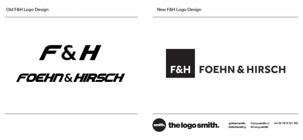
The Old F&H Brand Identity
You can see their existing brand identity below. The logo is used in two parts, the initials and the main wordmark. The initials are used mostly to brand the actual products, whereas the full logo is used for the website and product packaging.

Looking at the Existing Brand Identity
This is a good example of how a trending style of typeface can actually age before you expect it to. You look at this font and thing it’s pretty modern, it has nice curves and it on the whole it’s a clean and solid font.
Casting a critical eye over existing identity
Knowing what’s wrong or what needs to change with an existing logo design is crucial first step when evaluating a redesign. It’s not the only step of course, but knowing where are how it falls down allows you to instantly improve before you have even started.
If there are technical reasons why a design fails to deliver, then this does not fall into the tricky topic of ‘subjectivity’.
Not making the same technical mistakes is a ‘almost’ guaranteed win, so long as you don’t then incorporate a new set of technical design issues failures, which is quite possible.
Quite simply, the italics and the tracking let this down. The tracking is way too tight and with incorrect individual kerning pairs. The ampersand certainly looks a little awkward and out of place, with it’s weight being noticeably thinner than the wording, which just adds to the poor ampersands awkwardness.
The ampersand itself is fine, nothing wrong with it but in the context of the Foehn & Hirsch wording, it’s way out of place. It’s almost indicating you should whisper ‘and’ and that it’s embarrassed to be associated with ‘Hirsch‘, like a poor cousin.
The ampersand issue is a big fail with this existing design as it plays a significant part of the identity. It’s not just a small feature, or a hidden detail, it forms a fundamental role in the brand name. Yet, as it appears here, it seems to be missing a chunk of style.
The most noticeable issue is the void left between the ampersand and ‘H’, although it does fit snugly next to the ‘F’.

There is also a small but typographic problem with the height of the ampersand. As you can see in the image above, the top and bottom curve fall directly on the baseline, when in an ideal world it would of been nice if the top and bottom dipped over the line, just for the visual optical purists out there.
The blue indicates the original ampersand, the black version with the horizontal guides shows the ideal placement.
![]()
The F&H logo on the side of their building; about the length of 3 double deckers.
The Creative Brief
A brief is useful in a rebrand, he say’s rather nonchalantly. It’s crucial of course. I mean, I could have just gone ahead and designed something pretty, and I’m sure it would have looked nice.
But that’s not quite the point here, this transcends my own individual tastes and design style.
Without a brief, without a breakdown of why Foehn & Hirsch feel they need to update, I would be clueless as to a design direction and thus would be behaving rather irresponsibly as a logo designer.
The brief was pretty intensive, so I can’t fully go into detail here, but I will try to sum up the essentials. Fortunately, the clients are design savvy individuals, so already knew a fair bit about the changes and style direction to take, where to improve and such like.
It’s always useful to find out if your client does have any design knowledge, as it can make a difference to how you relate information back to the client. It can however cause it’s own set of problems if personal design style precedes the more rational and subjective nature required from a rebrand, but on the whole, it can help to have a design savvy client as part of your team.

Brand Positioning
First up on the table. Looking at the competitors.
The main brands that F&H needed to align itself alongside were Sanyo, Toshiba, Goodmans, Samsung and Philips. These are direct competitors in terms of product cost and would be found on the same page by a customer if conducting say a price range search.
Crucial to know what brands could be side by side with each other. Essential then to know how they market themselves, their own reputation and their own success.
What do they do right, what do they do wrong, look for things you can improve on and leverage to get your clients brand a solid bunk up.

Brand Aspiration
Brands such as Sony, Apple and Olufsen & Bang were mentioned as the brands we should pay attention to in terms of brand recognition and awareness. We were not talking about F&H being more than it was, but more an aspiration angle.
No harm to see how the top dogs align themselves, how they portray their identity, after all, so much valuable stuff to learn from. Better to look forward and up, than backwards and down, but also retaining a sense of realism and sensibility, to not loose sense of what who and what F&H represents.
For example, I want to be a top logo designer. I am not yet, far from it, but it helps for me to start leveraging aspirational aspects when marketing my own brand. To hint at subtle associations with more established and prestigious designers.
Careful not to overstep the mark, selling yourself as the best when you are not the best is a recipe for a brand meltdown, but if done carefully and realistically, can actually help determine and steer your brand perception into this ‘create your own future’ mind set.
It’s akin to portraying yourself as an ‘authority’ on a certain subject. I know a fair bit about logo and brand identity, enough to be confident talking about, give advice and tips, but the important point here is that being an ‘authority’ doesn’t necessarily make you the ‘best’ at what you do.
So this is a safe middle ground, and frankly, being ‘the best’ is a little unrealistic, OK, a lot unrealistic, but being an ‘authority’ is well within a lot of people’s reach.
Power of Labels
We want to try and place F&H as a brand that people are interested in, that they feel good about spending money on F&H products. F&H are not the best persai in the entire global universe of all brands electronic, that falls to Apple.
F&H know their place, but they are trying to be the best, the most attractive and unique in their relative brand space, by creating a stylish visual identity that looks a natural fit on their products, but stylish enough for consumers to be tempted to buy.
The consumer mentality of, ‘Oh, I like that label‘ is a powerful one to harness, especially in the competitive world of electronics, gadgets and geeky toys.
The target customer base would generally be gadget ad tech conscious individuals who appreciate a classy and stylish brand identity. Customers with a sense of financial sensibility, appreciate fine things but not looking to ‘blow’ needless cash, in other words ‘affordable luxury‘.
Getting a firm grip on how these other brands positioned themselves was crucial prep work. From this early stage I felt there was definitely room for a new F&H look, these existing brands have less than inspiring identities, in fact one could argue many in need of a refresh, but that’s just my own view. Although improving on Sanyo or Goodmans would be easy, the challenge was to keep it real.
Dressing up F&H to be more than it actually is would be a disastrous move, making a brand look too much better than it actually is will not fool paying customers indefinitely. It might prove a short term success, but mid to long term it would no doubt prove fatal.
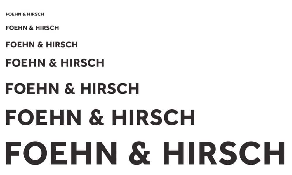
Typeface Selection
I could see where I needed to go in my head, so the first practical step was to look at typefaces. I knew this would be a mostly typographic solution, it had to be to fit in with existing brands so this created a instant boundary to play within.
Designers go about their logo and identity design in a manor of different ways, so there is no one right way, but there can be many wrong solutions. For me, I spend a vast amount of time and energy looking at typefaces for most of my logo projects, this is usually the first step for me.
The typeface of a logo portrays so much of the identities emotion and personality. As I have mentioned elsewhere on my blog, the right typeface choice is crucial to the success of a new logo or identity. Select the wrong typeface and you can destroy an otherwise sound logo. Therefore it is worthy recipient of your patience to seek out that perfect typeface.
I provided the client with a number of initial ideas, some of which were intentional outsiders and some were honest contenders. I wanted the client, in this case, to see a large variety of typefaces. For various reasons, the project was paused at this point. The client had these selections, so in away, they had time to sit with the presented ideas.
When the client was ready to start up again, they had valuable feedback on the typeface choices I initially made. At no point this project was rushed, so although it moved along slowly, it did move along. I am pleased now in retrospect it worked out this way.
With plenty of time to reflect, I also ended up looking at a fresh new direction, myself not convinced with the initial selections. The next choice was the winner. The moment the client saw my mock-up, they knew they had the winner.
This was reassuring as I of course felt exactly the same way. So this is a small example of the benefits of not rushing on such crucial decisions. In hindsight, I am quite horrified to compare the typeface we used with some of the early selections, at least we covered all the bases.
We had a winner.
Owning the Foehn & Hirsch Brand
So with typeface chosen, the next step was to personalise it. Somehow creating F&H an ownable brand mark. What do I mean by ownable? It’s a feature of an identity that is unique to the brand in question, could be subtle, could be in your face. For F&H it needed to be very subtle.
A logomark is the usual way to create a unique identifying and ownable mark, using unique colours is another solution. Some companies commission a custom typeface, you can’t get much more unique and ownable that that.
If your logo is to be a regular typeface, no matter how stunning that typeface is, it will never be unique. This is why some brands that rely heavily on a strong typographic wordmark will incorporate a stylised container, such as Samsung or Goodmans. This adds the ‘ownable’ aspect, but can add clutter and noise if poorly executed.
The F&H Ampersand Customisation
Looking at the the structure of the F&H logo, the emphasis would always fall on the ampersand, regardless of what logo version was used. The ampersand was the constant, be it the initials or the full wording. One of the solutions with the F&H logo, was focusing on the most loved ampersand.
The solution was to create a custom ampersand; not as simple as it sounds.
This ampersand had to be unique but not so out of context that it would look out of place. I resorted to creating a hybrid ampersand, using two typefaces as my platform.
As you can see below, merging the two styles together, creates a ‘bastard’ but most loved ampersand.
Step 1 : We start with the original ampersand, minus any plastic surgery.
Step 2 : The magenta colour shows where the first alteration is to occur, adding a ‘slab foot’ to a sans-serif font.
Step 3 : The second procedure creates a nice solid mid level platform, leading the way to ‘Hirsch’. A few tweaks to the overall sizing required to keep the size consistent.
Step 4 : Third major alteration adds a slab foot, to the foot.
Step 5 : The result of Steps 1 – 4.
Step 6 : Now we have some subtle detail alterations to make. The magenta line shows the original contour from Step 5, the inside radis is a little too angular, so I smoothed this line out, the cyan line is the refreshed version.
Step 7 : This is the bonus round. This is where I made my ‘mark’, the subtle ownable element to this ampersand. The magenta line shows the angular cut I will make. It’s a small detail, but enough to add some interest to the ampersand.
Step 8 : Nearly there, and in fact at one point I was almost ready to rock and roll with the ampersand. However, after living with it for a few days, I noticed that the the inner radius of the blue line, area in question shown by the magenta line , looked a little off. The magenta line shows the new contour.
Step 9 : After tweaking on Step 8, I then noticed that the continuation of this outer radius was also a little ‘off’. The cyan line is the original contour, the magenta line shows the revised contour.
Step 10 : The final and completed F&H ampersand.
The image above shows the original and new ampersands as an outline overlay. The first example shows the structural differences between the two, the grey outline is the overall shape and proportions to keep too, the blue outline shows the slab portions I transplanted to the grey outline.
The second example shows a pair of green and red lines, these show where I needed to keep an eye on the overall thickness at various points.
This was essential to keep the overall proportions the same as the main wording. The red line is the optimum width, the green line shows where I need to ‘pull’ the width in just a smidgen.
Learning from the disparate combination of ampersand in the original identity, we need to make sure we don’t fall foul of the same oversight.
So a bit of nip and tuck needed.
The F&H Logo Mark
With the balk of the new logo design complete, we looked at ways to add more impact to the overall logotype. At this point we had Foehn & Hirsch as one logo version then also the initials as a standalone mark. The initials would be used for all product branding, the main wording for websites and packaging etc.
But I felt something more solid was needed for other aspects of the identity, to help create a more expandable and flexible identity. It’s one thing to keep things simple, but sometimes you need to add a ‘focus’ area.
A solid black box was the first idea to come to mind and was pretty much the only option I decided to focus on. I instantly felt this was appropriate for the F&H identity.
It’s bold, it’s simple, it’s flexible, it’s smart and provides a strong visual ‘boommark’. Clearly it’s not an overly creative idea, but often the most obvious solution can be the best solution, it then comes down to how you execute the ‘obvious idea’. I looked at a few variations of boxed container.
Fortunately for me, the one idea I really liked is also the idea that the client went for as well. I decided to place the F&H initials in the lower half, with equal spacing left, right, bottom.
If you cut the box horizontally in half, then the margin from the top of the initials to the cut line would in fact be exactly half the total space on the other 3 sides. So the measurement ‘Z’ is half the height of measurement ‘Y’.
Small detail I know, but I like details, if you can tie up details like this, then it feels just nice and looks well proportioned.
 Consistency and Variation
 Consistency and Variation
We now have a visual identity that can be applied to a number of different formats, providing a more dynamic and consistent brand identity. The boxed version will be used on stationery and corporate materials, as well as product packaging. We also now have a convenient social media brandmark, which will work well as a Twitter profile picture and website favicon.
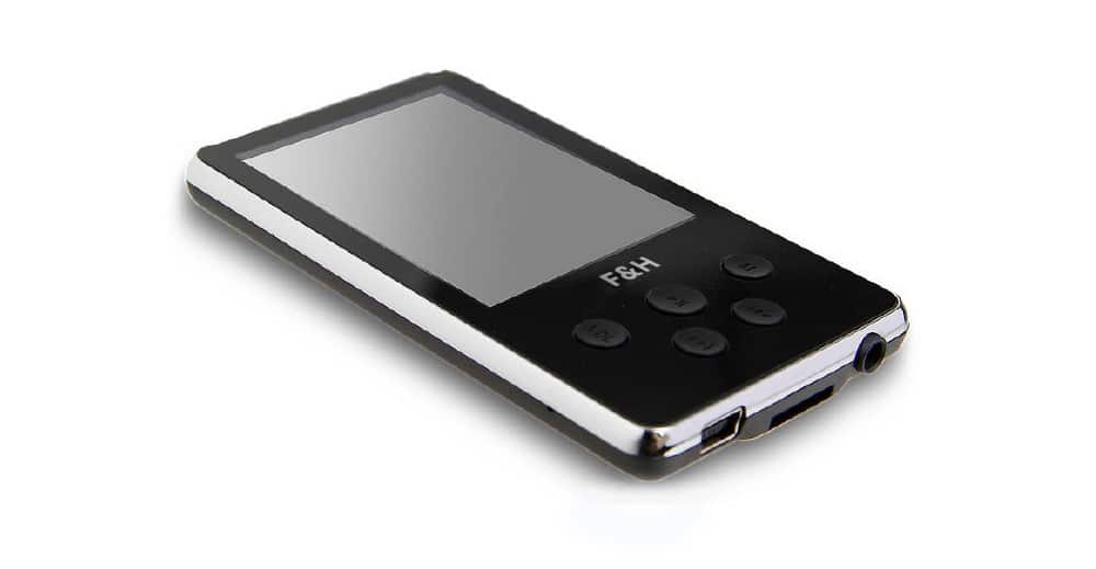
The initial only version will be mostly used for placing on the actual products such as a badge, printed onto various surfaces and etched directly onto bare metal surfaces.
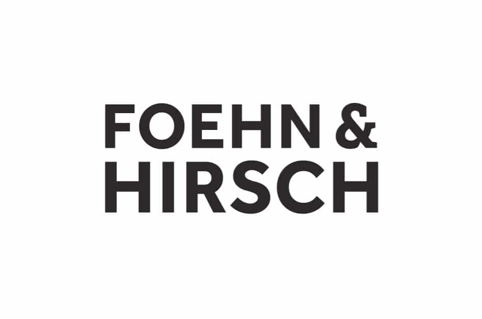
The main wording, minus the initials and container, will be used also for some aspects of product branding, areas of the website and corporate materials where the boxed version might add too much noise.
To Conclude
Realise this identity development post has been rather lengthy, so congrats if you actually managed to read up till this point.
It has been a epic project and is worthy of a thorough explanation, as well as being a valuable explanation of my methods for new potential clients of course.
I was delighted to hear that the powers that be at Foehn & Hirsch were delighted with the final result, so much so that a invitation to work on another identity project is in the works.
As I mentioned earlier, it is still early days with the roll out of this identity, something which is in process as I write this. It will be rewarding to see the new F&H initialmark emblazoned on forthcoming products such as TV’s, MP3 and DVD players to name just a few products.
It’s one thing to design a logo for website or even for a company, but designing a new identity that will feature your new design on products for, hopefully, years to come is a wonderfully rewarding experience.
It will prove to be an interesting few months as the new identity is rolled out, to see exactly how this redesign has affected brand in the eyes of the consumer.
It’s quite one thing for the client and even myself to be saying ‘job well done’ but quite another with regards to consumer perception and acceptance.