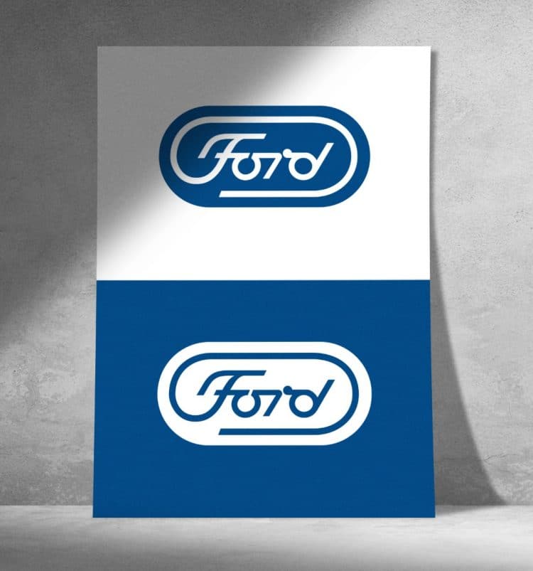
For the life of me I can’t recall ever seeing this version of Ford’s iconic identity, created in 1966 by Paul Rand, but here it is, an alternative Ford Logo, found on DesignHistory.
Except for the few flourishes on the ‘F’ and ‘d’, this version of the Ford logo looks super modern, and must have been viewed as totally radical back then.
Ford (1966): “Although the new mark wasn’t adopted, its presentation remains an impressive example of the genre.”
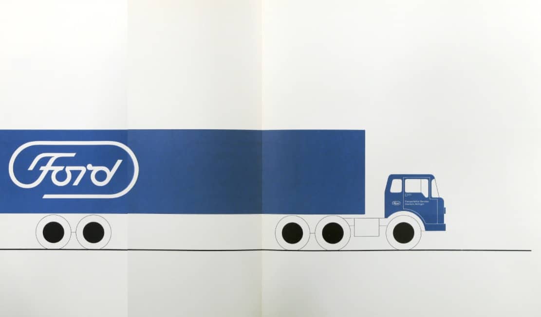
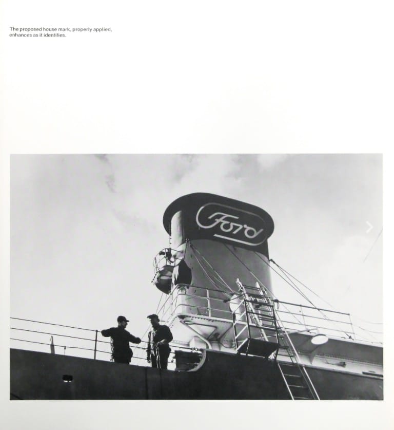
Salient features of the propose Ford house mark are:
Paul Rand on Fords House Mark
In Paul Rands presentation book for his new Ford logo, this is how he summed up their current logo:
“It is apparent that the Ford mark has been subjected to many of the abuses cited, and perhaps, in some cases, for valid reasons. The present house mark nevertheless has a good deal of merit. If one were to choose but one flaw it would be that it is incongruous in point of time with its environment. It is neither perfectly compatible with the kind of product it represents, not can it be easily reconciled with contemporary typography and design.”
Paul Rand’s Ford Logo Design Concept in Graphis Magazine Issue 153
In Issue 153 of Graphis magazine, you’ll find articles on How Paul Rand Presents Trade-Mark Designs to Clients, written by Stanley Mason; Photographis ’71 International Advertising Photography, by Allan Porter; and The Riddle of Easter Island, by Dr. Erika Billeter. Profiled artists include Victor Vasarely, written by Dr. Willy Rotzler; Robert O. Blechman, by Jerome Snyder; John Alcorn, by Jerome Snyder; James Valkus, by Stanley Mason; and Gervasio Gallardo, by Dr. Erika Billeter.
One imagines how the Ford board reacted, one also wonders how they would react now if presented with this design.
It’s an interesting snapshot of how iconic designers like Paul Rand did, and could change our perception of what’s current and what is ‘radical’ just by their own interpretation of a company.
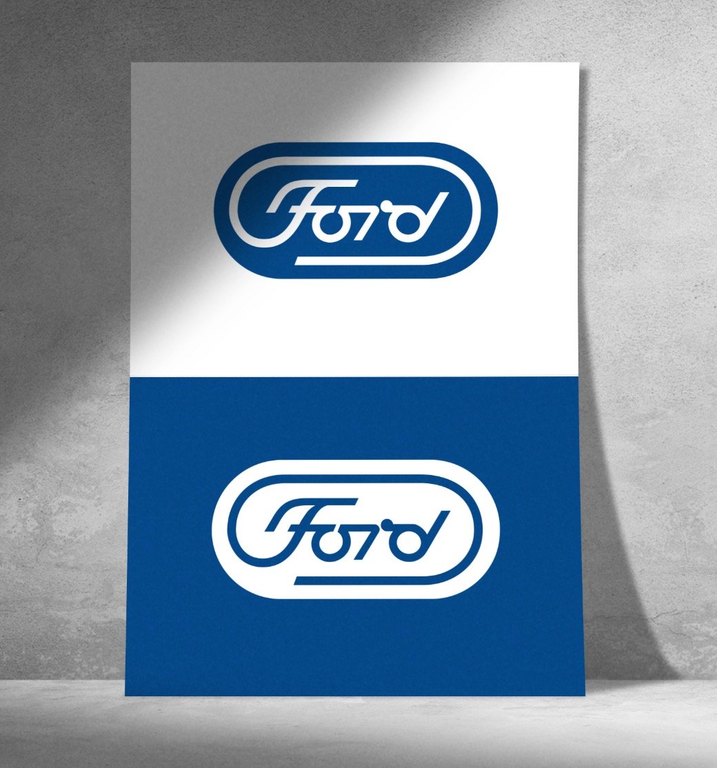
Original Bitmap version of the Ford Logo
This bitmap version of the Ford Logo (below) is about the only version on the internet; it’s pretty small, and poor resolution, and it’s getting pretty ropier by the day.
Recreating Paul Rands Unused Ford Logo Design Concept
So I’ve done my usual trick of recreating the logo in vector (view more logo & poster recreations here), so that it might last on the internet for a lot longer.
Worth noting that the original isn’t precise, in terms of various alignments and such. Things like the white border not being properly centred, some of the letters not having consistent widths, are all replicated in my recreation as closely as possible. It’s not 100% identical, but around 98-99%, just due to size and poor resolution of original.
Feel free to download the vector here, or drag the following SVG to your desktop, and then drag that file into Illustrator. If you just double-click the file, then it’ll likely just open up a text editor.
On Paul Rand
Laszlo Moholy-Nagy, describing Rand: “He is a painter, lecturer, industrial designer, [and] advertising artist who draws his knowledge and creativeness from the resources of this country. He is an idealist and a realist, using the language of the poet and business man. He thinks in terms of need and function. He is able to analyze his problems but his fantasy is boundless.”
Paul Rand is one of the most famous and recognized American designers of the 20th Century. His ideas, philosophies and approach continue to be a large part of the fundamentals of design taught in education programs across the world.