Wavepulse Acoustics was not a usual project: a logo design rushed out in a matter of a few hours, not something I would usually ‘shout out about from the rooftops‘.
Most logo and identity projects require an element of time: time to research the company, the type of business, the competitors, idea formulation, sketching, concepts, artwork and client designer banter.
Usually for me, an average project takes upwards of 4-8 weeks; some have extended past 8-16 weeks.
Rushing a logo project is not particularly responsible, especially when you have to throw out of the window all your usual processes.
However, the client was in fix and needed a logo urgently, and fortunately appreciated my dilemma.
The dilemma being not being able to do what I would usually do, being cautious and responsible.
The client had provided a pretty detailed brief, and some examples of logo designs that he liked from my existing portfolio.
Be firm
There was also the issue of money, one which I will skip. Needless to say, I had to insist of a number of conditions before taking the project on.
I will say at this point that I had already formulated an idea in my head from reading the brief and seeing the types of logo designs he liked. I also knew this idea was a winner, especially given the time the client had.
First of all I insisted that the money would be paid up front by Paypal before we proceeded any further. Just the time I was taking out of my day to liaise with the client meant I had to secure some form of monetary recompense. I was in the middle of several other projects, so I just had to be realistic.
I realised the client liked my general style of design, so that put me in a strong position. By accepting the project, and by saying I had a strong idea formulated, the client was sort of hooked in already, more out of curiosity and need.
One of the conditions was that I would do one design, and that’s it: no changes, no tweaks, no fiddling… Take it or leave it.
But paramount to me was ensuring I would be able to do the best job possible, even given the time frame. It’s not about money, certainly wasn’t in this case. I would benefit in other ways, so it was all a calculated decision.
So as well as asking for the money upfront, which he accepted immediately, I also offered to show him a previous logo design of mine that was similar in style to the idea in my head. This meant that after he paid up, he would see the sort of idea I would give him. This was a sort of middle ground safety net. If he didn’t like it, we agreed we would leave the project and he would have to find someone else.
I assured him that my idea was solid and that I knew it was a strong idea and more than suitable for his business. My confidence in my own idea meant he was reassured enough to take this gamble.
He said to me even if he didn’t like the idea, it was a interesting process and one worth paying for. He was realistic and not being demanding in anyway, which is why I took this project on. It was my choice, but with my rules to keep things grounded.
Take the money and run
Not quite. I did take the money, and frankly, I was a little surprised that he accepted my conditions and even more surprised when the money turned up about 30 minutes later.
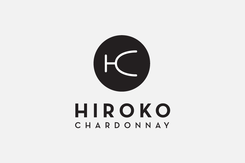
As promised, I sent him a screen shot of a previous logo idea, that was a similar style to the one in my head. Fortunately this was one of the ideas he had loved in my portfolio, it was the Hiroko Chardonnay logo.
Game on
Now given the nature of the company: Designing and building custom loudspeakers for PA systems, musical instruments, touring rigs, sound reinforcement, DJ’s and the like, the possibility of falling foul of anything cliche or stereotypical (pun intended) was high. Pulses, waveforms (think hospital and health type logos) etc.
Also needed to ensure the logomark was simple and strong enough to work on its own as a badge, printed onto speaker grills, printed onto various materials from small to large.
So for a quick turnaround logo, there were a few essentials to factor in to make it workable.
Clock is ticking
Within 15 minutes I had the initial idea vectored up in Illustrator. Took a few attempts to get the lines working as they appeared in my head. The lines form the ‘W’ the ‘P’ and ‘A’. Admittedly the ‘P’ is a little bit of a stretch, but the association is there.
It was in fact more of a fluke, and was not intended. The focus was on creating the ‘W’ and ‘A’. Placed in a round container, we have a clean, stylish and simple mark which has a clear link to the business, taking both the initials and a visual reference to ‘wavepulse’.
We have avoided any overly cliché imagery.

Typography
As with all my logo designs, the focus on typography is paramount to a successful design. Choose the wrong font and the logo can fall apart, give the wrong impression or just look fugly. Inappropriate fonts can and often do destroy an otherwise sound logodesign.
Take time to find the right font. I can’t stress that enough.
I spend days and days looking for new and appropriate fonts for a certain project. I scour all the type foundries I know, spend ages on MyFonts comparing font style after font style.
For Wavepulse Acoustics I wanted something slightly ‘edgy’ and ‘raw’ but clean and easy on the eye. I remember seeing a font in my library a while back, so I knew where to look. I did try a number of font styles as you can see below.
But the winner was Amplitude from The Font Bureau.

It just works
This was a perfect fit, couldn’t of asked for a more suitable font in my mind. Check out the portions of the font where a small sliver has been cut out, for example on the shoulder of the ‘p’. They almost mimic the shape of a waveform and help reinforce the visual association, albeit quite subtly. This feature really gave it the edge I needed and given the name of the font ‘Amplitude’ it seemed a match made in heaven.

A few details
This just shows how I have aligned the various aspects of the logo. I didn’t go for the more obvious solution of aligning the wording perfectly centered on with vertical with the logomark.
I had formed the ‘wavepulse’ in such a way that the bottom half was the same x-height as the logotype.
This meant I could align the logotype with the bottom half of the logomark.
To sum up
So yes, not the usual run of the mill project. From the time the client contacted me, from the time I sent him the initial idea was just a few hours.
The client was over the moon. Given the circumstances, this logo design proved to be a lot of fun to work on and I am particularly proud of it.
There is no question that experience helps one when contemplating ideas and concepts. Some logo projects can be challenging, ideas don’t seem to come easily.
The opposite can also be true, ideas can come easily and quickly. This of course depends on the level of information you have from the client, the client themselves and the nature of the business and how familiar you might be with the subject matter.
I would not have taken this project on had I not already seen an idea in my head. Knowing I had the idea before even started meant that the project would cause minimal disruption to my regular schedule.
I would also come out of it with a decent logo for the portfolio as well as one happy client.