Short and sweet selection of vintage logo and identity guidelines from the 1976 Montréal Olympics, designed by Georges Huel and Pierre-Yves Pelletier.
It’s interesting to see that the logo was actually designed over a grid system (below), with the logo design itself representing: a podium, a running track, the letter M and the Olympic rings.
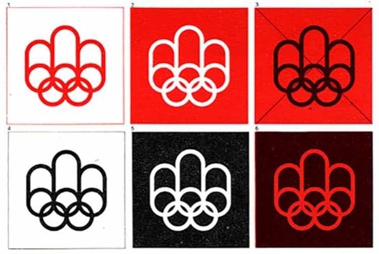
1976 Montréal Olympics Logo Standards Manual
When it is impossible to enlarge the Symbol photographically, or if such enlargement is likely to affect the quality of reproduction, the Symbol must be constructed by means of a grid, according to the following instructions.
The vertical lines are each marked with a V and a number, the numbers running left to right; the horizontal lines are marked H, and numbered from bottom to top. Two radius only, AB and AC, are needed to construct the curves of the Symbol and to make the visual corrections.
Just love seeing this traditional approach of logo design, and marvelling at the sheer attention to detail needed to ensure accurate logo reproduction.
Sometimes logo grids ARE crucial.
Recreated Vintage 1976 Montreal Olympic Logo Grid Poster for Download
Update: I’ve now recreated the below Olympic Symbol Grid, which you can download here:
→ Download Recreated Vintage 1976 Montréal Olympic Logo Grid Poster
1976 Montreal Olympics Logo Standards on Flickr
→ 1976 Montreal Olympics Basic Logo Standards
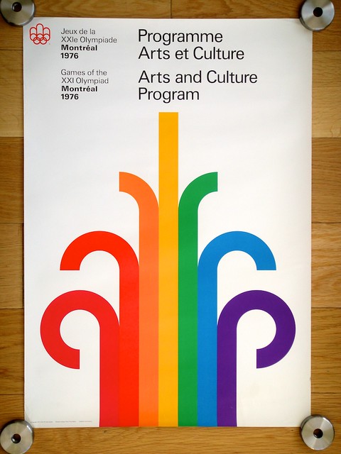
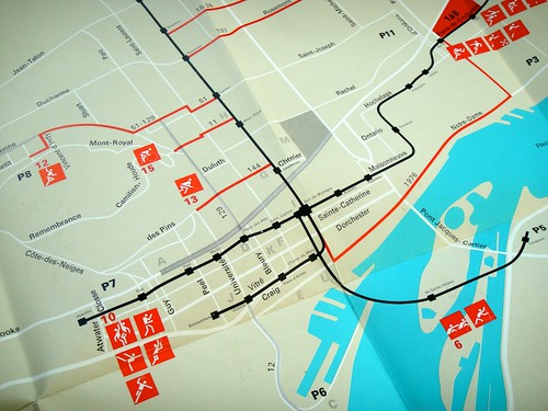
Here’s a small selection of additional print and design: