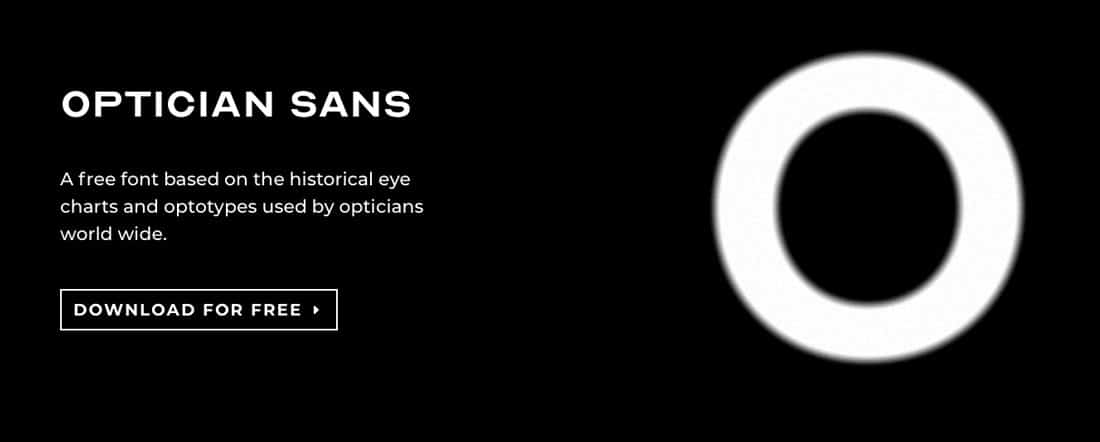
Optician Sans was created by ANTI Hamar and typographer Fábio Duarte Martins, and is available as a Free Font Download from the Optician Sans website.
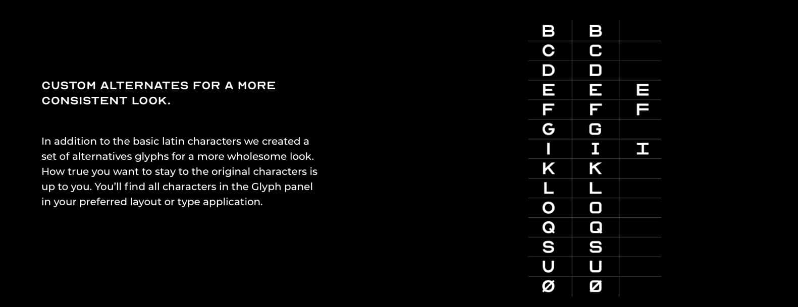
Optician Sans Custom Alternates
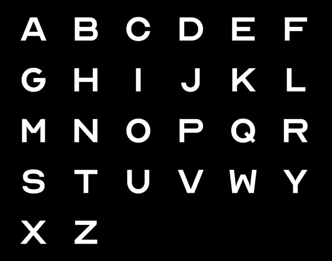
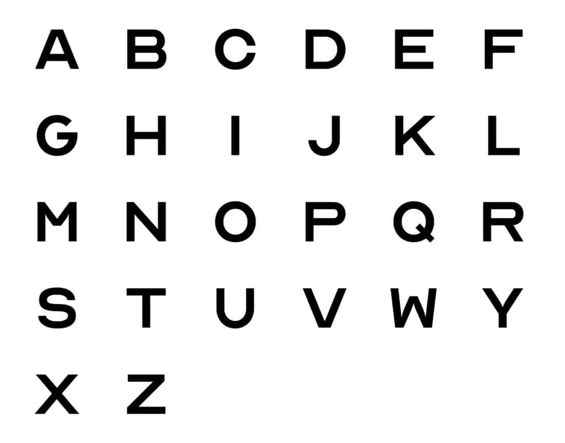
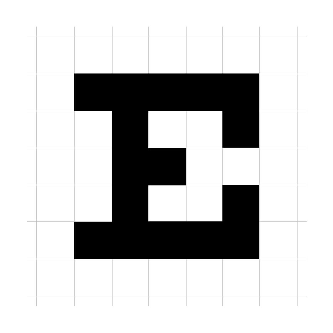
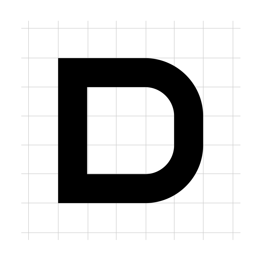
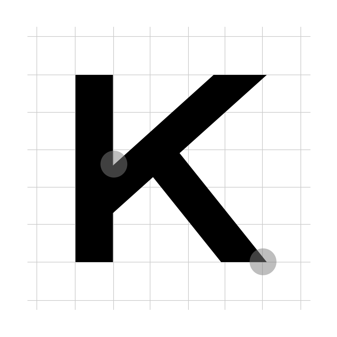
Optician Sans also comes with a handful of custom alternate gylphs, for a bit of variety.
The main letters with alternate versions are: B, C, D, E, G, I, K, L, Q, S, U, and O. E gets a 2nd alternate, so 3 styles in total.
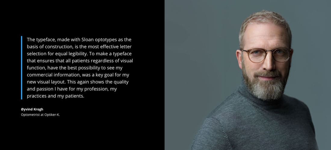
Øyvind Krogh – Optometrist at Optiker-K
Øyvind Krogh – Optometrist at Optiker-K: “The typeface, made with Sloan optotypes as the basis of construction, is the most effective letter selection for equal legibility.
To make a typeface that ensures that all patients regardless of visual function, have the best possibility to see my commercial information, was a key goal for my new visual layout.
This again shows the quality and passion I have for my profession, my practices and my patients.”
Optician Sans Font Licensing
Optician Sans is released under the SIL OPEN FONT LICENSE.
As with all Free Fonts, don’t assume anything when it comes to commercial/personal use, making modifications, redistribution etc.
Make sure you look through this to make sure there are no limitations that might get you in trouble.
Download Optician Sans
→ Download Optician Sans via the website.
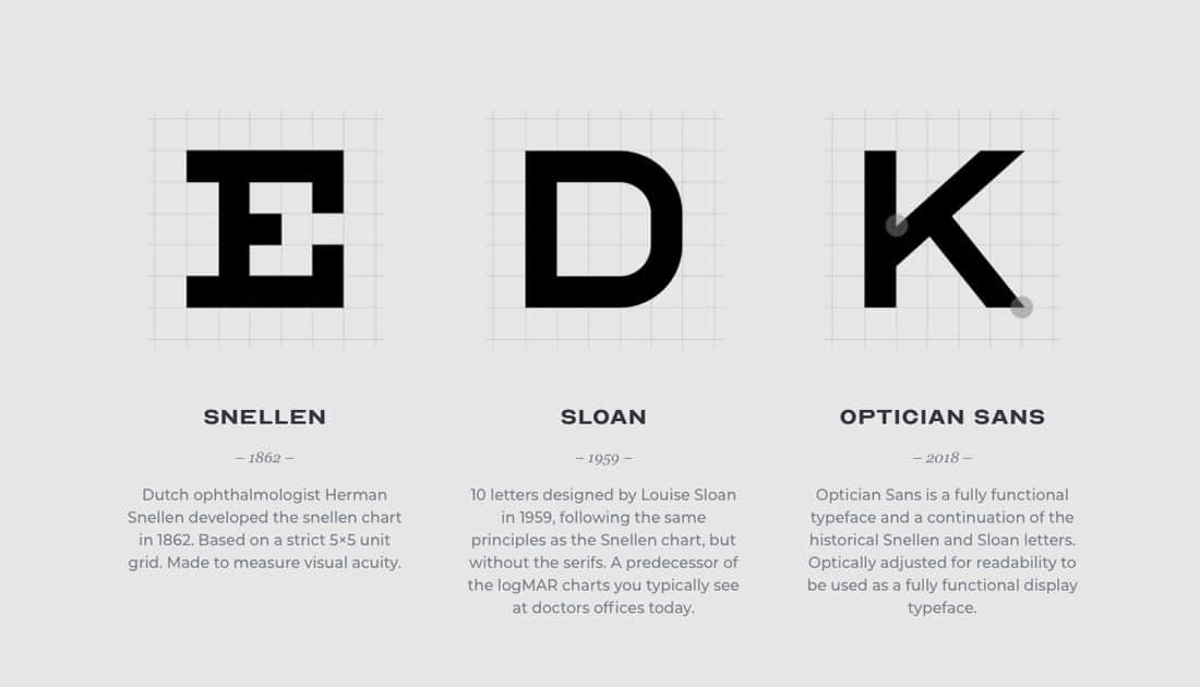
Snellen
– 1862 –
Dutch ophthalmologist Herman Snellen developed the snellen chart in 1862. Based on a strict 5×5 unit grid. Made to measure visual acuity.
Sloan
– 1959 –
10 letters designed by Louise Sloan in 1959, following the same principles as the Snellen chart, but without the serifs. A predecessor of the logMAR charts you typically see at doctors offices today.
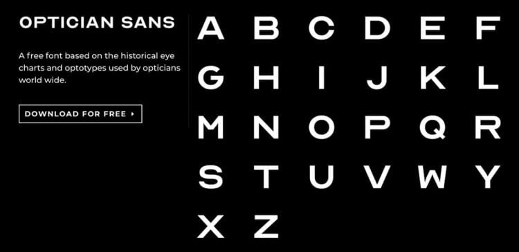
Optician Sans
– 2018 –
Optician Sans is a fully functional typeface and a continuation of the historical Snellen and Sloan letters. Optically adjusted for readability to be used as a fully functional display typeface.

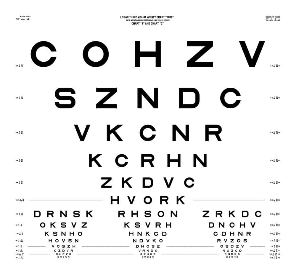
The Logarithmic Visual Acuity (LogMAR) Chart “2000”
The LogMAR Chart is used by ophtalmologist, optometrists and vision scientist to estimate visual acuity.
The chart consists of 10 letters and was developed at the National Vision Research Institute of Australia.
Optician Sans is based on the same visual principles as the LogMAR chart, adjusted to be used as a fully functional display typeface.