portfolio & design blog of logo & identity designer, Graham Smith

Identity guidelines for Wavepulse Acoustics logo
View a larger size over at my Flickr account.
Read more on the development of this logo design – Logo Process – WavePulse Acoustics Identity Development.
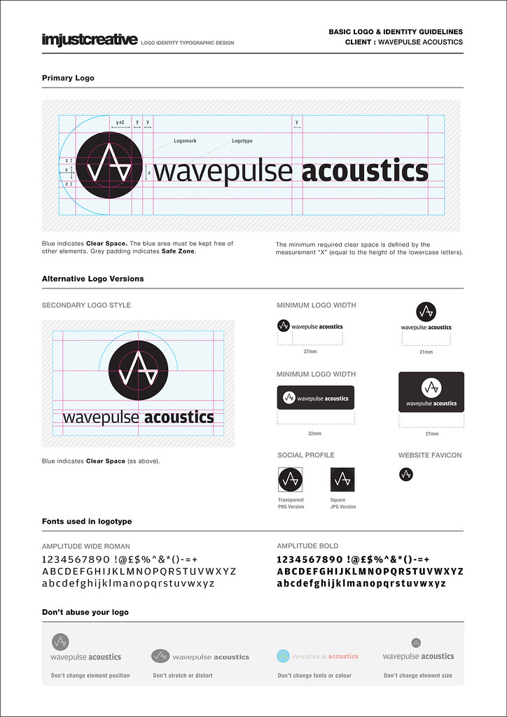
This is a single page A4 identity guide for the Wavepulse Acoustics logo. It’s purpose is to provide basic guidelines for the correct usage of the logo. As some projects are only providing logo designs, opposed to more complex brand identities, the amount of information needed is minimal. It’s not meant to confuse or overwhelm the client, hence it being a handy A4 PDF file.
What’s included
This guide covers the general construction of the logo, dimensions and proportions. Also includes the additional logo styles such as contained logos, portrait and landscape logos, social media profile images and website favicon. Information on the fonts used as well as a few handy ‘don’t do this with your logo’ examples at the foot of the guide.
This is a neat way to also show the client, at a glance, the level of detail that goes into a logo, the spacing, the alignment, proportions etc. On initial glance, the logo may look simple with a word here and logomark there, there is fine level of detail to ensure the logo looks and feels right.
It has been a challenge to try to fit all the information I wanted onto one page, without over crowding, whilst maintaining a clean layout design.
Created how?
This file was created in Illustrator opposed to InDesign. Not sure why, I just started fiddling in Illustrator and then I was too far done to start over. It did take some time, I was tweeting my progress whilst at various stages of the design. Finding the right amount of detail and laying it out so that is looks ‘OK’ was the challenge. Lots of tweaking, redoing, rehashing, coffee and undo’s. This was one page, I researched corporate identity guides with over 20 pages of guidelines, so these things are not quick. One reason why they cost so much to design.
Now I have one file done, I can use this as a template for all my other projects, so time should be greatly reduced. I have done ad-hoc guides before, but I wanted to create a more branded look, something consistent with my own brand. I am now working on a 2 page guide and also a 4-6 page guide.
The client will get
The file will be saved as a PDF file and also a layered Illustrator EPS file. All elements except the various logo styles will be locked. This means the client can use this to pick up the various logos for their own use without having individual logo files floating around, should help to keep everything neat and tidy.
Therefore, my aim is to provide each client with this ‘Dummies Guide to logo usage’ PDF guide. The majority of clients will get this A4 guide without question, this includes logo designs with a budget of more than £500. If the project or client requires a higher level of detail in the guide, they can pay extra for a more detailed book.
Template for download
I will be making a version of this identity guide available as a download, saved in Illustrator CS 4. Any other CS versions will be available on request. This means you can benefit from all my hard work and have a template to base your own guide from. Obviously try to inject some of your own style into it, rather than just using my design. But should be useful to get some of you off your feet in doing your own guides.
Follow me on Twitter, Facebook and Google Buzz to make sure you don’t miss the announcement of when the download is available. Probably best sign up to this blogs RSS feed as well whilst you are at it.

Categories: Identity Guidelines, Logo Process, Logo Specifications, Portfolio
Tagged: brand identity, Identity, identity guidlines, logo design, logos, pdf, wavepulse < Previous: A Viable Career as a Freelance Logo Designer?
> Next: Passenger plane crash disaster caught on video 2009


Pingback: uberVU - social comments
You’re awesome. Can’t wait to see it :)
This is nice, very handy.
Isn’t it kind of depressing that we have to tell people not to change the colors, fonts etc. of the logo?
Just one note – in measurement you use two values: “x” and “y” and where you have double “y” space I think it would be less confusing to write “2y” instead of “yx2″.
Fair point with the ’2y’, will tweak the file soon. Thanks for the feedback. :)
Hi Graham,
This is great. I’ve been meaning to design an identity guidelines document for some time but just haven’t got round to it. Your template will certainly save me a load of time.
I hesitate to ask but if your template could be made available in InDesign, that would be great.
Thanks,
Nick
I did not think to do it in Indesign, but I may transfer it. I have yet to do the ‘template’ version, needs tidying up before I release it as a download, so InDesign may suit. Will give it some thought.
Nick you lazy bugger… I’ve been doing these for a few years! Good job Graham.
Well, lazy maybe… but they do require an element of ‘motivation’ to start and complete. If a client is not prepared to pay for this level of detail then it can be a challenge to muster up the energy to do. But I feel that now, with the prolific nature of logo designers, one needs to up the game. To offer more incentive for a client to choose you over some one else.
This is part of my reasoning to offer it now to most clients, budget depending. If I am doing a cheap £200 logo as a favour, then I doubt I will do a guide. Unless ofcourse the logo in question is a good £200 logo, and looks good in my portfolio, then I will do it for my own marketing needs. Much like the situation with Wavepulse Acoustics. You would have a heart attack if you knew how much i let this logo go for… :)
Hi Graham,
Looking forward to the template download.
Found your site via a post on visualswirl.
Great articles.
Much appreciated
Nolan
Hi Graham,
Looking forward to the template download.
Found your site via a post on visualswirl.
Great articles.
Much appreciated
Nolan
I love your approach on this Graham. It looks fantastic.
I’m looking forward to the template to check it out more.
Thanks Jake, working on the template over the next few days.
I love your approach on this Graham. It looks fantastic.
I’m looking forward to the template to check it out more.
Thanks Jake, working on the template over the next few days.
That’s awesome work man! I have been working on something similar for my work. I always enjoy seeing the killer things you share.
Looking good Graham. I’m appreciating your attention to detail and the clean layout.
I have a couple of comments:
1. Color/Color Palette – without a set color palette this logo will undoubtedly end up in 80 different shades of blue (and maybe pink).
2. Logotype font – I never provide the client with the font used to create the logotype. Clients always want to use the font in other works (print, online, headlines, body copy!). This dilutes the brand – making their new logo less unique.
Instead I would suggest that you add a recommended font set that compliments your logo.
I love this stuff. Thanks for sharing!
and to all those asking for a template…make your own. You are designers, right?
All designers take note this is how all logo and brand creation should be done. Great work Graham