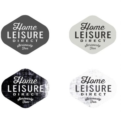


Continuing on from earlier explorations of the Home Leisure Direct logo I have refined the overall idea to be fully contained as above.
This is my first attempt at this particular style, so the weathered textures are just placeholders as well as other details to firm up later: overall size of text, overall proportions, colours, thickness of lettering.
The challenge with this project has been the overall length of the 3 word brand name as well as trying to work in the “Seriously Fun” tag line. Lost count of how many variations I have thrown together in order to try and get these 3 words looking good as well as countless font combinations. In this example there are 3 main fonts used which is one more than I would usually work in, but I really feel it works in this context.
The shape of the container allowed me to size each line of text to follow the angles so the overall effect is one of neatness and of belonging.
I feel this is not coming along really well and that the finished logo should not look too different from what you see above. I think the tricky bit will be getting the overall distressed look just right. Not too much: not too little.