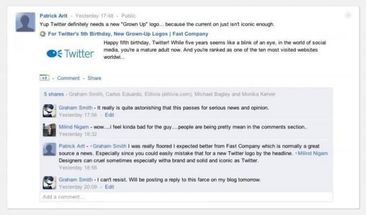
I just had to follow up on post published by the Fast Company: For Twitter’s 5th Birthday, New Grown-Up Logos where author Rick Barrack has decided that the Twitter logo needs a redesign.

I initially came across this post via my Google+ stream, and loved Patrick’s comment, “Yup, Twitter definitely needs a new “Grown Up” logo because the current one is just not iconic enough.”
In the usual case of concepts, open-letters and even major brand rebrands, such as The Gap, we are used to seeing designers come up with alternative ideas and suggestions.
I personally couldn’t resist the opportunity to jump on the rebranding attempt with The Gap Logo Revisited, and I genuinely felt that it was “fair game” to put out my own interpretation of the rebrand. In this case The Gap HAD asked for designers to openly submit new designs so this was for the most part a free-for-all frenzy. I am just glad that they opted to revert back to their classic logo, but I did enjoy the opportunity to voice my own thoughts and ideas.
Sometimes these open-letters or “I can do better even though I wasn’t asked” are only sparked by an individuals desire to be heard, and to have their internalizations externalised. The results can actually be fascinating, to view and read, even if it’s mostly a pipe dream.
I have seen recent cases of these open-letters that have really piqued my interest, and have been impressed with the designers’ take on the subject matter at hand. Other times, however, they don’t offer anything worthwhile, don’t improve upon the original and even make the designer look rather stupid.
Enter The Fast Company
This is where the Fast Company and Rick Barrack make a rather puzzling entrance. If you haven’t scoped out the original article then do so now as you need to be aware of the reasons put forward.
Honestly? I am super baffled by this.
On one hand I can see the benefit of kicking up some controversy with the end goal of getting some epic page views, links and coverage which would of course include this post.
Nothing like kicking up a shit-storm for some good page views.
That I can understand.
What I can’t understand, or quite make out, is if this is an actual joke by the Fast Company and Rick Barrack, or a genuine attempt to put forward a serious redesign proposition for the Twitter logo.
I have read, and reread this article just to make sure I have not missed anything that would suggest it’s not to be taken seriously. For the life of me I can’t find a thing. It really does look like a genuine proposition.
If it’s a joke then the joke will be mostly on Rick as The Fast Company will already have about 20 posts in front of this by the end of the day, and will soon be a distant post in their archives. They will get a bit of a slating in the short terms as can be seen in the post comments but it will die out soon enough.
The same can’t be said for Rick. This sort of thing clearly gets attention for which I am pretty sure the Fast Company were counting on, but not so sure it’s the attention that Rick was expecting or counting on. I had to double check what you did for a living before my heart sunk even further.
This is the stuff that April Fools is made of.
One part of me actually considered, and wanted to believe for Rick’s sake, that this post was scheduled for an April Fools but was mismanaged and a Scheduled Post was set-up with July 15th as the date.
So could this be an admin error?
If so you would think it would have been spotted by now, and discreetly pulled. So I think it’s therefore safe to assume it was not a mismanaged Scheduled Post.
I don’t think this was a joke as there really is not indication to suggest it is. The post is written with reasonably serious intent, and you are left with the idea that Rick truly would, and is, staking is a portion of his reputation on his idea of what the Twitter logo should now look like.
And here it is.
The Twitter Logo Redesigned

I don’t agree with this assumption that the Twitter logo needs to grow up. I love the Twitter logo especially since they tweaked it a short while back. It’s utterly iconic and works perfectly in pretty much every scenario and location possible from the: favicon, website header and applications icons etc.
I’ll be blunt.
Rick’s take on what the new Twitter logo should look like scares the crap out of me. It’s just wrong.
Here’s another.

Gradients? A speech bubble? An i morphed into the w? Please tell me this IS a joke? I would rather end up with egg on MY face if someone can point out I have totally missed the point of his post.
And to remind you of the current “official” logo just incase you’re eyes are now bleeding.
I love this passage, “So it’s way past the time for you to grow up as a brand. In other words, how about presenting a more appropriate image that reflects your current status? The following are just a few suggestions of how we think you should toast your fifth year as a media heavy.”
So these two examples of Twitter’s new logo present “a more appropriate image that reflects your current status?” If Twitter rebranded with any of these designs I would laugh till I died, and then I am pretty sure The Devil would take pity on me.
So there we have it.
If anyone chooses to practice this type of conceptualising, especially when it wasn’t needed or asked for, then I think it is fair enough to say you should be able to take the flak if people, like myself, don’t agree. I myself received flak for my thoughts on what The Gap logo could look like but I still stand behind the logic, and the design itself. It was based on nothing but my own views on The Gap and how I see them as a brand.
So I have now given a bit more life to Rick’s post, sent a few more visitors towards the Fast Company and done my bit for their daily article page views. I hope that at some point Rick can take time to address some of the comments on his post, and show us how strongly he sits behind the Twitter logo redesigns.
I could carry on with this assassination but to be honest I just feel for the guy. This is not something you put your name to, a mainstream website, unless you enjoy playing dodgeball with career suicide.