Post Updated with information from the BBC: Airbnb’s new logo faces social media backlash
AirBNB’s New Logo Design Gets Mobbed
It’s always a shame when something like this happens, mostly because there is some poor soul, or group of poor souls, who are having to just sit through all this media shit about how their new AirBNB logo can be perversely disfigured.
Right now I’m feeling a little pity for London-based firm, DesignStudio. I love the new design, and love how it’s been implemented across the brand identity, and I really do massively feel for the flack AirBNB are getting over the new logo.
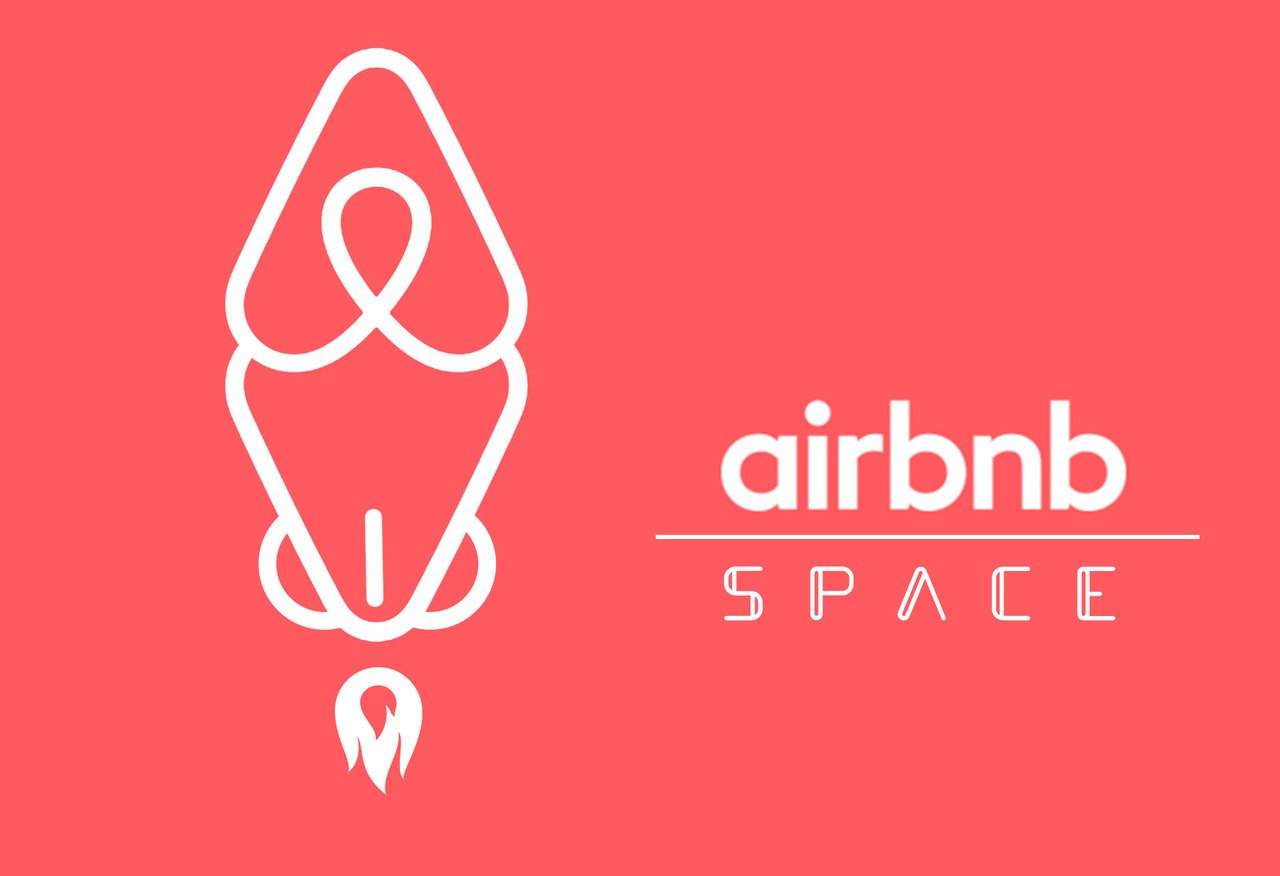
What I didn’t previously realise: AirBNB actually asked for the logo to be adapted, and played with, by the public. So in a sense, the various versions you might see are not without reason, but the extent to which the pervy nature of some of the adaptions does leave a lot to be desired.
Ben Wright, the founder of DesignStudio, worked on the rebrand for over a year, and are all still fully behind the new logo design, even if a certain few are seeing ‘genitalia’ within the design.
As Ben Wright has been quoted as saying, “In the grand scheme of things, it doesn’t really bother us too much what people are saying about it. People around the world are reacting to this and a small percentage of those people are choosing to read into the logo how they want.”
The Story Behind The New AirBNB Logo
Read about the new the design over on AirBNB’s website: http://blog.airbnb.com/belong-anywhere
Due Diligence
I really don’t think the designers were lacking in due diligence here, because let’s be honest, it’s a bit of a stretch to be able to foresee all manor of warped, and deluded, interpretations that sick and twisted individuals might be able to wrench out from the logo.
OK, on the face of it some of them are relatively funny and harmless, like the two examples above, but the other interpretations are just way too childish to be taken seriously.
But even with the immense childishness of some of them (you can see them all here), the reality is that ‘perception’ will have taken a massive shift, and not for the better.
If you live the internet, then this will seem like a huge and unrecoverable episode, but not everyone who might influence and support the AirBNB company live their collective lives checking out meme websites, and getting caught up with foolish tinkering antics.
Whoever came up with the logo looking like a vagina clearly has issues, and then from making that public, it then takes no skill at all to soil the AirBNB logo with less and less funny variations.
It’s a sort of heart, with a crossover turned upside down, and there are plenty of examples of this sort of style that get his sort of perverse attention: the old Habitat logo is one example I’m referring too:
AirBNB and AutomationAnywhere
There is also the other issue that has been ongoing, and that is the similarity of the new AirBNB logo, and that of the AutomationAnywhere logo. Apparently both companies have come to an agreement, and Automation Anywhere is in the process of moving to a new logo design themselves.
Moving On
Let’s hope people have their fun, and allow the AirBNB logo and company to move on, and get on.
There have been, and always will be unfortunate outcomes from certain logo and brand designs, with people seeing some bizarre interpretation that no one else would have seen.
If a massive branding agency like Pentagram can ‘accidentally’, and so ‘monumentally’, completely shift the meaning of an otherwise well respected brand, then it can happen to any one.
This is the scary thing being a logo designer: there is always that one job that will capture the hearts of the internet mob, and for some it can be a devastating blow to their business, lively hood, and reputation.
The weightwatchers logo (above), redesigned by Pentagram in 2012. On the surface a clean, and solid, looking wordmark. The gradient wasn’t to everyones liking, but then something happened.
The moment you see the word ‘twat’, slap bang there in the middle, it’s simply impossible to unsee it. The fallout from this was immense, and to this day, this brand new weightwatchers brand redesign, is still just idly sitting in Pentagrams portfolio section.
So What Now?
1. This perverse chain of events might just die out as quickly as it started, and AirBNB can just move onward, and forward.
2. The damage to the AirBNB’s reputation could, in all seriousness, take a massive hit, and there could be some need to adjust the logo, or revert back to the existing one, much like weightwatchers seems to have done with the ‘twat’ logo, (that work by Pentagram really did need to make a rapid exit).
3. AirBNB might just try to ride out the storm for as long as it takes, and hope that in time all this tomfoolery will be forgotten. In reality, it will never be properly forgotten, so AirBNB will need to closely monitor how it’s company has been, and will be affected, and then make a decision on the logo at some point down the road.
4. Another option similar to #2 is that they simply cut their losses right now, take no chance with the disfiguring of the new logo damaging their brand, and make some rapid alterations pronto. A pretty famous example of this ‘cut their losses now route’ was with the rebranding of the Tropicana packaging, which saw them sway to public demand in just under two months, and revert back to the original packaging.
It’s still a mighty shame that all it takes is one perverse vision, for a few cheap and quick giggles, to create quite a strong negative buzz about a brand.


